From a distance, it’s difficult to build an understanding of the scale and…
Nathan Yau
-
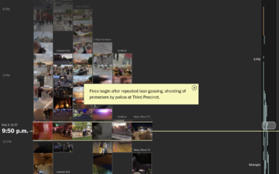
Reconstructing protests in Minneapolis using hundreds of livestreams
-
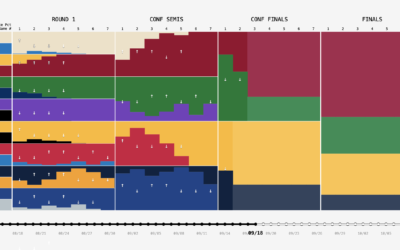
NBA playoff win probabilities, animated over time
FiveThirtyEight publishes win probabilities for NBA games throughout the season. During the playoffs,…
-
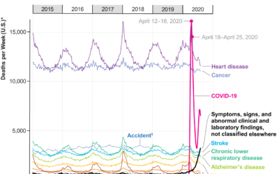
Covid-19, the third leading cause of death
For Scientific American, Youyou Zhou made a line chart that shows cause of…
-
Members Only

The Process 110 – Contrast
For two minutes, a black speck on a white background was all anyone could talk about.
-
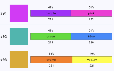
Colour Controversy is a game of perception and labeling
Colour Controversy is a simple game that shows you a shade and asks…
-
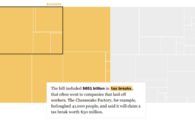
Breaking down the $4 trillion bailout
Using a straightforward treemap, The Washington Post looks at where the $4 trillion…
-
Presidential Plinko
To visualize uncertainty in election forecasts, Matthew Kay from Northwestern University used a…
-
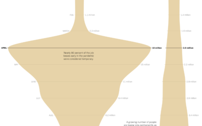
Shape of unemployment
For The New York Times, Ella Koeze looks at the various types of…
-
Excel spreadsheet limit leads to 16,000 Covid-19 cases left off daily count
Microsoft Excel is useful for many things, but it has its limitations (like…
-
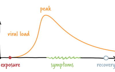
Coronavirus infection timeline
The timeline for a new infection isn’t the same for everyone. Some never…
-
Seems relevant
Just looking back at the past eight or nine months of coronavirus posts…
-
Sonification of Covid-19 rates
You’ve seen the line charts showing case rates over time. The focus is…
-
Members Only
Visualization Tools and Resources – September 2020 Roundup
Here’s the good stuff for September 2020.
-

Millions of people experienced unhealthy air in 2020
NPR estimated how many people have experienced unhealthy air this year, largely in…
-
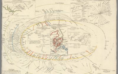
Exhibition of historical visualization
RJ Andrews, in collaboration with the David Rumsey Map Center, curated a collection…
-
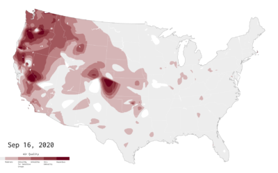
Air Quality Mapped Over Time
With wildfires burning in the western United States, smoke fills the air. This is an animation of the air quality during the past couple of months.
-
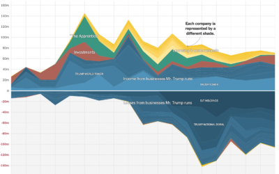
Timeline of the President’s taxes
The New York Times got a hold of the President’s tax records for…
-

I am a book. I am a portal to the universe.
Stefanie Posavec and Miriam Quick have a new book out called I am…
-
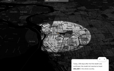
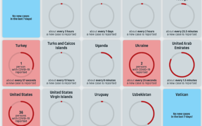
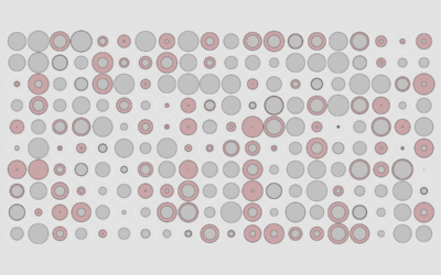
Covid-19 in your neighborhood
With recorded U.S. Covid-19 deaths passing the 200k mark, somehow the number still…
-

What states are doing to make mail-in ballots clearer
Mail-in ballots can be rejected if they’re not filled out or mailed correctly.…
Recently for Members
Second Edition
 Visualize This: The FlowingData Guide to Design, Visualization, and Statistics (2nd Edition)
 Visualize This: The FlowingData Guide to Design, Visualization, and Statistics (2nd Edition)
New tools, refined process.
Browse by Chart Type See All →


