Nate Sloan and Charlie Harding, for NYT Opinion, look at how the structure…
Nathan Yau
-
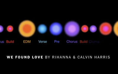
Visual deconstruction of popular songs
-
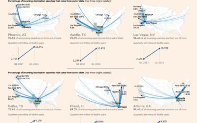
Maps of migration to smaller cities
Steven Bernard for Financial Times, in a report by Claire Bushey and Steff…
-
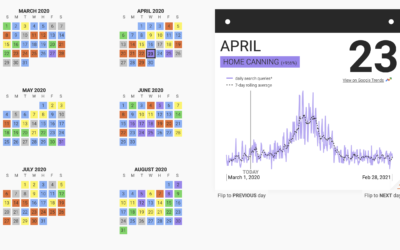
Trending hobbies during the pandemic
This past year has seen a rising interest in long-lost hobbies due to…
-
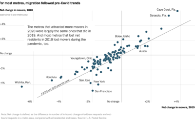
Pandemic migrations
With the restrictions of the pandemic, you might expect an unusually big wave…
-

Converting Minecraft worlds to photorealistic ones using neural networks
Researchers from NVIDIA and Cornell University made GANcraft:
GANcraft aims at solving the… -
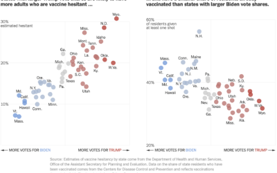
Voting and vaccination rate
Danielle Ivory, Lauren Leatherby and Robert Gebeloff for The New York looked at…
-

Particles on a plane
The CDC says it’s safe to travel now if you’re vaccinated, so you…
-
Generate a color analysis by uploading an image
Mel Dollison and Liza Daly made a fun interactive that lets you upload…
-
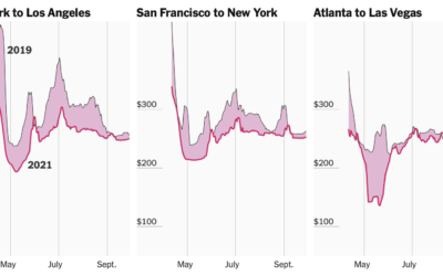
Tracking airfare as a proxy for summer travel plans
Quoctrung Bui and Sarah Kliff for NYT’s The Upshot used difference charts to…
-
Members Only

Chart Remix: U.S. States Ranked – The Process 135
Welcome to another edition of me trying to make a graphic look better.
-
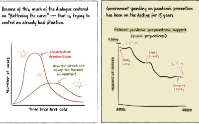
Stopping a pandemic before it starts
For Politico, Beatrice Jin provides an illustrated guide on stopping a pandemic before…
-
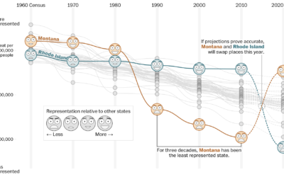
How your state might lose or gain representation with Census count
Harry Stevens, Tara Bahrampour and Ted Mellnik for The Washington Post look at…
-

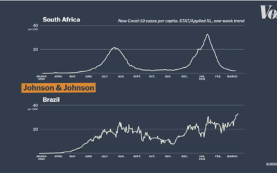
Visualizing risk of Johnson & Johnson vaccine side effect
As the Johnson & Johnson vaccine pauses in the United States, Philip Bump…
-

Send postcards of plots made in R
How many times have you made a plot in R and thought, “I…
-
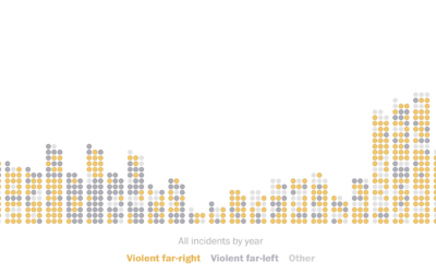
Domestic terrorism incidents plotted over time
The Washington Post (paywall) shows the recent rise in domestic terrorism incidents in…
-

Guide for React with D3.js
Amelia Wattenberger wrote a guide on how you can use the JavaScript library…
-
Code (data) as therapy
For Wired, Craig Mod writes about how he uses code as a way…
-
Vaccine efficacy rates explained
Vox explains efficacy rates and why the best vaccine is the one you…
-
Members Only

Look for the Good Charts – The Process 134
Focus on the possibilities instead of all of things you shouldn’t do.
-
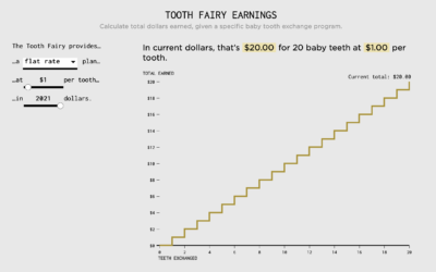
Tooth Fairy Exchange Rate
Calculating how much money a kid gets after exchanging all twenty baby teeth.
Recently for Members
Second Edition
 Visualize This: The FlowingData Guide to Design, Visualization, and Statistics (2nd Edition)
 Visualize This: The FlowingData Guide to Design, Visualization, and Statistics (2nd Edition)
New tools, refined process.
Browse by Chart Type See All →


