Joshua Barbeau fed an AI chatbot with old texts from his fiancee who…
Nathan Yau
-
An AI chatbot to talk to the dead
-
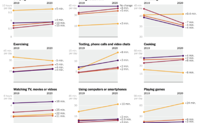
How time use changed in 2020
Ben Casselman and Ella Koeze for The New York Times compared time use…
-
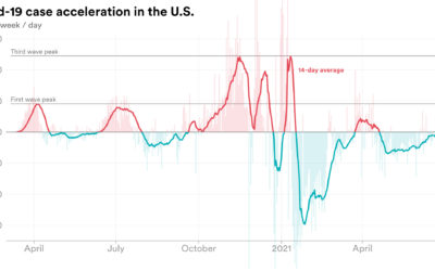
Rate of change in Covid-19 cases
We’re all familiar with the Covid-19 line charts that show cases over time,…
-
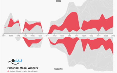
Olympic medal tracker
The Bloomberg medal tracker is fun to look at. I think the graphics…
-
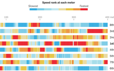
Calculating swim speeds
The New York Times charted speed ranks during the women’s 4×100 freestyle relay.…
-

New Olympic sports explained
The 2020 Summer Olympics are here, so ’tis the season for experimental visual…
-
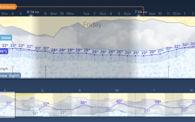
Weather Strip, an app that shows the forecast as a time series
Weather Strip is a new weather app by visualization researcher Robin Stewart. It…
-
Members Only
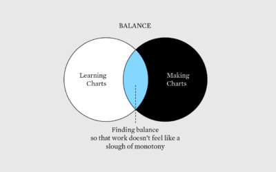
Learning New Visualization Things Practically – The Process 149
Learn about new visualization things, but also get actual work done.
-

Olympic event visual explainers
With the Olympics starting on Friday, The New York Times started their coverage…
-
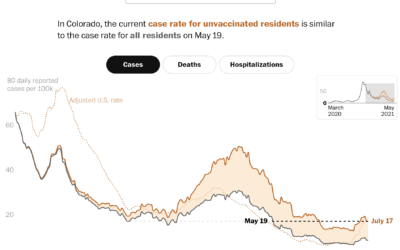
Case rates adjusted for the unvaccinated
Covid-19 cases in the United States were down, but they’re moving up again,…
-
Introduction to Deep Learning
Sebastian Raschka made 170 videos on deep learning, and you can watch all…
-
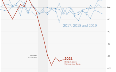
Falling spin rates in baseball after rule enforcement
NYT’s The Upshot analyzed spin rate on pitches before and after enforcing a…
-
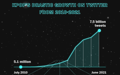
Rise of K-pop
K-pop seems to be inescapable these days, which really confuses me. Marian Liu,…
-
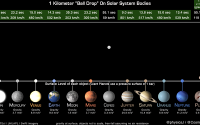
How long it takes a ball to drop on various Solar System bodies
James O’Donoghue made this straightforward animation that shows how long it takes for…
-
Members Only

Analyzing Data, General to More Specific – The Process 148
Use basic statistical methods to move you towards fancier things.
-
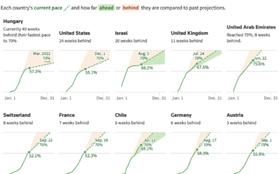
Slowing and then renewed interest in getting vaccinated
When countries gained access to vaccines, there was an initial burst of vaccinations,…
-

Noah Kalina’s averaged face over 7,777 days
Noah Kalina has been taking a picture of himself every day since January…
-
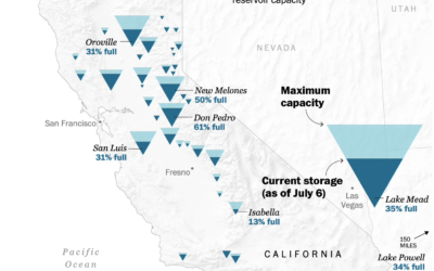
Map of drying reservoirs in the west
To show water levels in California’s drying reservoirs, The Washington Post used upside…
-
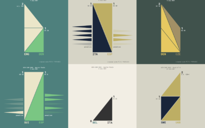
UEFA Euro 2020 matches visualized with triangle sets
Krisztina Szűcs used sets of animated triangles to show how each match played…
-
Value of R, the Statistics-specific language
Paul Ford has been learning R to better understand the field of Statistics.…
Recently for Members
Second Edition
 Visualize This: The FlowingData Guide to Design, Visualization, and Statistics (2nd Edition)
 Visualize This: The FlowingData Guide to Design, Visualization, and Statistics (2nd Edition)
New tools, refined process.
Browse by Chart Type See All →


