For FiveThirtyEight, Nate Silver provides tips to stay less stressed staring into the…
Nathan Yau
-
Tips for not letting polls and forecasts occupy your mind for two weeks
-
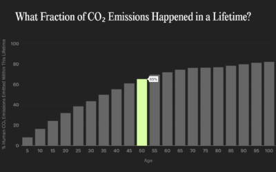
Interactive data essays on climate change
In their second issue, Parametric Press focuses on climate change with a set…
-
Data visualization in virtual reality
Virtual reality puts you in a digital world that can feel like a…
-
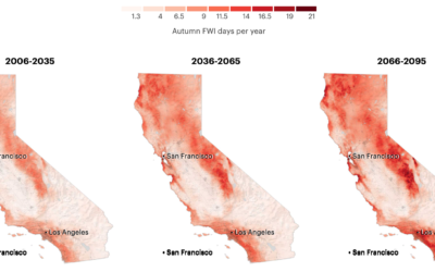
More fire weather days coming
It’s been smoky this season. Based on research from Michael Goss et al.,…
-
Lifelines
Using estimates from a report by the Well Being Trust and the Robert…
-
Members Only
The Process 111 – Excel Limit
A row limit in Microsoft Excel led to an undercount of Covid-19 cases in the thousands. The root of the problem goes past the software though.
-
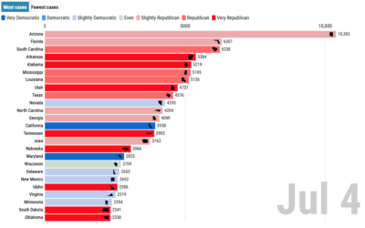
Covid-19 cases and state partisanship
From Dan Goodspeed, the bar chart race is back. The length of the…
-
Visual tour through the technology hype cycle
The Gartner hype cycle is a graphical representation of where certain technologies are…
-
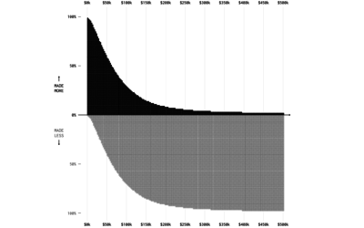
Who Makes More Money
Someone mentioned that $400,000+ per year was commonplace in American households. That seemed like an odd comment.
-
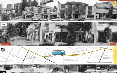
Exploration of 12 timelines along Sunset Boulevard
In 1966, artist Ed Ruscha published Every Building on the Sunset Strip, which…
-
Making a convincing deepfake
For MIT Technology Review, Karen Hao looks into the process of artists Francesca…
-
Reconstructing protests in Minneapolis using hundreds of livestreams
From a distance, it’s difficult to build an understanding of the scale and…
-
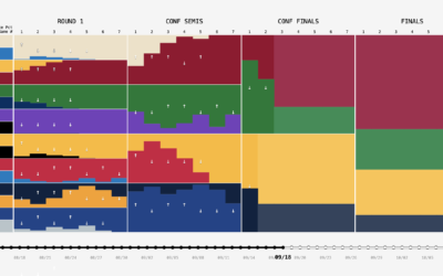
NBA playoff win probabilities, animated over time
FiveThirtyEight publishes win probabilities for NBA games throughout the season. During the playoffs,…
-
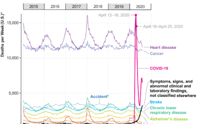
Covid-19, the third leading cause of death
For Scientific American, Youyou Zhou made a line chart that shows cause of…
-
Members Only
The Process 110 – Contrast
For two minutes, a black speck on a white background was all anyone could talk about.
-
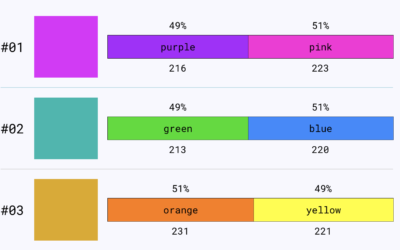
Colour Controversy is a game of perception and labeling
Colour Controversy is a simple game that shows you a shade and asks…
-
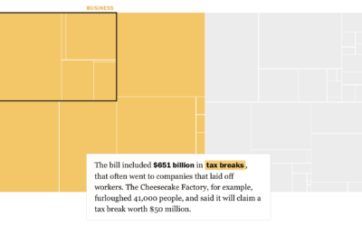
Breaking down the $4 trillion bailout
Using a straightforward treemap, The Washington Post looks at where the $4 trillion…
-
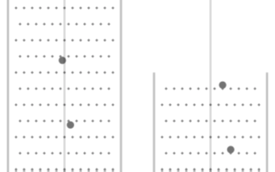
Presidential Plinko
To visualize uncertainty in election forecasts, Matthew Kay from Northwestern University used a…
-
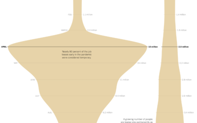
Shape of unemployment
For The New York Times, Ella Koeze looks at the various types of…
-
Excel spreadsheet limit leads to 16,000 Covid-19 cases left off daily count
Microsoft Excel is useful for many things, but it has its limitations (like…







 Visualize This: The FlowingData Guide to Design, Visualization, and Statistics (2nd Edition)


