ProPublica just released a search tool for nonprofit tax records:
The possibilities are…
Results for nytimes
-
Search through 3m nonprofit tax records
-
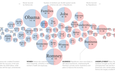
Words used at the National Conventions
The elections season is in full swing, and the New York Times graphics…
-
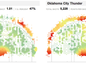
Geography of the basketball court, interactive edition
Remember geographer Kirk Goldsberry’s analysis of shot efficiency on the basketball court? Jeremy…
-
Build a pop song, pick the right pieces
Voice producer Kuk Harrell works with performers like Justin Bieber and Rihanna to…
-
More people want to learn statistics
Data is hot right now, so as you would expect, more people are…
-
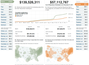
Compare presidential candidate fundraising
Presidential candidates have raised $186 million up to now, according to the Federal…
-
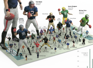
Most mentioned NFL players on SportsCenter
Like something from of a video game, this graphic from The New York…
-
Analysis versus storytelling
Robert Kosara contrasts my version of the pay gap graphic with the NYT…
-

Point guard fundamentals of Jeremy Lin
You knew this was coming, right? The New York Times describes the point…
-
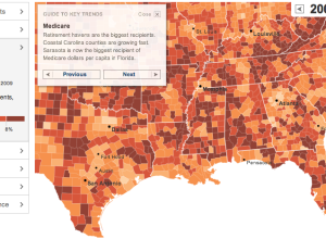
Geography of government benefits
I missed this one a while back, but The New York Times had…
-
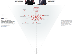
Who voted for Santorum and Romney
As a complement to Shan Carter’s exit poll dancing boxes, The New York…
-
Journalism in the Age of Data
In the words of Terrell Owens, get your popcorn ready, because this video…
-
The Election on Twitter
In what seems to have become an expectation during all major events, a…
-
Telling Stories with Data, A VisWeek 2010 Workshop
This is a guest post by Joan DiMicco, who heads the IBM Visual…
-
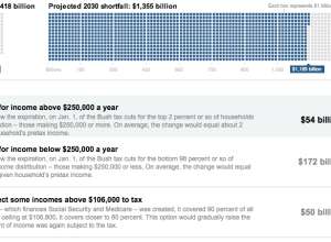
You fix the budget puzzle
Not pleased with how the government is handling the budget and deficit? Fine.…
-
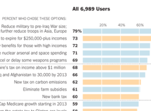
How Twitter users balanced the budget
In a follow-up to their puzzle to balance the budget, The New York…
-
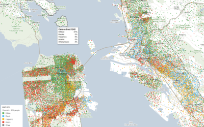
Mapping demographics of every block and city in America
Government data technology has felt behind the times the past few years with…
-
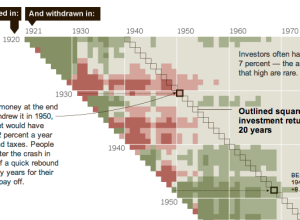
In investing, timing is everything
When you invest in stocks, it’s not just what you invest in, but…
-
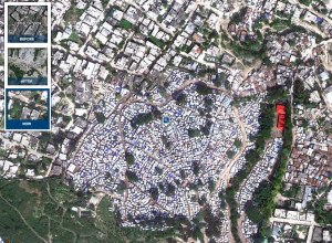
Aerial photos of destruction in Haiti, one year later
In memory of the devastating earthquake that hit Haiti one year ago on…
-
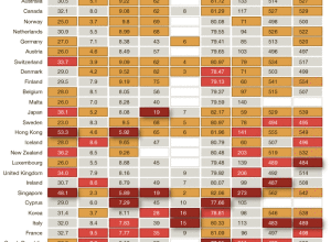
America is not the best at everything
Charles M. Blow has a look at some metrics for the International Monetary…
Recently for Members
Second Edition
 Visualize This: The FlowingData Guide to Design, Visualization, and Statistics (2nd Edition)
 Visualize This: The FlowingData Guide to Design, Visualization, and Statistics (2nd Edition)
New tools, refined process.
Browse by Chart Type See All →


