The Digital Story Innovation Team for ABC News in Australia looked at political…
2021
-
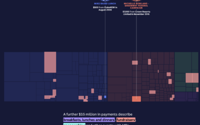
Treemap tour of political donations
-

How the Longest Running Shows Rated Over Episodes
Most television shows don’t get past the first season, but there are some that manage to stick around. These are the 175 longest running shows on IMDb that have ratings.
-
Members Only

Keep Them Separated – The Process 161
Not everything has to be in the visualization at the same time.
-
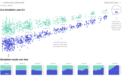
Simulating how just a little gender bias in the workplace can lead to big effects up the chain
Yuhao Du, Jessica Nordell, and Kenneth Joseph used simulations to study the effects…
-

How the 3-point line changed basketball
[arve url=”https://www.youtube.com/watch?v=2p3NIR8LYoo” loop=”no” muted=”no” /]
Vox shows how the 3-point line is “breaking”… -

Possible cheating seen in a scatterplot
When plotting Russian election results, a structured grid patterns appear. From The Economist:…
-

A data visualization magazine
Nightingale is a publication from Data Visualization Society that offers more depth for…
-
Scientists with bad data
Tim Harford warns against bad data in science:
Some frauds seem comical. In… -
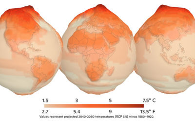
Reducing methane to slow climate change
We often hear about increased CO2 in the context of global warming. Hayley…
-
Spike maps in R
Spike maps use the height of spikes to encode data geographically. The format…
-
Members Only
Data Visualization Freelance Advice, from Someone Who Doesn’t Freelance and Has No Clue What He is Talking About – The Process 160
This is the best freelance advice ever written.
-
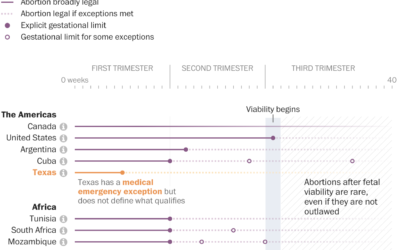
Comparing abortion limits in the U.S. against other countries
The Washington Post, in an effort that I’m sure took more energy and…
-
Visualizing time-based data
Zan Armstrong, Ian Johnson, and Mike Freeman for Observable wrote a guide on…
-
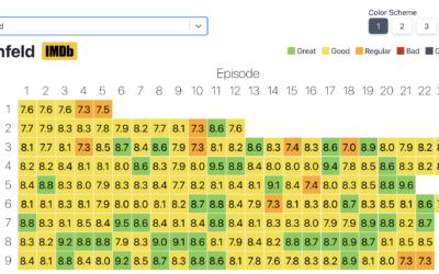
Heatmap of average IMDb ratings for all the shows
Inspired by a graphic on Reddit, Jim Vallandingham expanded the format for all…
-
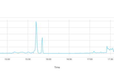
How Facebook disappeared from the internet
Cloudflare describes how things looked from their point of view the day that…
-

Visual guide for protecting your home from wildfire
Aaron Steckelberg and Tik Root for The Washington Post provide a visual guide…
-
Your location for sale
Companies collect and aggregate location data from millions of people’s phones. Then that…
-
Members Only

Backwards Visualization Critique – The Process 159
At least it gave us something to look forward to.
-
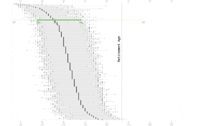
Age and Occupation
Whether it’s because of experience, physical ability, or education level, some jobs tend towards a certain age of worker more than others.
-
Mapping climate change in the Arctic
UnstableGround is a project from the Woodwell Climate Research Center that focuses on…
Recently for Members
Browse by Chart Type See All →


Browse By Topic
Get the Book
 Visualize This: The FlowingData Guide to Design, Visualization, and Statistics
 Visualize This: The FlowingData Guide to Design, Visualization, and Statistics
Available now.