You probably knew that coronavirus deaths have been in the several thousands per…
2021
-
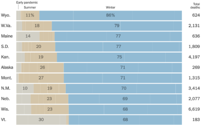
Half of coronavirus deaths were in the winter
-
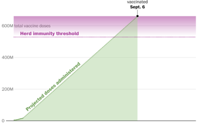
How quickly the U.S. is vaccinating vs. how long it’ll take to get back to “normal”
Vaccines provide light at the end of the tunnel, but when we finally…
-
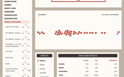
Comparing live music recordings against the studio versions
There’s something about hearing music live no matter how many times you’ve heard…
-

Tracking Capitol rioters through their mobile phone data
For NYT Opinion, Charlie Warzel and Stuart A. Thompson returned to the topic…
-

AI-generated candy hearts
Continuing her annual tradition, Janelle Shane trained various AI models to generate two-word-all-caps…
-

Pandemic Graphics Archive
The Pandemic Graphics Archive is a work-in-progress collection of floor signs and posters…
-
Members Only
Uncertain Words and Uncertain Visualization, Better Together
People’s interpretation of a chart can change if you use differents words to describe it, even if the data stays the same.
-
Data Visualization in Society
Data Visualization in Society, an open access book, is a collection of works…
-
Sonification of Covid-19 deaths
This is interesting:
What does 425,000 Covid deaths sound like? I was inspired…
-
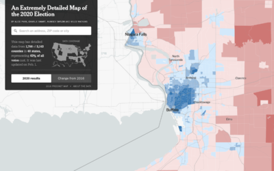
Precinct-level map of 2020 election results
NYT’s The Upshot published their precinct-level map of 2020 election results. Zoom in…
-
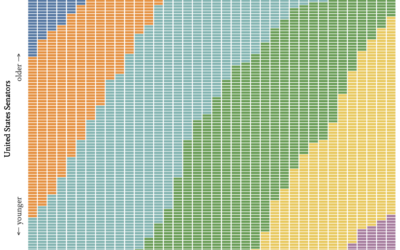
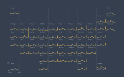
Age generations in the U.S. Senate, over time
With this straightforward unit chart, wcd.fyi shows which generation each Senate member belonged…
-

Living in Data
I’m also looking forward to Jer Thorp’s Living in Data, which comes out…
-
The Art of Statistics
While we’re on the topic of Statistics books for the general public, David…
-

The Data Detective
Tim Harford has a new book coming out tomorrow called The Data Detective:…
-
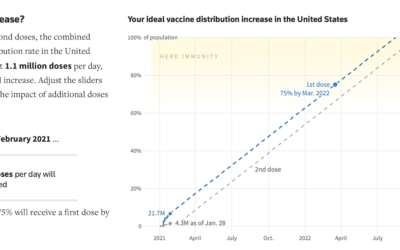
When the U.S. could be vaccinated
For Reuters, Feilding Cage, Chris Canipe and Prasanta Dutta made an interactive that…
-

Snowflake generator
Vivian Wu made a snowflake generator. Adjust parameters such as growth, kaleidoscoping, and…
-
Members Only
Visualization Tools and Learning Resources – January 2021 Roundup
Here’s the good stuff for January.
-

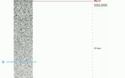
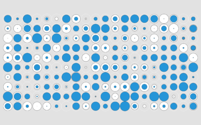
Dot density to show Covid-19 deaths over time
The United States passed 425,000 coronavirus deaths this week. For The New York…
-
Members Only
How to Make Small Multiples in Excel
Also known as trellis charts, lattice chart, or whatever you want to call them, the technique lets you compare several categories in one view.
-

Small JavaScript library for density plots
Twitter released a small JavaScript library to make density plots — for when…
Recently for Members
Browse by Chart Type See All →


Browse By Topic
Get the Book
 Visualize This: The FlowingData Guide to Design, Visualization, and Statistics
 Visualize This: The FlowingData Guide to Design, Visualization, and Statistics
Available now.