Quoctrung Bui and Sarah Kliff for NYT’s The Upshot used difference charts to…
2021
-
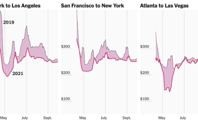
Tracking airfare as a proxy for summer travel plans
-
Members Only
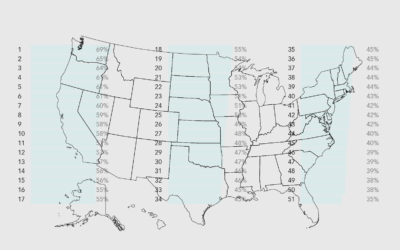
Chart Remix: U.S. States Ranked – The Process 135
Welcome to another edition of me trying to make a graphic look better.
-
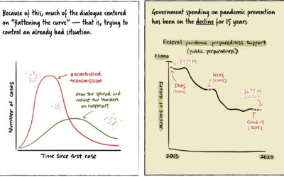
Stopping a pandemic before it starts
For Politico, Beatrice Jin provides an illustrated guide on stopping a pandemic before…
-
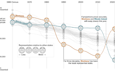
How your state might lose or gain representation with Census count
Harry Stevens, Tara Bahrampour and Ted Mellnik for The Washington Post look at…
-

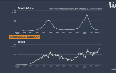
Visualizing risk of Johnson & Johnson vaccine side effect
As the Johnson & Johnson vaccine pauses in the United States, Philip Bump…
-
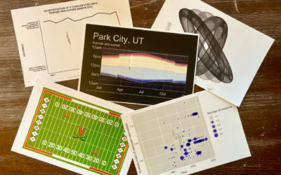
Send postcards of plots made in R
How many times have you made a plot in R and thought, “I…
-
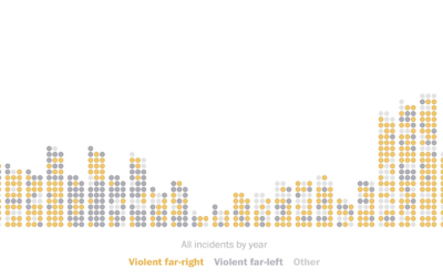
Domestic terrorism incidents plotted over time
The Washington Post (paywall) shows the recent rise in domestic terrorism incidents in…
-
Guide for React with D3.js
Amelia Wattenberger wrote a guide on how you can use the JavaScript library…
-
Code (data) as therapy
For Wired, Craig Mod writes about how he uses code as a way…
-
Vaccine efficacy rates explained
Vox explains efficacy rates and why the best vaccine is the one you…
-
Members Only

Look for the Good Charts – The Process 134
Focus on the possibilities instead of all of things you shouldn’t do.
-
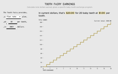
Tooth Fairy Exchange Rate
Calculating how much money a kid gets after exchanging all twenty baby teeth.
-
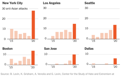
Collecting reports of anti-Asian hate crimes
The New York Times collected, categorized, and linked to reports of anti-Asian hate…
-
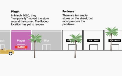
Stores that closed on famous shopping streets
Pre-pandemic, we walked around shopping areas casually browsing, but a lot of retail…
-
When you don’t own your face
For The New York Times, Kashmir Hill describes the implications of facial recognition…
-
Public agencies using facial recognition software without oversight
An anonymous source supplied BuzzFeed News with usage data from Clearview AI, the…
-
Technopolitics of the U.S. census
Dan Bouk and Danah Boyd wrote an essay on the data infrastructure and…
-

How the Ever Given got unstuck
The Washington Post illustrated how the Ever Given got stuck and was freed…
-
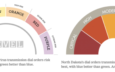
Varying colors of state guidance maps
Many states use color to represent levels of Covid-19 and/or county restrictions. The…
-
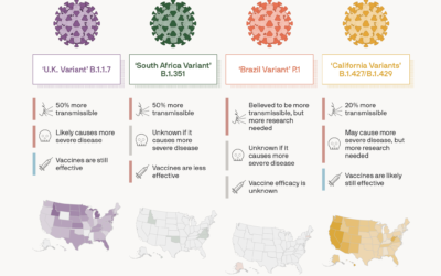
Coronavirus variant tracker
For Axios, Will Chase, with illustrations by Brendan Lynch, provides the current status…
Recently for Members
Browse by Chart Type See All →


Browse By Topic
Get the Book
 Visualize This: The FlowingData Guide to Design, Visualization, and Statistics
 Visualize This: The FlowingData Guide to Design, Visualization, and Statistics
Available now.