Based largely on satellite data and the results of an airborne data collection…
-
What Antarctica looks like underneath the ice
-
Climate change described visually
A video from the International Geosphere-Biosphere Programme explains global warming and projected changes…
-
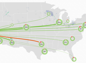
MiseryMap of current flight delays and cancelations
FlightAware is a live flight tracker that lets you look up a flight…
-

FlowingData Gift Guide 2013
The holiday season came out of nowhere this year. Everyone put their lights…
-
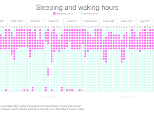
Quantified breakup
A recently divorced woman is using her personal data — phone logs, emails,…
-
FlowingData Job Board, November 2013
Looking for a job in data science, visualization, or statistics? There are openings…
-
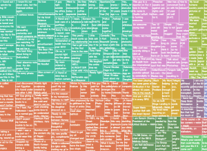
Top reddits of all time
For the downtime post-turkey. James Trimble stuck the top 200 reddits of all…
-
Your life in jellybeans
Using the effective jellybean method, Ze Frank describes the finite time we have.…
-

The Baseline and Working with Time Series in R
A big part of statistics is comparisons, and perhaps more importantly, to figure out what to compare things to. Perspective changes with the baseline.
-
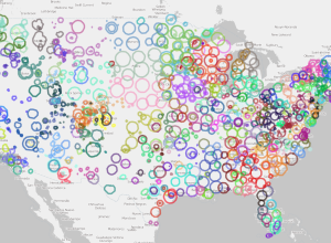
Where the public radio is
Andrew Filer mapped the reach of public radio stations in the United Stations,…
-
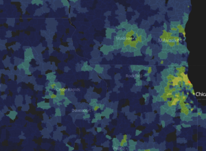
Super ZIP codes →
The Washington Post looked at Super ZIP codes, a classification based on household…
-
Bokeh, a Python library for interactive visualization
Bokeh, a Python library by Continuum Analytics, helps you visualize your data on…
-
Spectrogram shows dialup modem handshake sounds
Presented mostly for my fond memories as a grade schooler, with a fresh…
-
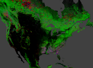
Global forest change
Hansen, Potapov, Moore, Hancher et al. produced high-resolution maps of global forestry to…
-

Bart Simpson and the cone of ignorance
Nice. See also Lisa Simpson on the curve of knowledge. [via reddit]…
-
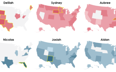
The Most Regional Names in US History
It was a challenge to choose a name for my son, someone who…
-
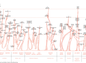
Bourbon family tree
Colin Spoelman for GQ illustrated an educated guess of the bourbon family tree.…
-
Databases for lazy people, a Python library
Friedrich Lindenberg and Gregor Aisch recently released dataset, a Python library to take…
-
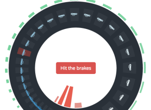
Why traffic waves and congestion happen
You’re on the freeway, traffic is moving along, and for no apparent reason…
-
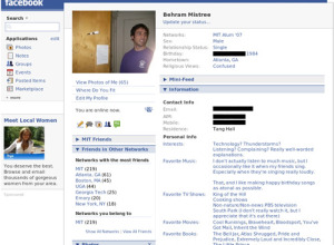
Prediction of sexual orientation through Facebook friends
Carter Jernigan and Behram F.T. Mistree found that sexual orientation of an individual…
Recently for Members
Second Edition
 Visualize This: The FlowingData Guide to Design, Visualization, and Statistics (2nd Edition)
 Visualize This: The FlowingData Guide to Design, Visualization, and Statistics (2nd Edition)
New tools, refined process.
Browse by Chart Type See All →


