If my wife, the physician, has taught me anything, it’s that everything that…
-
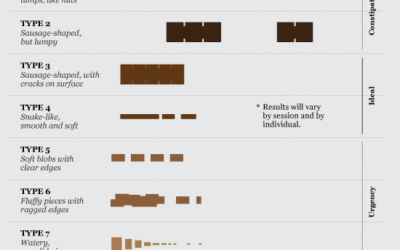
Data Underload #21: Exit Strategy
-

Why context is as important as the data itself
John Allen Paulos, a math professor at Temple University, explains, in the New…
-
Fake filming locations of Paramount Studios
This might shock you, but many movies are not filmed on location. Yeah.…
-
Tour of advanced visualization techniques
Jeffrey Heer, Michael Bostock, and Vadim Ogievetsky provide a good overview of some…
-
Twitwee the Twitter cuckoo clock
I love it when data, or in this case, tweets, finds itself in…
-
FlowingData is brought to you by…
My many thanks to the FlowingData sponsors who help keep the gears turning…
-
Senate and House races are on
I’m not proud of this, but I know very little about what’s going…
-
HTML5 visualization readiness
Everyone’s been bashing Flash lately and holding HTML5 up on a pedestal. This…
-
Design of Frank Lloyd Wright’s Masterpiece
In 1934, American architect Frank Lloyd Wright designed Fallingwater, a house built partly…
-
Facebook users who don’t know they are sharing
I’m pretty sure all this Facebook stuff will blow over soon enough. Most…
-
Facebook privacy options untangled
People are up in arms about Facebook’s new privacy policies, partly because some…
-
Wait. Something isn’t right here…
No clue where this is from, but something seems sort of off, no? I guess we should take the title literally. By the numbers… only. I’m going to give the benefit of the doubt though, and assume this was just an honest mistake. Here’s my guess about what happened.
-
Marge Simpson is Europe in disguise
I bet you didn’t know this. Marge Simpson was actually modeled after the coastlines of Europe. True story.
-
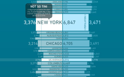
What America spends on food and drink
How much more (or less) money do you spend on groceries than you do on dining out? Bundle, a new online destination that aims to describe how we spend money, takes a look at the grocery-dining out breakdown in major cities.
-
Interview: Fernanda Viégas and Martin Wattenberg
Andrew interviews Fernanda and Martin about their new venture Flowing Media, visualization, and their amazing taste in adjectives.
-
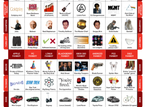
Field guide to fanboys
PCWorld provides a handy field guide to help you spot fanboys in the wild.
-
Write your own TED talk with lies, damned lies and statistics
Sebastian Wernicke, an engagement manager at Oliver Wyman and former bioinformatics researcher, explains the results from his pseudo-analysis of TED talks. The result: a guide on how to give the ultimate TED talk.
-

How open data saved $3.2 billion
This is a story of fake charities and tax shelters. In an analysis of data from the Canada Revenue Agency (CRA), it was found that billions of dollars in donations were collected by fraudulent organizations, with only a tiny portion going to the actual causes. In one case, only $1 out of every $100 went to helping the homeless. The rest of the money went to a tax shelter. Shameful.
-
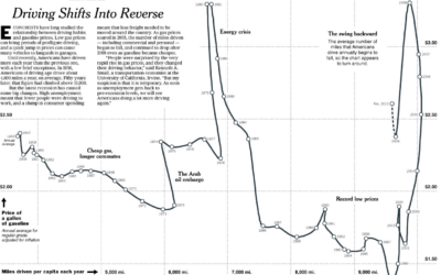
Driving habits and gas prices shift into reverse
Hannah Fairfield of the New York Times looks at driving habits and gas…
-
The path to successful infographics
Most people don’t know what actually goes into a good infographic. There’s a…
Recently for Members
Second Edition
 Visualize This: The FlowingData Guide to Design, Visualization, and Statistics (2nd Edition)
 Visualize This: The FlowingData Guide to Design, Visualization, and Statistics (2nd Edition)
New tools, refined process.
Browse by Chart Type See All →


