 This guest post is by Kaiser Fung, from Junk Charts and Data Matter. He answers my question – “What is data and why should we care about it?”
Who’s got more data? The largest retailer in the world or the largest library in the world?
Walmart tends to over 500 terabytes of data (see here, here, etc.) while the Library of Congress, largest according to the Guinness Book of World Records, has a petty 20 terabytes, cowered by comparison.
To hear it from data warehouse vendors, data mining academics, data savvy politicians, or data fixated citizens, Walmart versus the LOC is like New World versus Old World, the future versus the past, fast versus slow, wired versus tired.
The more things change, the more they stay the same. The flood of data has not washed away these two age-old truisms.
- It’s not the Quantity, it’s the Quality.
Walmart knows to excruciating detail who bought what when: "we capture data on every item, for every customer, for every store, every day". In the Library of Congress reside a Gutenberg Bible, books in 470 languages, world newspapers from the past 300 years, millions of maps and sheet music, among other treasures.
So who’s got more data now?
-
Corollary: When More is Less
With riches of data has profused “data-rich” graphics, which takes Tufte’s data-ink ratio to ridiculous extremes. The result is more clutter, less clarity.
Consider the following chart of Google’s employees (found here, via Information Aesthetics).
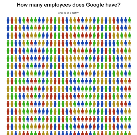
It’s an example of pages of ink to illustrate one number. But let the imagination turn this into a data-rich graphic, and assume that the Googlers are ordered from most to least tenured, and the colors are associated with distinct job functions. So the blue one is employee #1, an engineer; the red one is employee #2, a business person; etc.
A lot of data but how much data really?
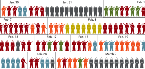
Some time ago, a more interesting take of this concept was used by the New York Times to illustrate casualties in Iraq.
Good statistics is always about data reduction. In this age of abundant data, it is technically challenging to infuse graphics with as much of it as possible. Resist the temptation to overdo it.
 Visualize This: The FlowingData Guide to Design, Visualization, and Statistics (2nd Edition)
The most-to-least-tenured/color-by-business-function data rich graphic would probably only be useful and relevant up to a very small total number of employees.
The NY Times chart on deaths in Iraq is interesting and loaded with data. I’m not sure it wouldn’t be better to use multiple charts to present different aspects of the data separately. For example, a timeline of death count by day would give a better picture of this particular stat than does looking at rows and rows of boxes (it’s hard to note days with zero deaths unless one studies the dates).
Similar timelines showing the different causes of fatalities would help to note patterns in prevalence of, say, hostile fire vs suicide bombings. I find it harder to get this from the jumbled blobs of color in the large chart than I would from multiple-series timelines.
But as Nathan has reminded me in a private communication, you often need to attract readers to your analysis with colorful, attractive, “fun” charts.
The usual distinction drawn in the BI community is between data (where Wal-mart has 500 terabytes) and information.
Information might also be called “insights” or “intelligence” or something else, but involves some form of summary that makes the information useful to a decision maker.
This distinction is neither new nor ignored.
Are gigantic databases the new world? Sure.
Do they change the way we deal with statistics? Sure.
For one thing, there’s my old motto: “Data drives out analysis.” For example, if you are just able to keep aggregate data, you might need to model how much of a particular product to send to a store depending on size of store, seasonality, demographics of the trading area, and other analytic factors. Once you have all this data, in many cases you can simply say: what’s the average sales rate in this store at this price?
For another thing, large databases put a premium on the ability to automate analysis, so the statistician’s task isn’t to analyze a particular data set, but to figure out how to analyze data sets of this type (and define “type”) so useful results can be displayed. This puts a big premium on “robust”.
Can we think of information, insights, or intelligence as simply processed, cleaned, and/or processed data?
Nathan asks: “Can we think of information, insights, or intelligence as simply processed, cleaned, and/or processed data?”
Yes, with the added requirement that it be processed (usually aggregated or summarized) for some purpose. For example, a moving average used as a naive forecast is information — to a person who needs a naive forecast.
“Insights” is a current business buzzword. A lot of former VP’s of Marketing Research became VP’s of Insights over the past few years. It’s a cooler, less descriptive title.