Shan Carter, Amanda Cox, and Mike Bostock for The New York Times, analyzed…
interactive
-
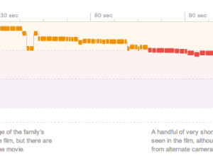
A dissection of movie trailers →
-
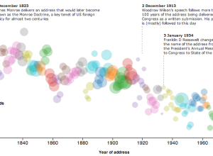
State of the Union address decreasing reading level →
With the State of the Union address tonight, The Guardian plotted the Flesh-Kincaid…
-
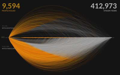
A visual exploration of US gun murders
Information visualization firm Periscopic just published a thoughtful interactive piece on gun murders…
-
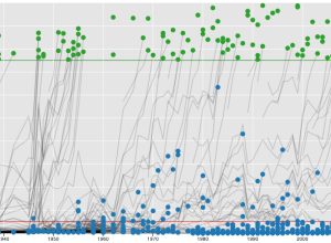
Baseball Hall of Fame voting trajectories
Carlos Scheidegger and Kenny Shirley, along with Chris Volinsky, visualized Major League Baseball…
-
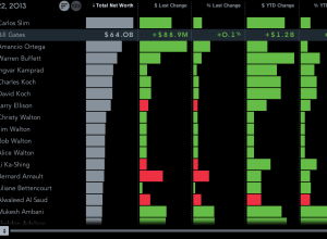
Billionaires of the world ranked and charted
How wealthy are the richest people in the world? How do they compare…
-
How to Animate Transitions Between Multiple Charts
Animated transitioning between chart types can add depth to your data display. Find out how to achieve this effect using JavaScript and D3.js.
-
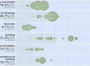
Women as academic authors over the years →
The Chronicle of Higher Education has a look at the percentage of academic…
-
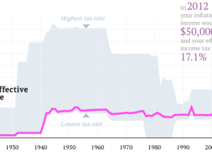
Your tax rate in 2012, and past rates since 1913
What is your effective tax rate now versus years past? Ritchie King made…
-
Link
Small multiples with details on demand →
Small charts. Click. Big chart.
-
An ideal bookshelf
Thessaly La Force, with illustrator Jane Mount, recently published My Ideal Bookshelf, which…
-
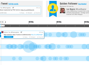
Get a visual recap of your year on Twitter
As 2013 nears, let the recaps, reviews, and best ofs begin. Twitter put…
-
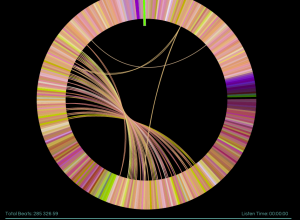
Infinite Jukebox plays your favorite songs forever
You know those songs that you love so much that you cry because…
-
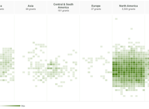
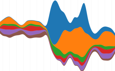
Exploration of Hewlett grants
Since 2000, the Hewlett Foundation has made over 7,000 grants summing $3.86 billion,…
-
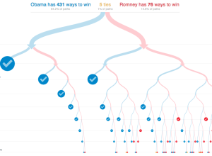
All possible paths to the White House
With the election tomorrow, Mike Bostock and Shan Carter for the New York…
-

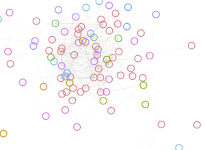
Every Lost episode visualized and recreated
Santiago Ortiz visualized every episode of the show in the interactive Lostalgic. It’s…
-
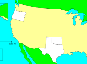
Game: Match states on a blank map →
In case you’re interested in learning how much you suck at US state…
-
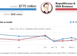
Presidential campaign finance explorer
Hey, I think it’s election season, and you know what that means. It’s…
-
Color names plotted against gender
A couple of years ago, xkcd ran a survey that asked people to…
-

Voting similarities between Netherland cities
This month the Netherlands held national elections, and now that the results are…
-
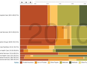
Who pays for healthcare, 1960 to 2010
Josh Cothran looked at who’s paid for healthcare over the past five decades,…
Recently for Members
Second Edition
 Visualize This: The FlowingData Guide to Design, Visualization, and Statistics (2nd Edition)
 Visualize This: The FlowingData Guide to Design, Visualization, and Statistics (2nd Edition)
New tools, refined process.
Browse by Chart Type See All →


