How to Animate Transitions Between Multiple Charts
Animated transitioning between chart types can add depth to your data display. Find out how to achieve this effect using JavaScript and D3.js.
Sometimes one chart just isn’t good enough. Sometimes you need more.
Perhaps the story you are telling with your visualization needs to be told from different perspectives and different charts cull out these different angles nicely. Maybe, you need to support different types of users and different plots appeal to these separate sets. Or maybe you just want to add a bit of flare to your visualization with a chart toggle.
In any case, done right, transitioning between multiple chart types in the same visualization can add more insights and depth to the experience. Smooth, animated transitions make it easier for the user to follow what is changing and how the data presented in different formats relates to one another.
This tutorial will use D3.js and its built in transitioning capabilities to nicely contort our data into a variety of graph types.
If you’re a FlowingData member, you might be familiar with creating these chart types in R.We will focus on visualizing time series data and will allow for transitioning between 3 types of charts: Area Chart, Stacked Area Chart, and Streamgraph. The data being visualized will be New York City 311 request calls around the time hurricane Sandy hit the area.
Check out the demo to see what we will be creating, then download the source code and follow along!
The Setup
Before we dive in, let’s take a look at the ingredients that will go into making this visualization.
D3 v3
Recently, the third major version of D3.js was released: d3.v3.js. Updates include tweaks and improvements to how transitions work, making them easier overall to use.
If you have used D3.js previously, one significant change you will want to know about is that the signature of the callback function for loading data has changed. Specifically, when you load data, you now get passed any errors that have occurred during the data request first, and then the actual data array. So this:
d3.json('data', (data) -> console.log(data.length))
Becomes this:
d3.json('data', (error, data) -> console.log(data.length))
Not a huge deal, as the old API is still supported (though deprecated), but one that gives you enough advantages that you should start using it.
For More on D3.v3, check out the 3.0 upgrading guide on the D3.js wiki.
A Big Cup of CoffeeScript
And again, please feel free to compile to javascript if that will make you happy. But before you do, give CoffeeScript 5 minutes of your time – who knows, you just might fall in love.As in my previous tutorial on interactive networks , I’ll be writing the code in CoffeeScript . I recommend going back to that tutorial if you aren’t familiar with CoffeeScript to get some notes on its syntax. But just in case you don’t want to click that link, here’s the 3 second version:
functions look like this:
functionName = (input1, input2) ->
  console.log('hey! I'm a function')
We see that white space matters – the indentation indicates the lines of code inside a function, loop, or conditional statement. Also, semicolons are left off, and parentheses are sometimes optional, though I usually leave them in.
A Little Python Web Server
The README in the source code also has instructions for using Ruby.Because of how D3.js loads data, we need to run it from a web server, even when developing on our own local machine. There are lots of web servers out there, but probably the easiest to use for our development purposes is Python’s built in Simple Server.
From the Terminal, first navigate to the source code directory for this tutorial. Then check which version of Python you have installed using:
python --version
If it is Python 3.x then use this line to start the server:
python -m http.server
If it is Python 2.x then use
python -m SimpleHTTPServer
In either case, you should have a basic web server that can serve up any file from the directory you are in to your web browser, just by navigating to http://0.0.0.0:8000.
The simple python web server running on my machine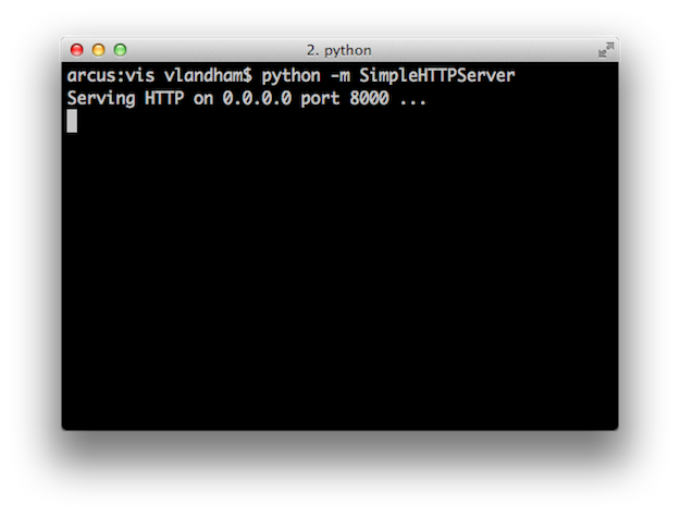
But What About Windows
On Linux or Mac systems, you will already have python installed. However, it takes some moxie to get it working on a Windows machine. I would suggest looking over this blog post, to make sure you don’t overlook something.
If you aren’t in the mood for some python wrangling, you might take the advice of this getting started with D3 guide and try out EasyPHP. With this installed and running, you can host your D3 projects out of the www/ directory in the root of the installation location.
A Dash of Bootstrap
While we will use D3.js for the actual visualization implementation, we will take advantage of Twitter’s Bootstrap framework to make our vis just a bit more attractive.
Mostly, it will be used to make a nice toggle button that will used to transition between charts. This might not be the most efficient method for getting a decent looking toggle on a site, but it is very easy to implement and will give you a chance to check out Bootstrap, if you haven’t already. It is quite lovely.
Transitions
Before we start using them, lets talk a bit about what D3 transitions are and how they work.
Think of a transition as an animation. The staring point of this animation is the current state of whatever you are transitioning. Its position, color, etc. When creating a new transition, we tell it what the elements should end up looking like. D3 fills in the gap from the current state to the final one.
D3 is built around working with selections. Selections are arrays of elements that you work with as a group. For example, this code selects all the circle elements in the SVG and colors them red:
svg.selectAll("circle")
  .attr("fill", "red")
It might then come as little surprise that transitions in D3 are a special kind of selection, meaning you can effect a group of multiple elements on a page concisely within a single transition. This is great because if you are already familiar with selections, then you already know how to create and work with transitions.
There are a few more differences between selections and transitions – mainly due to the fact that some element attributes cannot be animated.The main difference between regular selections and transitions is that selections modify the appearance of the elements they contain immediately. As soon as the .attr("fill", "red") code is executed, those circles become red. Transitions, on the other hand, smoothly modify the appearance over time.
Here is an example of a transition that changes the position and color of the circles in a SVG:
# First we set an initial position and color for these circles.
# This is NOT a transition
svg.selectAll("circle")
  .attr("fill", "red")
  .attr("cx", 40)
  .attr("cy", height / 2)

# Here is the transition that changes the circles
# position and color.
svg.selectAll("circle")
  .transition()
  .delay(500)
  .duration(750)
  .attr("fill", "green")
  .attr("cx", 500)
  .attr("cy", (d, i) -> 100 * (i + 1))
I’ve coded up a live version of this demo (in JavaScript), to get a better feel for what is going on.
The functions called on the transition can be separated into 2 groups: those modifying the transition itself, and those indicating what the appearance of the selected elements should be when the transition completes.
The delay() and duration() functions are in the former category. They indicate how long to wait to start the transition, and how long the transition will take.
The attr() calls on the transition are in the later category. They indicate that once the animation is done, the circles should be green, and they should be in new positions. As you can see from the live example, D3 does the hard work of interpolating between starting and ending appearance in the duration you’ve provided.
There are lots of interesting details you can learn about transitions. For a more through introduction, I’d recommend Jerome Cukier’s introduction on visual.ly.
Custom interpolation, start and end triggers, transition life cycles, and more await you in this great guide!To really rip off the covers, check out Mike Bostock’s Transitions Guide , which exposes more of the nitty gritty details of transitions and is required reading once you start needing their more advanced capabilities.
For now, let’s stop with the prep work and get going on more of the specifics of how this visualization works.
A Peak at the Data
When I discovered the NYC OpenData site provided access to raw 311 service request data, I had visions of recreating the classic 311 streamgraph from Wired Magazine originally created by Pitch Interactive.
Alas, my dreams were dashed upon the realization that the times reported for all the requests was set to midnight! I assume some sort of bug in the export process is currently preventing the time from being encoded correctly.
Not wanting to give up on this interesting dataset, I decided to switch gears and instead look at daily aggregation of requests during an interesting period of recent New York history: hurricane Sandy. This tells, I think, an interesting, if not surprising, story. Priorities change when a natural disaster strikes.
Here is what the data looks like:
[
  {
    "key": "Heating",
    "values": [
      {
        "date": "10/14/12",
        "count": 428
      },
      {
        "date": "10/15/12",
        "count": 298
      },
      // ...
    ]
  },
  {
    "key": "Damaged tree",
    "values": [
      // ...
    ]
  },
  // ...
]
In words, our array of data is organized by 311 request type. Each request object has a key string and then an array called values. Values has an entry for each day in the visualization. Each day object has a string representation of the date as well as the number of this type of request for that day, stored in count.
You could use d3.nest to convert a simple table into a similar array of objects, but that is a tutorial for another day.This format was chosen to match up with how the visualization will be built. As we will see, the root-level request objects will be represented as SVG groups. Inside each group, the values array will be converted into line and area paths.
A Static Starting Point
To create movement, one must begin with stillness. How’s that for sage advice? Not great? Well, it will work well enough for us in this tutorial.
Transitions don’t deal with the creation of new elements. An element needs to exist already in order to be animated. So to begin our visualization, we will create a starting point from which the visualization can transition from.
Layouts and Generators
First let’s setup the generators and layout we will use to create the visualization. We will be using an area generator to create the areas of each chart, a line generator for the detail on the regular area chart, and the stack layout for the streamgraph and stacked area chart, as well as some scales for x, y, and color.
Here is what the initialization code looks like:
x = d3.time.scale()
  .range([0, width])

y = d3.scale.linear()
  .range([height, 0])

color = d3.scale.category10()

# area generator to create the
# polygons that make up the
# charts
area = d3.svg.area()
    .interpolate("basis")
    .x((d) -> x(d.date))

# line generator to be used
# for the Area Chart edges
line = d3.svg.line()
    .interpolate("basis")
    .x((d) -> x(d.date))

# stack layout for streamgraph
# and stacked area chart
stack = d3.layout.stack()
  .values((d) -> d.values)
  .x((d) -> d.date)
  .y((d) -> d.count)
  .out((d,y0,y) -> d.count0 = y0)
  .order("reverse")
The stack layout could use a bit more explanation.
Unlike what its name might imply, this layout doesn’t actually move any elements itself – that would be very un-D3 like. Instead, its main purpose in this visualization is to calculate the location of the baseline – which is to say the bottom – of the area paths. It computes the baseline for all the elements in the values array based on the stack’s offset() algorithm.
The out() function allows us to see this calculated baseline value and capture it in an attribute of our value objects. In the code above, we assign count0 to this baseline value. After the stack is executed on a set of data, we will be able to use count0 along with the area generator to create areas in the right location.
Loading the Data
Ok, we need to load the JSON file that contains all our data.
This is done in D3 by using d3.json:
$ ->
  d3.json("data/requests.json", display)
Load the requests.json file, then call the display function with the results.
Here is display:
display = (error, rawData) ->
  # a quick way to manually select which calls to display.
  # feel free to pick other keys and explore the less frequent call types.
  filterer = {"Heating": 1, "Damaged tree": 1, "Noise": 1, "Traffic signal condition": 1, "General construction":1, "Street light condition":1}

  data = rawData.filter((d) -> filterer[d.key] == 1)

  # a parser to convert our date string into a JS time object.
  parseTime = d3.time.format.utc("%x").parse

  # go through each data entry and set its
  # date and count property
  data.forEach (s) ->
    s.values.forEach (d) ->
      d.date = parseTime(d.date)
      d.count = parseFloat(d.count)

    # precompute the largest count value for each request type
    s.maxCount = d3.max(s.values, (d) -> d.count)

  data.sort((a,b) -> b.maxCount - a.maxCount)

  start()
The requests.json file has data for every request type, which would overload our visualization. Here we perform a basic filter to cherry pick some interesting types.
d3.time.format and the other time formatting capabilities of D3.js are great for converting strings into JavaScript Date objects. Here, our parser is expecting a date string in the %m/%d/%y format (which is what %x is shorthand for. We use this formatter when we iterate through the raw data to convert each string into a date and save it back in the object.
Then we call start() to get the display ball rolling.
The Start of the Visualization
Finally, we are ready to create the elements needed to get our charts going. Here is the start() function which sets up these elements:
start = () ->
  # x domain setup
  minDate = d3.min(data, (d) -> d.values[0].date)
  maxDate = d3.max(data, (d) -> d.values[d.values.length - 1].date)
  x.domain([minDate, maxDate])

  # I want the starting chart to emanate from the
  # middle of the display.
  area.y0(height / 2)
    .y1(height / 2)

  # now we bind our data to create
  # a new group for each request type
  g = svg.selectAll(".request")
    .data(data)
    .enter()

  requests = g.append("g")
    .attr("class", "request")

  # add some paths that will
  # be used to display the lines and
  # areas that make up the charts
  requests.append("path")
    .attr("class", "area")
    .style("fill", (d) -> color(d.key))
    .attr("d", (d) -> area(d.values))

  requests.append("path")
    .attr("class", "line")
    .style("stroke-opacity", 1e-6)

  # default to streamgraph display
  streamgraph()
We still haven’t drawn anything, but we are getting close.
The data array is bound to the empty .request selection. Then, as mentioned in the data section above, a g element is created for each request type.
Finally, two path elements are appended to the group. One of which is for drawing the areas of the three charts. The other, with the class .line, will be used to draw lines in the regular area chart.
Without this, the first transition will just cause the areas to appear immediately.
As a little detail, I’ve started the .area paths in the center of the display, so the first transition to the first chart will grow out from the center.
A Movement in Three Parts
Now that we have the basic visualization framework, we can focus on developing the code for each chart.
We want the user to be able to switch back and forth between all the graph styles, in a non-linear manner. To accomplish this, the functions implementing each chart needs to accomplish 3 things:
- Recompute values that might get changed by switching to the other charts.
- Reset shared layouts and scales to handle the selected chart.
- Create a new transition on the elements making up each chart.
With this consistent structure in mind, let’s start coding up some charts.
Steamgraph
The initial streamgraph display
We will start with the streamgraph – because of my original dreams to emulate Wired, and because it is pretty easy to create with the stack layout.
streamgraph = () ->
  # 'wiggle' is streamgraph offset
  stack.offset("wiggle")
  stack(data)

  # reset our y domain and range so that it
  # accommodates the highest value + offset
  y.domain([0, d3.max(data[0].values.map((d) -> d.count0 + d.count))])
    .range([height, 0])

  # setup the area generator to utilize
  # the count0 values created from the layout
  area.y0((d) -> y(d.count0))
    .y1((d) -> y(d.count0 + d.count))

  # here we create the transition
  t = svg.selectAll(".request")
    .transition()
    .duration(duration)

  # D3 will take care of the details of transitioning
  t.select("path.area")
    .style("fill-opacity", 1.0)
    .attr("d", (d) -> area(d.values))
Its all a bit anticlimactic, right? The shape of the path is defined by the attribute d. See the MDN tutorial if you aren’t familiar with SVG paths.Look at that. We didn’t even have to get our hands dirty with creating SVG paths. The area generator did it all for us. Nor did we have to deal with any of the animation from current state to final streamgraph. The transition helped us out there. So what did we do?
The initial call to stack(data) causes the stack layout to run on our data. Its setup to use wiggle as the offset, which is the offset to use for streamgraphs.
The y scale needs to be updated to ensure the tallest ‘stream’ is accounted for in its calculation.
Again, check out that Transition Guide for more clarity on how this works.The last section of the streamgraph function is the transition. We create a new transition selection on the .request groups. Then we select the .area path’s inside each group and set the path and opacity they should end up using the attr() calls.
D3 will interpolate the path’s values smoothly over the duration of the transition to end up at a nice looking streamgraph for our data. The great thing is that this same code will work for transitioning from the initial blank display as well as from the other chart types!
Stacked Area Chart
The stacked area chart provides a new view with little code.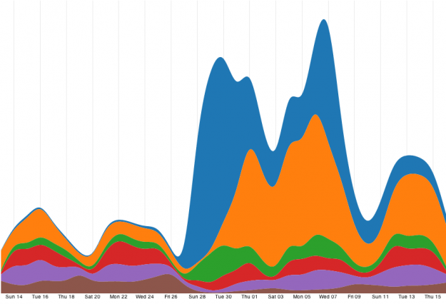
I’m not going to go over the code for the stacked area chart – as it is near identical to the streamgraph.
The only real difference is that the offset used for the stack layout calculations is switched from wiggle to zero. This modifies the count0 values when the stack is executed on the data, which then adjusts the area paths to be stacked instead of streamed.
Area Chart
With the overlapping area chart, we reduce opacity to prevent from obscuring ‘short’ areas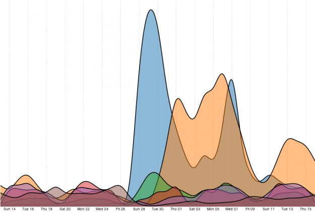
Our last chart is a basic overlapping area chart. This one is a little different, as we won’t need to use the stack layout for area positioning. Also, we will finally get to use that .line path we created during the setup.
Here is the relevant code for this chart:
areas = () ->
  g = svg.selectAll(".request")

  # as there is no stacking in this chart, the maximum
  # value of the input domain is simply the maximum count value,
  # which we precomputed in the display function
  y.domain([0, d3.max(data.map((d) -> d.maxCount))])
    .range([height, 0])

  # the baseline of this chart will always
  # be at the bottom of the display, so we
  # can set y0 to a constant.
  area.y0(height)
    .y1((d) -> y(d.count))

  line.y((d) -> y(d.count))

  t = g.transition()
    .duration(duration)

  # partially transparent areas
  t.select("path.area")
    .style("fill-opacity", 0.5)
    .attr("d", (d) -> area(d.values))

  # show the line
  t.select("path.line")
    .style("stroke-opacity", 1)
    .attr("d", (d) -> line(d.values))
The main difference between this chart and the previous two is that we are not using the count0 values in any of the area layouts. Instead, the bottom line of the areas is set to the height of the visualization, so it will always stay at the bottom of the display.
The .line is adjusted in the other charts too (just not shown in these snippets). It is just always set to be invisible in the transition.In the transition, we set the opacity of the area paths to be 0.5 so that all the areas are still visible. Then we do another selection to set the .line path so that it appears as the top outline of our areas.
Switching Back and Forth
As each of these charts is contained in its own function, transitioning between charts becomes as easy as just executing the right function.
Here is the code that does just that when the toggle button is pushed:
transitionTo = (name) ->
  if name == "stream"
    streamgraph()
  if name == "stack"
    stackedAreas()
  if name == "area"
    areas()
Each of these functions creates and starts a new transition, meaning switching to a new chart will halt any transition currently running, and then immediately start the new transition from the current element locations.
The Little Details
There are some finishing touches that I’ve made to the visualization that I won’t go into too much depth on. D3’s axis component was used to create the background lines marking every other day.
Shameless plug: Check out my tutorial on small multiples if you want to take a deeper look into the implementation of this great pieceA little legend, inspired by the legend in the Manifest Destiny visualization. It is also an SVG element and the mouseover event causes a transition that shifts the key into view. The details are in the code.
Finally, like I mentioned above, the toggle button to switch between charts was created using bootstrap. Checkout the button documentation for the details.
Wrapping Up
Well hopefully now you have a better grasp on using transitions to switch between different displays for your data. We can really see the power of D3 in how little code it takes to create these different charts and interactively move between them.
Thanks again to Mike Bostock, the creator of D3. His presentation on flexible transitions served as the main inspiration for this tutorial.
Now get out there and start transitioning! Let me know when you create your own face melting (and functional) animations.
Made possible by FlowingData members.
Become a member to support an independent site and learn to make great charts.
About the Author
Jim Vallandingham is a programmer and data analyst currently working in the Nordstrom Data Lab as a data visualization engineer. He is interested in interactive interfaces to data that allow for exploration and insight. You can find him on Twitter @vlandham and his personal site, vallandingham.me.
12 Comments
Add Comment
You must be logged in and a member to post a comment.
Thanks for the tutorial Jim. Is there a live example or does that come with membership to the site?
Thanks
Hi Ian, there’s a “Demo” link in red at the beginning of the tutorial. Also here:
http://projects.flowingdata.com/tut/chart_transitions_demo/
:)
Now I feel really dumb! Thanks for the quick response Nathan.
Nice transitions, thanks for the tutorial. For user experience, though, I’m not sure I like a design where the user has to mouse over the legend in order to see what the color codes mean. And a small nit, the colors on the legend don’t seem to match when the chart type changes to area.
Hi Sharon,
Thanks for you comments!
I like the legend out of the way – to better compensate for different screen sizes. But you are right, a more rounded out version of this visualization would include either annotated areas, or perhaps mouseover pop-up tooltips.
And I agree – a more nuanced legend would change opacity along with the areas when switching to the plain area chart.
That would be a great idea for people who wanted to start customizing the chart a bit. It wouldn’t be too hard, just add another transition that modified the legend in each of the chart functions.
Thanks again!
Jim
I can’t tell if the reference to ‘peak at the data’ is being facetious, rather than using ‘peek’… but what a great concept!
ah. probably just a typo… but perhaps I really AM that clever… cleaver… :)
Thanks.
Very nice, makes me fall in love with D3 all over again. I then reached for my iPad3 and Samsung Note2 running Chrome and got sad and then even sadder :-|(
Is there anyway to speed up D3/SVG on mobile platforms? Would so like to not have to use the Canvas element for everything!
Ah. is it slow – even on the iPad?
well, there is some similar lamentations here:
http://stackoverflow.com/questions/11571026/state-of-svg-performance-on-ios-and-other-tablets
with some things to try here:
http://hivemindmap.blogspot.co.uk/2013/01/html5-and-interactive-graphs.html
not sure what else to tell you. It is a shame that it doesn’t work as fast on these platforms. I wonder how Chrome on the iPad compares with the built in web browser.
Hi Nathan,
Neither the data or Demo link work. Can you please provide the data for this tutorial.
Thanks
@Siddharth – Can you try it again? The original links were working for me, but I just moved the files. Maybe the new location will help.
Thanks Nathan, I also just realized that the links work in Chrome but not Mozilla (and i mostly use mozilla). Thanks again.