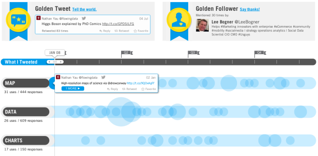
As 2013 nears, let the recaps, reviews, and best ofs begin. Twitter put up their 2012 year in review of top tweets, trends, and such, which is mostly pictures and lists, but in collaboration with Vizify, they also have a section to visualize your own tweets. Click on the “View year on Twitter” button in the top right. Here’s mine, for example. (Surprise, I mention maps, data, and charts often.)
It’s a word frequency chart that shows usage over the year. Scroll left to right or mouse over bubbles to see specific tweets. Mostly, it’s just fun to look back. [Thanks, Todd]
 Visualize This: The FlowingData Guide to Design, Visualization, and Statistics (2nd Edition)