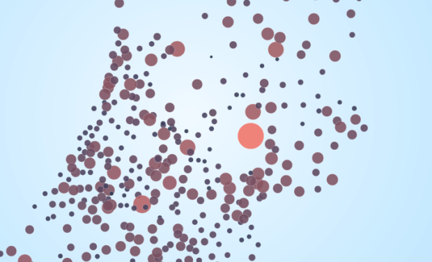
This month the Netherlands held national elections, and now that the results are in, interaction designer Jan Willem Tulp had a look at voting similarity between cities. I’m not sure what metric was used to judge similarity, but it looks like it was based on voting distributions for candidates.
Each circle represents a city, and you can choose between a geographic layout or a radial one. When you select a circle, the others change size and color, where more red and larger means more similar. In the radial layout, circles that are farther are away are less similar. Be sure to look at the city of Urk in the radial layout. According to Tulp, it’s the most religious city, and it votes completely differently from the rest. [Thanks, Jan]
 Visualize This: The FlowingData Guide to Design, Visualization, and Statistics (2nd Edition)
Hi Nathan,
thanks for showing my project on Flowindata! The similarity is indeed the Euclidean distance based on voting distributions.
Best,
Jan Willem
Looks good, I like the one if you choose Amsterdam in the radial with the size based on population; bigger cities vote alike. One question though, the difference in population sizes seems exaggerated. Is the population proportional to the area of the circle, or it’s diameter?
It doesn’twork in IE9, but it’s okay in Chrome
@Thomas aawh, crap!! I can’t imagine I made the most basic mistake. You were right, circle sizes for population were not correct. I fixed it immediately. Thanks for spotting this!!
@Peter I am aware that it doesn’t work in IE9.