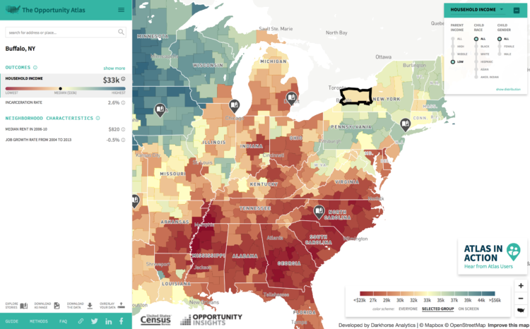
• With this scatterplot, Quoctrung Bui and Margo Sanger-Katz for The Upshot describe where experts and the public agree and disagree on gun control. Basically, whether it’s the best or not, the top right is what policymakers are looking for. Make sure to check out the breakdowns for various groups of people.

  • FLOW is an interactive art installation by Maotik that represents real-time weather data in the form of digital tides and waves that fill a room.

    I used 11 parameters to define the ocean form, we connect ourselves to a database and retrieve data such as sea levels, tide coefficient, humidity, weather cast, wind force, wind direction, weather cast, moon cycle, location, time of the day. When parameters such as wind force or sea levels will affect the movement of the sea others such as weather cast or humidity will change the colors.

    How do I install this in my garage?

  • BBC Radio 4 looks at algorithms in our everyday lives and why we should care what goes on in the black box.

    Algorithms are the powerful mathematical tools which shape so much of modern life, from the news which appears in our timelines to the adverts which pop up on our computer. But with algorithms now assessing CVs for jobs, or mortgage applications, the need to understand what they do, and if necessary challenge them is greater than ever before. So how do we exert legal or democratic control over the Unaccountable Algorithm? Emily Bell investigates.

  • People go to Google to find information about things, and when new words appear or grow popular in a language, search trends typically reflect the growth. This scrolly and interactive collaboration between the Google News Lab and Polygraph shows you the words that surged the most, their geography, and where they fit in with past words such as “selfie” and “slay.” [Thanks, Jenn]

  • Statistics took a hit this election season, and it could be a slow trek to get back to where we once were. William Davies for The Guardian discusses the current feelings towards data and provides some history of how we got here.

    In many ways, the contemporary populist attack on “experts” is born out of the same resentment as the attack on elected representatives. In talking of society as a whole, in seeking to govern the economy as a whole, both politicians and technocrats are believed to have “lost touch” with how it feels to be a single citizen in particular. Both statisticians and politicians have fallen into the trap of “seeing like a state”, to use a phrase from the anarchist political thinker James C Scott. Speaking scientifically about the nation – for instance in terms of macroeconomics – is an insult to those who would prefer to rely on memory and narrative for their sense of nationhood, and are sick of being told that their “imagined community” does not exist.

    But maybe this is an opportunity for data folks. Maybe people are ready for more data and more distributions and ready to look past averages and values without uncertainty.

  • “Let the data speak” they say. But what happens when the data rambles on and on?

  • So the inauguration was on Friday, and there’s been some disagreement about how many people showed up to the event. It turns out, as one might expect, counting thousands of people moving in and out of a space without some kind of counting mechanism like turnstiles is tricky. The New York Times provides a bit of background.

  • There are a lot of visualization-related tools out there. Here’s a simple categorized collection of what’s available, with a focus on the free and open source stuff.

    This site features a curated selection of data visualization tools meant to bridge the gap between programmers/statisticians and the general public by only highlighting free/freemium, responsive and relatively simple-to-learn technologies for displaying both basic and complex, multivariate datasets. It leans heavily toward open-source software and plugins, rather than enterprise, expensive B.I. solutions.

    I found some broken links, and the descriptions need a little editing, but it’s a good place to start.

    Also, if you’re just starting out with visualization, you might find all the resources a bit overwhelming. If that’s the case, don’t fret. You don’t have to learn how to use all of them. Let your desired outcomes guide you. Here’s what I use.

  • Embedding.js is a work-in-progress JavaScript library by Beau Cronin that makes it more straightforward to create data-driven environments. Think virtual reality and rotating areas in the browser.

    From Cronin:

    [I]t’s not just about 3D — we’ve used various depth cues in windowed visualization settings for some time, and in some cases these techniques have been put to good use. But something altogether different happens when we inhabit an environment, and in particular when our sensory inputs change immediately and predictably in response to our movements. Real-world perception is not static, but active and embodied; the core hypothesis behind embedding is that data-driven environments can deliver greater understanding to the degree to which they leverage the mechanisms of exploration and perception that we use, effortlessly, in going about our daily lives.

    A case where virtual immersion led to greater understanding doesn’t come to mind right away, but maybe ease-of-use is a step towards getting there.

  • Artist Matthew Rangel hikes cross-country and through the mountains, exploring and drawing along the way. He then mixes his drawings with maps and photos from history for unique results and perspective.

    My location drawings of large expanses throughout my journey serve to reinforce our land-based visual codes by the activity of transcribing the land through yet another system of careful measurements. This practice deepens my personal connection with the land, lending a sense of embodied awareness of its natural and/or unnatural characteristics. I allow the process of discovery from gathering extensive research to play out in the final compositions, where maps I have gathered are combined with my location drawings to set the stage to depict personal encounters and experiences that re-present the land through a framework that speaks of the constructs humans place on the land which, in turn, inform our experience.

    [via Socks]

  • A couple of years back The New York Times asked readers to draw on a blank plot the relationship between income and college attendance. It was a way to get you to think about your own preconceptions and compare them against reality. The Times recently applied the same mechanic to the changes during Barack Obama’s presidency.

    Bonus: Here’s how to make your own you-draw-it graph.

  • Focusing on immigrant characters in television shows, The Guardian US’s data editor Mona Cholabi interviewed Sesame Street’s Count von Count. It only lasts a few minutes but will put a smile on your face.

  • I have an affinity for new things designed as old things, so this brief history of data visualization by RJ Andrews hits the spot.

    I have placed cartoons representing important works of data visualization along a fictitious scroll map in the style of Ogilby’s atlas. The road marches you through time, passing many charts, through towns (named for key contributors whose charts make up said towns), and over waterways that mark important dates.

    If you’re interested in a comprehensive compendium, you should check out Michael Friendly’s Milestones project.

  • There was a time when the best way to get a view from above was to hop into a hot air balloon, which eventually led to the so-called “balloon map.” Cara Giaimo for Atlas Obscura starts the story with a ballooner named Thomas Baldwin.

    In an age of transatlantic flights and Google Earth, Baldwin’s suggestions seem a bit quaint. But in his time, when almost everyone was stuck on the ground, Baldwin’s attempts to pin down an accurate sky-view were heroic. Over the following century, entrepreneurs, military spies, and tourist boards alike would follow his lead, transforming some of the world’s most vital views into lovely, quirky “balloon maps.”

    Hand-drawn, detailed maps and graphics like this — before computers — always blows my mind.

  • Infographics devolved a bit in recent years, but there was a time the term wasn’t immediately associated with content marketing. (And there is still plenty of good infographic work that actually informs.) National Geographic is one such source of inspiration, and now you can get a best-of collection in book form that spans over a century.

    With an essay by Nigel Holmes, charting the evolution of National Geographic over the decades and its pioneering use of graphics, as well as four fold-outs mimicking original pull-outs or inserts in the magazine, the book stands as a defining record of one of the world’s best-known publications as much as it is a beautifully presented repository of discovery and learning.

    Get it on Amazon.

  • Data can be fact and analytical. It can help you make objective decisions. Data can also evoke the feels, helping you understand and relate to something that used to be foreign. Lisa Charlotte Rost, currently a Knight-Mozilla OpenNews fellow at NPR, makes the case in this talk.

  • Sometimes data can look really noisy when you zoom in close, and so you zoom out to get a better look at an overall trend. Sometimes it goes the other way. The Guardian looks at gun violence data at the local, census tract level, to focus on not just cities, but the clusters within the cities.

    America’s gun policy debate is usually driven by high-profile mass shootings that seem to strike at random, and it focuses on sweeping federal gun control or mental health policies. But much of America’s gun homicide problem happens in a relatively small number of predictable places, often driven by predictable groups of high-risk people, and its burden is anything but random.

    I like the scroll action that first shows the map with randomly distributed dots and then transitions to reality. Drives the point home.

  • It’s always fun to go back to sports articles and graphics that were a lead-up to a game the day after. The newest addition: this graphic from The New York Times that shows wide receiver Odell Beckham Jr.’s catches this season. It shows route patterns, the catch, yards after the catch, and touchdown paths. If you’re not into football, just take it in as a small multiples example.

  • Members Only

    In the the last part of the four-part series, you make a longer animation with more data and annotate.

  • In planning for the upcoming inauguration, the U.S. military is using a giant multi-part rollout map to do walkthroughs. Yep.