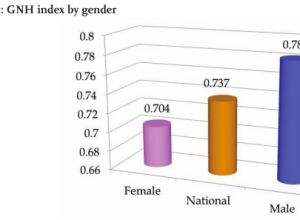
The Donald Trump campaign has a habit of highlighting poll results with a…
Ugly Charts
Some things just were not meant to be.
-
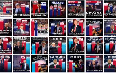
Trump bar chart baselines are the worst baselines. Sad.
-
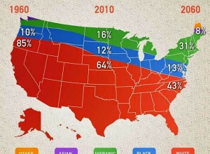
Weird stacked area map thing
This chart-map-looking thing from Nightly News is making the rounds, and it’s not…
-
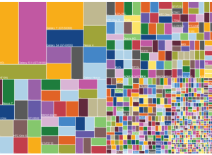
WTF visualizations
There are a lot of poorly conceived graphics that make little sense or…
-
Piemaster
I’m not entirely sure where this came from, but it’s from someone who…
-
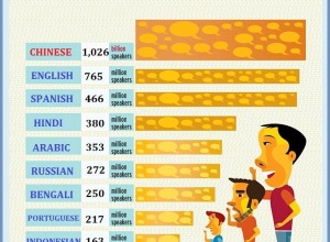
Useless infographics
The Guardian posted a small collection of useless infographics. It kind of looks…
-
What is wrong with these charts?
Whoa. There are a lot of things wrong with this chart. Gold star…
-
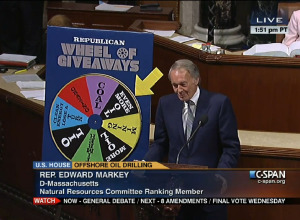
Ridiculous but real charts from the U.S. Congress floor
The Floor Charts tumblr shows actual charts used on the United States Congress…
-
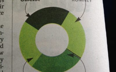
Not enough donut
From the October 10 Boston Metro. Oops. [via]…
-
World Happiness Report makes statisticians unhappy
It feels oh so wrong posting about bad charts in a report about…
-
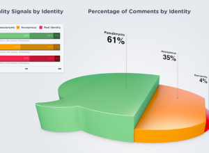
Pie step comment bubble 3D thing
This graphic by commenting platform DISQUS, arguing that higher quality online discussions come…
-
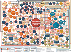
Ugly chart used to confuse readers
Charles Blow on this unnecessarily complex chart used to show the network of…
-
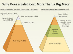
Challenge: Let’s do something with these 3-D pyramids
The government recommends a diet for healthy living, but there are billions of dollars of lopsided subsidies. Interesting point. Funky presentation.
-
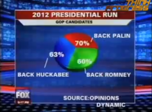
Fox News Makes the Best Pie Chart. Ever.
What? I don’t see anything wrong with it.…
-
Look at My Neato Lollipop Chart – Widgenie
As some commented on an earlier post, FusionCharts provides an easy way for…
-
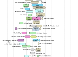
Books that Make You Dumb (Not Really)
Linking of low (and high) SAT scores and favorite books from Facebook.
-
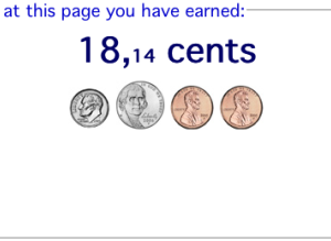
Watch the Money Clock to See What You’ve Earned
Despite being surrounded with ads, this money clock was kind of, um, interesting.…
-
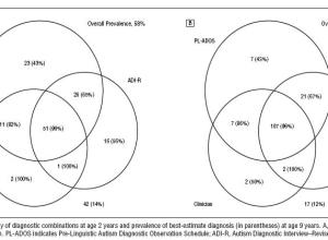
Find a Replacement for this Ugly Venn Diagram
This venn diagram showing results from tests for Autism really seems to be…
-
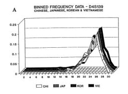
Not so Hot Graphs in Academic Papers
Karl Broman has an amusing list of the top ten worst graphs found…
Recently for Members
Second Edition
 Visualize This: The FlowingData Guide to Design, Visualization, and Statistics (2nd Edition)
 Visualize This: The FlowingData Guide to Design, Visualization, and Statistics (2nd Edition)
New tools, refined process.
Browse by Chart Type See All →


