Going off the calendar, today is the first day of spring, but nature…
Maps
Intuitive to look at spatial patterns and great for distributing geographic data.
-
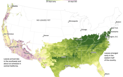
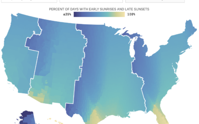
When spring is coming where you live
-
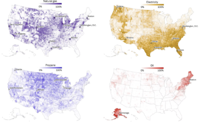
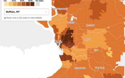
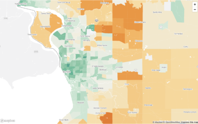
Maps of home heating sources in the United States
For The Washington Post, John Muyskens, Shannon Osaka, and Naema Ahmed mapped the…
-
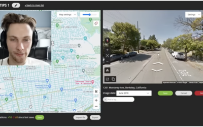
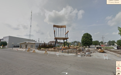
Finding the physical location in an online video via Google Maps clues
GeoGuessr player rainbolt is next-level good at reading Google Maps. Given a short…
-
Hypothetical map that shows how access changes if more states ban abortion
Based on analysis by economics professor Caitlin Myers, FiveThirtyEight provides a hypothetical map…
-
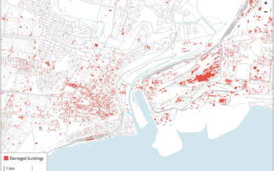
Using satellite imagery to assess the damage in Ukraine
The Economist combined two satellite imagery sources, one that estimates fire events and…
-
Map of homes bought with all cash
For The Washington Post, Emmanuel Martinez, Kevin Schaul and Hamza Shaban mapped the…
-

All of LeBron James’ career points, animated by season
All The King’s Buckets. pic.twitter.com/lzIultYSee
— Kirk Goldsberry (@kirkgoldsberry) February 8, 2023LeBron…
-
Wonders of Google Street View
You know those funny or weird screenshots from Google Street View that enter…
-
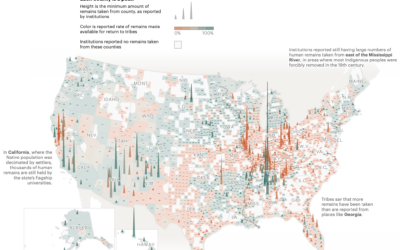
Unreturned Native American remains, mapped
A law was passed in 1990 that allowed Native American tribes to request…
-
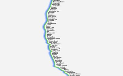
Barely a map of the west coast
Barely Maps is an ongoing project by Peter Gorman that shows geographic data…
-
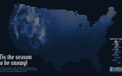
Snow cover mapped using snowflakes
To show snow cover across the United States, Althea Archer for the USGS…
-
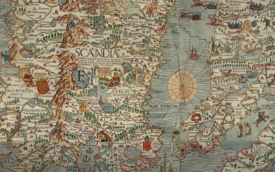
Origins of the world map
[arve url=”https://www.youtube.com/watch?v=AJBBVQrRwqo” /]
Mapping the entire planet is not exactly a straightforward thing… -
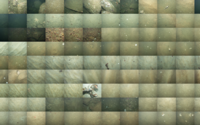
Mapping the sea floor
Jon Keegan on how USGS researchers collected data for 125 square miles of…
-
Apply your daylight saving preferences to the rest of the country
We like to complain about changing time an hour back or forward, and…
-
Carbon footprint in the city versus the suburbs
Bringing it down the Census tract level, Nadja Popovich, Mira Rojanasakul and Brad…
-
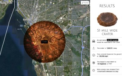
Asteroid simulator for before the big one hits
Knowing the impact of an asteroid falling in your city might not seem…
-
Depth of the underwater Tonga volcano
Mark Doman and Alex Palmer, for ABC News, show the depth of the…
-
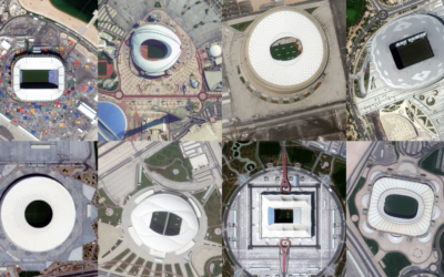
$300b World Cup seen through satellite imagery
Qatar spent $300 billion with a ‘b’ over the past twelve years to…
Recently for Members
Second Edition
 Visualize This: The FlowingData Guide to Design, Visualization, and Statistics (2nd Edition)
 Visualize This: The FlowingData Guide to Design, Visualization, and Statistics (2nd Edition)
New tools, refined process.
Browse by Chart Type See All →


