It’s easy to look at data and assume truthiness. Numbers! Facts! Concreteness! A lot of the time that’s just not the case.
uncertainty
-
Members Only
Mapping Course Updates; When the Data Speaks But Doesn’t Have Much to Say
-
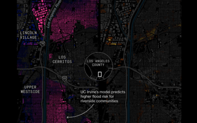
Uncertain risk behind climate change models
To demonstrate the level of uncertainty in using climate forecasting models, Bloomberg compared…
-
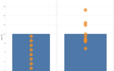
Two kinds of bar charts
Michael Correll describes two kinds of bar charts in the world. The first…
-
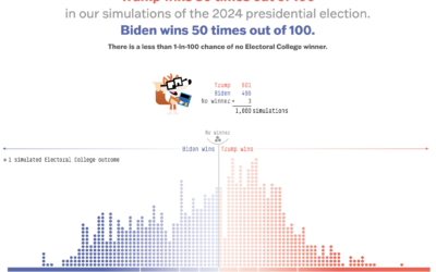
Nate Silver critiques the new 538 forecast model
Nate Silver, who left Disney and the FiveThirtyEight brand last year but took…
-
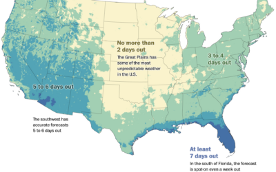
Accuracy of temperature forecasts where you live
You’ve probably noticed that the weather forecast can change a lot for predictions…
-
Members Only
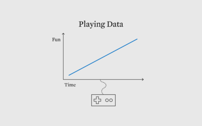
Games to Explore Data and Possibilities
Visualization and analysis is usually about minimizing uncertainty to more clearly see patterns. On the other hand, games force you to play through uncertainty.
-
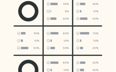
Probabilistic Tic-Tac-Toe
Thinking about life and randomness, Cameron Sun modified the classic game of Tic-Tac-Toe.…
-
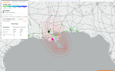
Mapping hurricane winds with avocado of uncertainty
Stamen, whose design breakdowns I always appreciate, discusses why they took a different…
-
Members Only
Range of Possible Answers, Maybe
In Statistics, analysis is more often about finding a range of possible answers than it is about finding a precise one.
-
Members Only
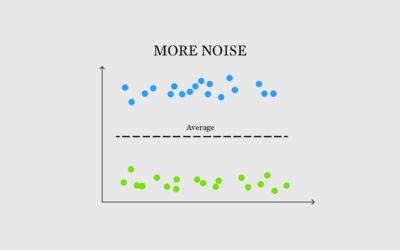
More Noise, Better Signal
Sometimes the noise, something we often try to minimize in data, makes for a better signal.
-
Building a happy life, interpreted through data
How to Build a Happy Life from The Atlantic is a podcast on…
-
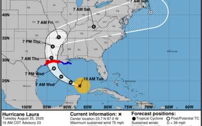
Difficulties reading the cone of uncertainty
It seems that there is always surprise when a hurricane makes landfall in…
-
Members Only
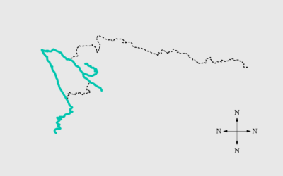
Navigating Through the Uncertainty and Messiness of Data – The Process 179
Connecting back to the real world is how we fill in the gaps.
-
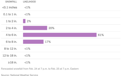
Distribution of snowfall estimates to show uncertainty
For NYT’s The Upshot, Aatish Bhatia, Josh Katz and Margot Sanger-Katz show the…
-
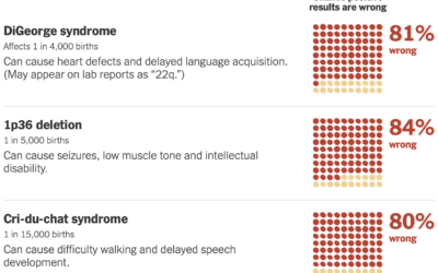
False positives with prenatal tests for rare conditions
Sarah Kliff and Aatish Bhatia for NYT’s The Upshot look at the uncertainty…
-
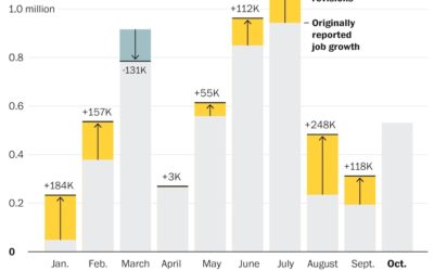
Job growth was underestimated
Andrew Van Dam for The Washington Post used a bar chart with corrections…
-
Writing about probability in a way that people will understand
We see probabilities mentioned in the news, in weather forecasts, during sporting events,…
-
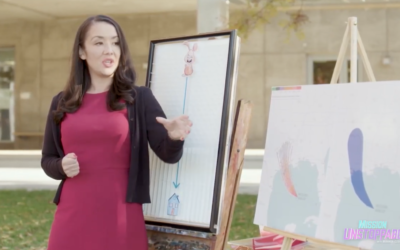
How perception can save lives
Visualization and perception researcher Lace Padilla was on the kid-centric show Mission Unstoppale…
-
Climate change and uncertainty
In his new data-driven documentary, Neil Halloran digs into the uncertainty attached to…
-
Members Only
Uncertain Words and Uncertain Visualization, Better Together
People’s interpretation of a chart can change if you use differents words to describe it, even if the data stays the same.




 Visualize This: The FlowingData Guide to Design, Visualization, and Statistics (2nd Edition)


