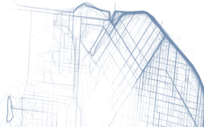
There are many exercise apps that allow you to keep track of your…
R
-
Where People Run in Major Cities
-
How R came to be
Statistician John Chambers, the creator of S and a core member of R,…
-
Learn R interactively with the swirl package
R, the statistical computing language of choice and what I use the most,…
-
Members Only
How to Map Geographic Paths in R
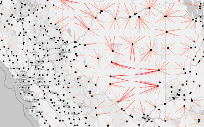
As people and things move through a place, it can be useful to see their connected paths instead of just individual points.
-
Introducing R to a non-programmer, in an hour
Biostatistics PhD candidate Alyssa Frazee was tasked with teaching her sister, an undergraduate…
-
The Baseline and Working with Time Series in R
A big part of statistics is comparisons, and perhaps more importantly, to figure out what to compare things to. Perspective changes with the baseline.
-
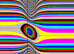
Accidental aRt
There comes a time late at night when your screen grows fuzzy and…
-
Members Only
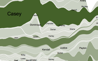
How to Display Text in R
Text can provide much needed context to traditional visual cues and can be used as a visual cue itself in some cases.
-
R plotting package ggplot2 ported to Python
Those who use the ggplot2 package in R and do everything else in…
-
Members Only
Working with Line Maps, the Google Places API, and R
A frequent challenge of visualization is behind the scenes, to get the data and to mold it into the format you need. Do that. Then map.
-
Members Only
How to Make a Connected Scatter Plot
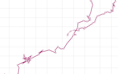
The combination of a time series chart and a scatter plot lets you compare two variables along with temporal changes.
-
Introduction to R, a video series by Google
Google released a 21-part short video series that introduces R. Most of the…
-
Link
R spells for data wizards
Thomas Levine provides a handful of useful tips for those getting started with R.
-
Members Only
Small Maps and Grids
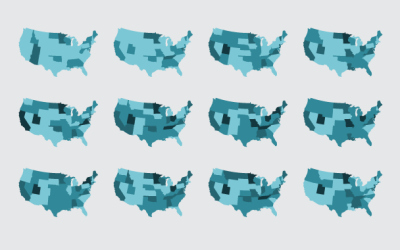
Maybe you want to make spatial comparisons over time or across categories. Organized small maps might do the trick.
-
Beer recommendation system in R
Using data from Beer Advocate, in the form of 1.5 million reviews, yhat…
-
Link
Visualising data with ggplot2
Hadley Wickham gives a two-hour video tutorial on how to use his ggplot2 package in R. I have limited experience with it, but a lot of people really like it and use the package exclusively for their visual analysis needs.
-
Members Only
How to Make Slopegraphs in R
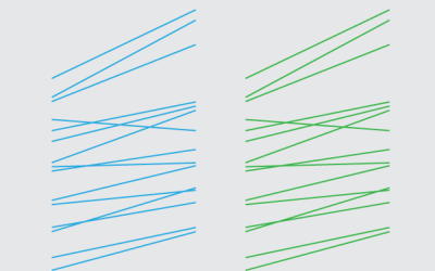
Also known as specialized or custom line charts. Figure out how to draw lines with the right spacing and pointed in the right direction, and you’ve got your slopegraphs.
-
Link
A Guide to Speeding Up R Code for Busy People
A Guide to Speeding Up R Code for Busy People. R can be slow at times. Here are some tips on getting it to go faster.
-
Members Only
Small Multiples in R
Make a lot of charts at once, line them up in a grid, and you can make quick comparisons across several categories.
-
Link
healthvis
The healthvis R package tries to make creation of interactive graphics easier by rendering in D3.



 Visualize This: The FlowingData Guide to Design, Visualization, and Statistics (2nd Edition)


