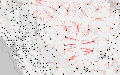
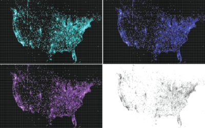
A frequent challenge of visualization is behind the scenes, to get the data and to mold it into the format you need. Do that. Then map.
Python
-
Members Only
Working with Line Maps, the Google Places API, and R
-
Link
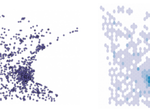
Creating a hexagonal cartogram
How to create a hexagonal cartogram using a combination of ArcGIS, Python, and D3.
-
Binify for hexagon binning in Python
As an alternative to dot density maps, Binify by Kevin Schaul allows you…
-
Link
NLTK Book
The Natural Language Toolkit is a Python library that is commonly used to extract data from text. There’s a free, online-accessible book to learn how to use it.
-
xkcd-style charts in R, JavaScript, and Python
The ports and packages to make your charts look like they came from…
-
Members Only
Mapping with Diffusion-based Cartograms
Sometimes these cartograms can distort areas beyond recognition, but they can also provide a better visual representation for a region with a wide range of subregions. At the least, they’re fun to look at.
-
Link
Chaco →
Plotting library in Python
-
Members Only
How to Make a Contour Map
Filled contour plots are useful for looking at density across two dimensions and are often used to visualize geographic data. It’s straightforward to make them in R — once you get your data in the right format, that is.
-
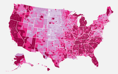
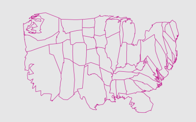
How to Make a US County Thematic Map Using Free Tools
There are about a million ways to make a choropleth map. The problem is that a lot of solutions require expensive software or have a high learning curve. It doesn’t have to be that way.
Recently for Members
Second Edition
 Visualize This: The FlowingData Guide to Design, Visualization, and Statistics (2nd Edition)
 Visualize This: The FlowingData Guide to Design, Visualization, and Statistics (2nd Edition)
New tools, refined process.
Browse by Chart Type See All →


