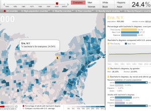
The Chronicle of Higher Education lets you explore the percentage of adults with…
interactive
-
Adults with college degrees, over time
-
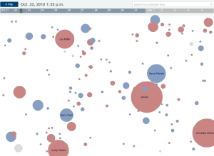
Explore your LinkedIn network visually with InMaps
LinkedIn has been having some fun with their data lately. They opened up…
-
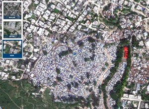
Aerial photos of destruction in Haiti, one year later
In memory of the devastating earthquake that hit Haiti one year ago on…
-
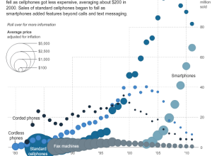
Price and adoption timeline of gadgets
New gadgets, from Web-connected TVs, to smartphones, to Fax machines, always seem to…
-
Our changing world in cartograms
In this series of interactive cartograms, FedEx shows our changing world (and I…
-
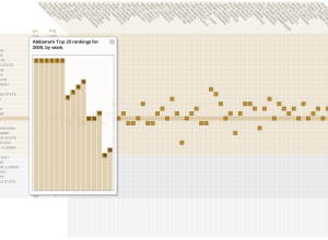
College football coaches’ ballots
Brett Coffman and Juan Thomassie for USA Today have a look at how…
-
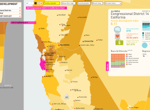
Mapping human development in America
In work with the American Human Development Project, Rosten Woo and Zachary Watson…
-
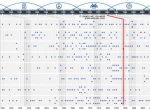
What generation do you belong to?
In this interactive, USA Today guesses your age, based on what influenced you…
-
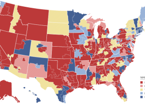
Keeping an eye on election results
All eyes here in the states will be on election results tonight, and…
-
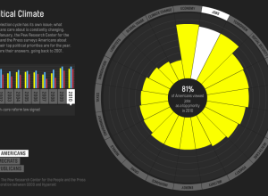
Issues Americans care about
Every year the Pew Research Center asks Americans what their top political priority…
-
The Election on Twitter
In what seems to have become an expectation during all major events, a…
-
Journalism in the Age of Data
In the words of Terrell Owens, get your popcorn ready, because this video…
-
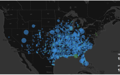
Watching the Growth of Walmart
The ever so popular Walmart growth map gets an update, and yes, it still looks like a wildfire. Sam’s Club follows soon after, although not nearly as vigorously.
-
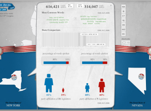
Compare What Your Senators and Reps are Talking About With Congress Speaks
There’s a lot of talking in congressional meetings, but what are your state…
-
Mapping and Animating Growth of Target Across United States
After I produced a map that shows the growth of Walmart, there were…



 Visualize This: The FlowingData Guide to Design, Visualization, and Statistics (2nd Edition)


