Ever since the huge forecasting upset in 2016, I’ve tended to stay away…
election
-
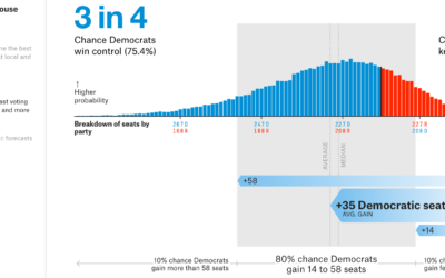
2018 House forecast from FiveThirtyEight
-
Members Only
Detailed Intentions of a Map, When Everything Leads to Nothing, Designing for Misinterpretations
The New York Times published an election map. A lot of people did not like the map, arguing that it was an inaccurate representation. Those who did like the map argued that one must consider intent before throwing a map to the flames.
What happens when intended use and actual use do not match up?
-
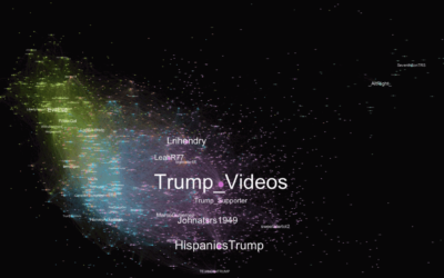
Download 3 million Russian troll tweets
Oliver Roeder for FiveThirtyEight:
FiveThirtyEight has obtained nearly 3 million tweets from accounts… -
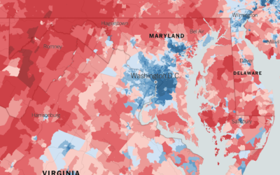
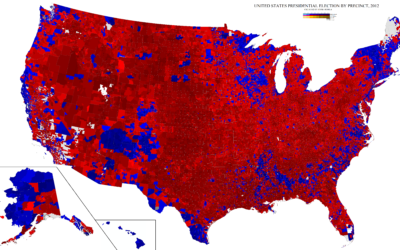
Extremely detailed election map
The Upshot returns to 2016 election results mapped at the precinct level. Because…
-
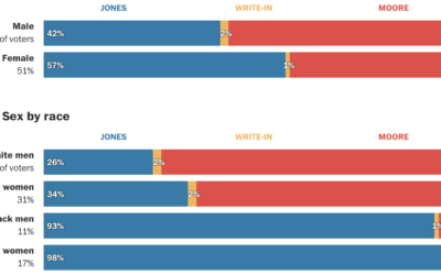
Alabama voter demographics
Democrat Doug Jones won in the senate race against Republican Roy More last…
-
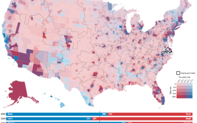
National precinct map
Mapping at the precinct level of detail is tough because there isn’t a…
-
Random states of America show changing election outcomes
Geography and state borders play a big part in how elections play out…
-
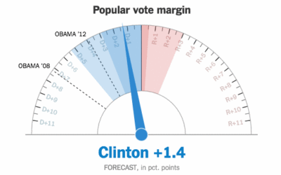
Showing uncertainty during the live election forecast
During the election, The New York Times showed a live gauge to show…
-
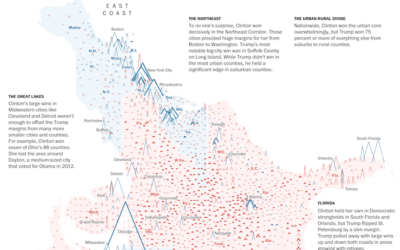
Peaks and valleys of presidential support
This is some fine map work by Lazaro Gamio and Dan Keating for…
-

Nuclear war is on the ballot
Neil Halloran, creator of the interactive World War II documentary focused on deaths,…
-
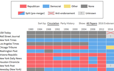
Newspaper endorsements since 1980
Noah Veltman put together a history of newspapers’ presidential endorsements since 1980 for…
-
All the ways to map election results
Every election, there’s a slew of election maps that come in all shapes…
-
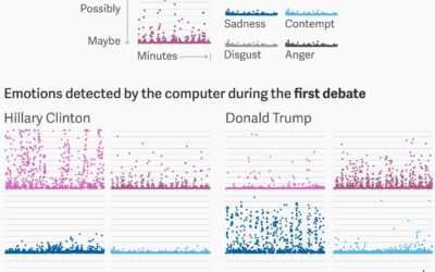
Sentiment analysis on Trump and Clinton faces during debate
For anyone who watched the presidential debates, I think it was fairly obvious…
-
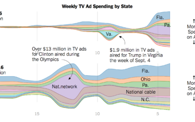
Ad spending for Clinton and Trump
Adam Pearce for the New York Times charted ad spending for Clinton and…
-
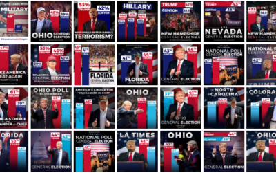
Trump bar chart baselines are the worst baselines. Sad.
The Donald Trump campaign has a habit of highlighting poll results with a…
-
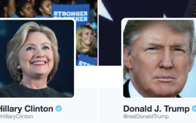
@HillaryClinton vs. @realDonaldTrump
A comparison of the words unique to the candidates on Twitter.
-
Seeking solace in data
I think many of us can relate to this during the odd election…
-
How one man shifts national polls
I love the statistics lessons coming out of the Upshot, in the context…
-
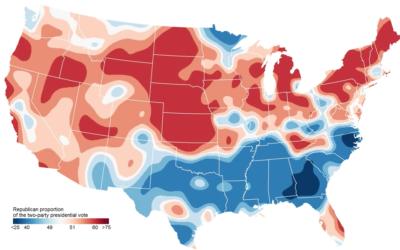
Map shows two-party presidential shifts since 1920
In an update to his two-party map, political scientist David Sparks shows the…
-
Trending #TrumpWon didn’t start in Russia
After the first presidential debate, #TrumpWon was a trending topic on Twitter, which…
Recently for Members
Second Edition
 Visualize This: The FlowingData Guide to Design, Visualization, and Statistics (2nd Edition)
 Visualize This: The FlowingData Guide to Design, Visualization, and Statistics (2nd Edition)
New tools, refined process.
Browse by Chart Type See All →


