The United States vaccination rate was rolling for a while there, but it has slowed down. Sema Sgaier for NYT Opinion talks about why that is, breaking it down to four general types of people who are hesitant or don’t plan on getting vaccinated:
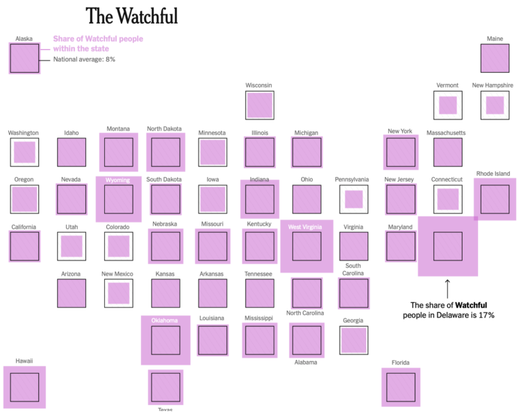
After conducting a national survey of U.S. adults, we grouped people into distinct profiles based on their shared beliefs and barriers to getting the vaccine. This approach, borrowed from the marketing world, is called psychobehavioral segmentation. It will allow health officials to target their strategies in ways that ignore demographic categories, like age and race. In the United States, we used this approach to identify five distinct personas: the Enthusiasts, the Watchful, the Cost-Anxious, the System Distrusters and the Covid Skeptics.
The last two groups will be harder to convince, but for the watchful and cost-anxious, I hope they look at the numbers.
The risk of side effects is very low (especially when you compare to the everyday things we do to live), your risk of infection or hospitalization goes way down when you get vaccinated, and you don’t have to pay anything.

 Visualize This: The FlowingData Guide to Design, Visualization, and Statistics (2nd Edition)


