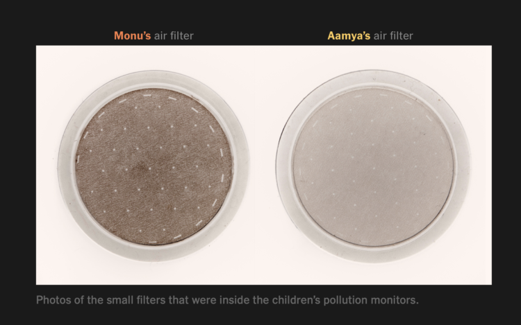
The New York Times measured pollution exposure during the day for two kids who live in New Delhi. Usually just described in terms of micrograms of particulate matter, the piece puts in more effort to give a feel for each person’s day-to-day. Side-by-side video along with a scrolling line chart provide a clear contrast between the two lives.
-
Ash Ngu for ProPublica and Sophie Cocke for Honolulu Star-Advertiser show the harm of building seawalls on Hawaii’s beaches. The walls protect luxury beachfront properties, but they have been built through administrative loopholes and destroy beaches, which are owned by the public.
I like the combination of video footage and map, providing a scroll along the coastline. It provides an anchor for where you are and what you’re looking at.
-
Last year, in 2019, my main goals for FlowingData and work were to stay focused and make charts. I was satisfied with my progress, and for 2020, I had hoped to step that up with more depth and more play.
But you know what happened. The year was challenging for many reasons, and it was hard to concentrate or to think of much else other than the day’s current events.
I’m lucky to be able to work from home though, and I am thankful for that. So FD was able to roll on.
As I do every year, I like to bookend with an annual review, so here we go.
Read More -
The New York Times reconstructed the night. Based on a collection of court documents, ballistics reports, body camera footage, and interviews, they built a 3-D model of the scene depicting what appears to be an unorganized and unexpected raid.
-
It used to be that climate changed seemed like something far off in the future, like something that would only affect future generations. But it’s looking more urgent these days. For Reuters, Chris Canipe, Matthew Green and Sam Hart show the “fingerprints of climate change” we saw this year.
-
Members Only
-
It’s been a year. We saw a lot of charts. These are the best ones.
-
Reuters looked at how seven main strains of the virus evolved around the world:
The analysis shows there are currently seven main strains of the virus. The original strain, detected in the Chinese city of Wuhan in December 2019, is the L strain. The virus then mutated into the S strain at the beginning of 2020. That was followed by V and G strains. Strain G mutated yet further into strains GR, GH and GV. Several other infrequent mutations were collectively grouped together as strain O.
It’s interesting to see the continent multiples. Different approaches to the pandemic led to different rates of mutations and a different spread of strains.
-
These days, most of us don’t have to do much to turn on a light when it’s dark out. But what if I told you it used to take a lot more time and money to get that sweet artificial light? For The Pudding, Ilia Blinderman and Jan Diehm equate scrolling down one pixel to one second for an average waged worker. See how much you have to scroll/work to earn one hour of light.
-
Using data from Global Fishing Watch, Hayley Warren and Ian Wishart for Bloomberg mapped the predominant country for fishing in European Union and British waters. There’s disagreement between the U.K. and the EU about who gets to fish where.
-
The Marshall Project and The Associated Press report on the Covid-19 rates in prison, which are multiple times greater than the general population. Katie Park shows the regional variation with this cross between a dot density map and a grid map.
They’ve made the data available here.
-
The world’s biggest iceberg, A68a, is on track to crash into a remote island in the Atlantic. For Reuters, Marco Hernandez and Cassandra Garrison show the path, the scale, and what might happen with A68a:
The iceberg is comparable in size to many well-known islands. A68a is very similar in size and shape to Jamaica, almost as long as the U.S. territory Puerto Rico, and dwarfs China’s Hong Kong Island as well as the Southeast Asian city state of Singapore.
Observers from the British Antarctic Survey told media that a flight last year over the A68a took about one and a half hours. The berg is so big, Royal Air Force pilots this week were unable to capture it all in one, single photograph.
-
Members Only
-
David Li, in collaboration with Google Arts and Culture, made a fun experiment to play with:
We developed a machine learning model trained on the voices of four opera singers in order to create an engaging experiment for everyone, regardless of musical skills. Tenor, Christian Joel, bass Frederick Tong, mezzo‑soprano Joanna Gamble and soprano Olivia Doutney recorded 16 hours of singing. In the experiment you don’t hear their voices, but the machine learning model’s understanding of what opera singing sounds like, based on what it learnt from them.
So smooth. So blobby.
-
Kirk Goldsberry, whose basketball charts you might recognize, made the Naismith International Park Map:
This map blends two of my passions: cartography and hoops. The elevation surface on the map is derived from the most common scoring areas in the NBA during the 2019-20 season. Higher places indicate the areas where NBA scorers scored the most from. Naturally this includes the areas near the rim and the areas just outside the 3-point line.
The original plan was to make a fun map poster emphasizing the best scorers from the 2019-20 season, but the project quickly spiraled out of control as I started to label more and more historic places.
So good.
-
How to Make an Animated Beeswarm Chart
Beeswarm charts are useful to highlight individual categories or entities. Animating them can help highlight change over time.
-
Owen Phillips compiled per game and cumulative foul calls for all NBA referees between the 2016-17 and 2019-20 seasons. On its own, I’m not sure it’s that exciting, but if you’re into basketball analytics, it might be fun to tie in with other data.
-
I’m sure you know this already, but just in case, air particles come out of your mouth when you talk, cough, etc. The Washington Post used an infrared camera to demonstrate:
To visually illustrate the risk of airborne transmission in real time, The Washington Post used an infrared camera made by the company FLIR Systems that is capable of detecting exhaled breath. Numerous experts — epidemiologists, virologists and engineers — supported the notion of using exhalation as a conservative proxy to show potential transmission risk in various settings.
-
Unemployment has hit some industries more than others. Here’s how the most recent estimates compare against last year’s.
-
[arve url=”https://www.youtube.com/watch?v=Htf0XR6W9WQ” loop=”no” muted=”no” /]
For Domain of Science, Dominic Walliman attempts to chart all of the deadly events that threaten humanity on a scatterplot. On the horizontal axis he places number of casualties. On the vertical he places likelihood. So something like, oh, say, a global pandemic ends up in the top middle of the plot.
See also Walliman’s video of the same flavor where he attempts to illustrate everything in the known universe.