Generative art seems to be having a moment right now, so it’s only appropriate that there’s an R package to help you make some. The aRtsy package by Koen Derks makes algorithms more straightforward to use. Set parameters and you’re off.
Generative art seems to be having a moment right now, so it’s only appropriate that there’s an R package to help you make some. The aRtsy package by Koen Derks makes algorithms more straightforward to use. Set parameters and you’re off.
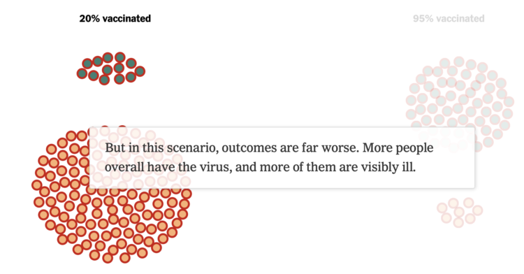
We see percentages for the vaccinated and unvaccinated, and people can easily misinterpret or miscommunicate the results. It’s especially problematic when people are actively trying to confirm misconceptions. For The New York Times, Lauren Leatherby tries to make things clearer imagining two groups: one that is 20% vaccinated and one that is 95% vaccinated.
Vaccines work.
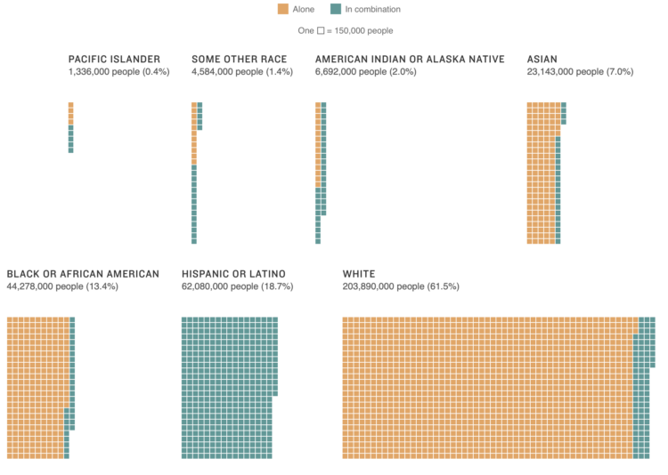
Using unit charts, NPR shows the number of people who identify with each race or ethnicity:
[A] different kind of breakdown can show how racial groups are becoming more heterogeneous. This graphic shows the number of people who said they identified with each race, regardless of how many races they chose. For example, if a person said they identified as Black and Asian, they would appear in both racial categories.
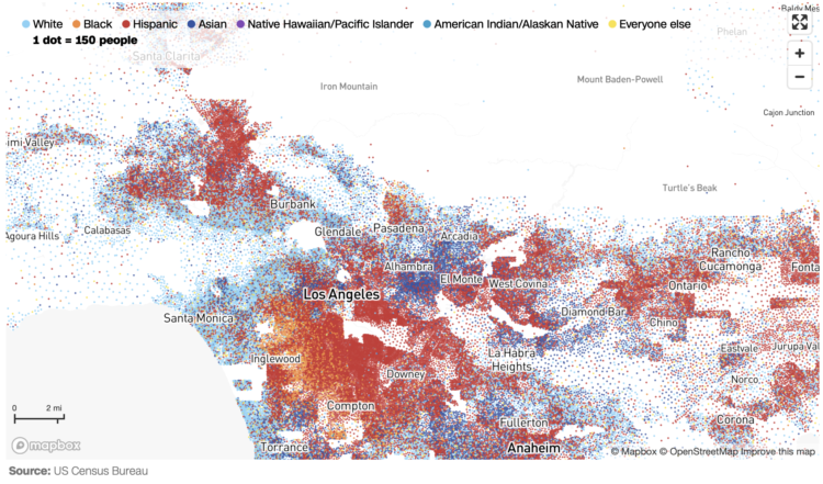
CNN goes with the dot density map for their first pass on the 2020 decennial. Each dot represents a certain number of people depending on your zoom level. Color represents race or ethnicity.
Does CNN have a limited color palette that they’re allowed to use? I would’ve gone for more contrast between the light blue for white and darker-but-still-light blue for American Indian/Alaskan Native.
See also: Dustin Cable’s racial dot map from 2013 and Erica Fischer’s dot maps of the same flavor from 2010.
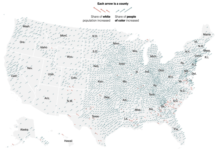
The New York Times go with the angled arrows to show the shifts in racial population. The red-orange arrows show an increase in the share of white population, and the teal arrows show an increase in the share of people of color. Longer arrows mean a greater percentage point change.
Whereas The Washington Post focused more on the changes for each demographic individually, NYT focused more on how two broad groups compared.
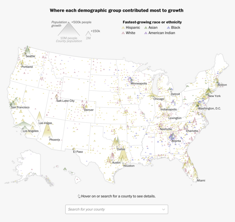
Using their peaks and valleys metaphor, The Washington Post shows the shift in racial population between 2010 and 2020. The open triangles, one for each county, show population with width, population growth with height, and fastest-growing race or ethnicity with color.
You might recognize the form from the Post’s 2016 election results, but there’s a small wrinkle when you look at the breakdowns for individual groups. The triangles flip upside down for where population decreased.
After a lot of angst over the past few years around undercount, representation, and anonymization, the Census Bureau released detailed data from the 2020 decennial census:
The U.S. Census Bureau today released additional 2020 Census results showing an increase in the population of U.S. metro areas compared to a decade ago. In addition, these once-a-decade results showed the nation’s diversity in how people identify their race and ethnicity.
“We are excited to reach this milestone of delivering the first detailed statistics from the 2020 Census,” said acting Census Bureau Director Ron Jarmin. “We appreciate the public’s patience as Census Bureau staff worked diligently to process these data and ensure it meets our quality standards.”
These statistics, which come from the 2020 Census Redistricting Data (Public Law 94-171) Summary File, provide the first look at populations for small areas and include information on Hispanic origin, race, age 18 and over, housing occupancy and group quarters. They represent where people were living as of April 1, 2020, and are available for the nation, states and communities down to the block level.

Lingdong Huang’s project fishdraw seems straightforward on the surface. You go to the page and there’s a drawing of a fish. But then you keep clicking the refresh arrow and realize the fish are procedurally generated, including the name on the bottom. So good.

You’re gonna miss out on all the good stuff if you just stare at the middle.
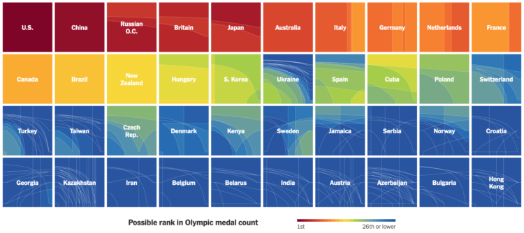
Ranking countries by medal count change depending on how much value you place on each medal. Should you just count number of medals straight up, or should you give more weight for gold than for silver or bronze? Josh Katz for The New York Times revamped his 2018 interactive for 2020 results, which lets you assign different weights to see how the overall rankings change.
The United States took first and China second, but there are many rank combinations among the rest.

Adjust coordinates, geometries, and encodings with packed circles to make various types of charts.
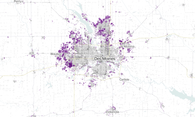
Zach Levitt and Jess Eng for The Washington Post mapped newly developed areas in the contiguous United States, between 2001 and 2019:
Between 2001 and 2019, the built-up landscape of America — buildings, roads and other structures — has expanded into previously undeveloped areas, adding more than 14,000 square miles of new development across the contiguous United States — an area over five times the size of Delaware.
My favorite part is the interactive map, which lets you see development in your area. The purple indicating newly developed areas against the grayscale provides a quick reference.
The maps are based on data from the United States Geological Survey, which you can grab here.
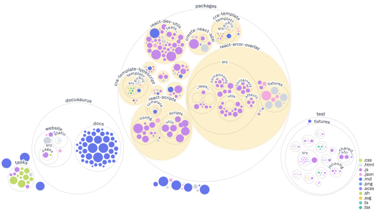
Most people are familiar with the file-and-folder view. Sort alphabetically, date, or file type, and scroll up and down. This works well when you know what you’re looking for, but sometimes you could use a quick overview of what a codebase looks like. Amelia Wattenberger for GitHub used packed circles.
The fun part is towards the end where you can enter any repo to see what it looks like.
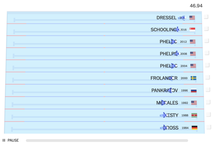
With the 2020 Olympics wrapped up, The New York Times raced this year’s medal winners against previous medalists to provide context for the new records set in Tokyo. The simplified style of the animations gave me Sega Game Gear flashbacks.
NYT made similar comparisons in 2012 with videos for track and field events. The more static 2016 rendition, which focused on Usain Bolt and previous 100-meter winners, is still favorite.
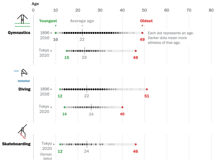
Bonnie Berkowitz and Artur Galocha go with the strip plot to show the distribution of age for different Olympic events. If it’s longevity you’re looking for, go for the equestrian, sailing, shooting, and archery events. There’s still time.
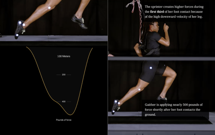
The Wall Street Journal tested out the TikTok algorithm with bots to see how quickly the app converged towards a user’s pre-specified interests. As viewing time of videos as the main signal, and to nobody’s surprise (I think), it only took a couple of hours for TikTok to narrow down interests.
This is how most social services work these days? The concerning part is that almost all TikTok videos are served based on the algorithm, which makes it easy to fall into terrible rabbit holes.

Set a strong base, and build whatever you want after that.
From The New York Times, the combination of video, motion graphics, and charts, packaged tightly in a scrollytelling format, clearly shows the differences.
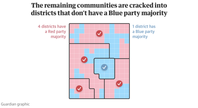
Gerrymandering continues to be an important thread that I think many people still don’t understand, mostly because it’s called gerrymandering. The Guardian provides a visual guide to explain how creative redistricting can lead to favorable votes.
If you’re still not sure, see also the game District by Christopher Walker which walks you through what gerrymandering is and how it works.
Our everyday routines changed over the past year, and with the 2020 American Time Use Survey, we can see by how much.
 Visualize This: The FlowingData Guide to Design, Visualization, and Statistics (2nd Edition)
New tools, refined process.


