• Membership
  • Newsletter
  • Projects
  • Learning
  • About
  • Member Login
  • Charts showing Tom Brady’s standout career

    February 2, 2022

    Topic

    Statistical Visualization  /  football, Tom Brady, Upshot

    Tom Brady announced his retirement from the National Football League, which ends a long career that stands out from the rest. As required by law, when it comes to sports records over time, The Upshot made four line charts that show cumulative stats for Brady and his peers.

  • Crisis Text Line and data sharing

    February 2, 2022

    Topic

    Statistics  /  Crisis Text Line, ethics, privacy

    Crisis Text Line was sharing data with a for-profit business started by its founder. Given the sensitivity and nature of the data, this relationship understandably seemed questionable at best. Danah Boyd, who serves on the board for Crisis Text Line, provides a detailed view into what happened and why:

    The practice of non-profit governance requires collectively grappling with trade-off after trade-off. I have been a volunteer director of the board of Crisis Text Line for 8 years both because I believe in the mission and because I have been grateful to govern alongside amazing directors from whom I constantly learn. This doesn’t mean it’s been easy and it definitely doesn’t mean we always agree. But we do push each other and I learn a lot in the process. We strived to govern ethically, but that doesn’t mean others would see our decisions as such. We also make decisions that do not pan out as expected, requiring us to own our mistakes even as we change course. Sometimes, we can be fully transparent about our decisions; in other situations – especially when personnel matters are involved – we simply can’t. That is the hardest part of governance, both for our people and for myself personally.

  • Crypto volatility charts

    February 1, 2022

    Topic

    Statistical Visualization  /  cryptocurrency, New York Times

    One of the attractions of crypto is that values can swing into the positive over a short period of time. Of course, that means values can also suddenly dip. Emily Flitter and Karl Russell for The New York Times reported on this volatility through the lens of a handful of cryptocurrencies.

    The charts are straightforward but the layering and organization is soothing for me. This must be what people feel when they talk about ASMR.

  • Diversity of federal judge picks, compared by president

    February 1, 2022

    Topic

    Statistical Visualization  /  diversity, Joe Biden, judges

    Adrian Blanco for The Washington Post used squares connected at the corners to compare federal judge confirmations across presidencies. Each square represents a demographic, which is sized by number of confirmations. I like it.

  • A game to gerrymander your party to power

    January 31, 2022

    Topic

    Infographics  /  game, gerrymandering, New York Times

    Ella Koeze, Denise Lu, and Charlie Smart for The New York Times made a game to help you understand gerrymandering better. They created a fake territory called Hexapolis, and your mission, if you choose to accept it, is to gerrymander your party into power. Good luck.

    See also the miniature golf game from The Washington Post. We. Will. Understand. Gerrymandering.

  • Questioning Novak Djokovic’s Covid tests, based on data

    January 31, 2022

    Topic

    Statistical Visualization  /  BBC, coronavirus, Novak Djokovic, tennis

    Tennis player Novak Djokovic is not vaccinated against the coronavirus, and as a result, was not allowed to compete in the Australian Open. Data collated by the BBC suggests that Djokovic lied about his Covid-19 test results in an attempt to get around rules:

    The confirmation codes in all cases slotted into the same chronological timeline as our initial batch sent by BBC colleagues and showed that the earlier the test result date, the lower the confirmation code.

    The only outlier of all the confirmation codes we’ve plotted was Mr Djokovic’s positive test on 16 December.

    See also Zerforschung’s questioning from earlier this month.

  • Chicken egg color spectrum

    January 28, 2022

    Topic

    Misc. Visualization  /  color, egg, physical

    Eggs aren’t always white, which is oddly calming in this photo by way of Bergs Fairytale Garden. [Thanks, all]

  • Members Only

    Visualization Tools and Learning Resources, January 2022 Roundup

    January 27, 2022

    Topic

    The Process  /  roundup

    Here’s the good stuff for January.

  • Spotting spurious correlations in health news

    January 27, 2022

    Topic

    Statistics  /  causation, correlation, health

    When it comes to diet and health, you might see one day that a certain food decreases life expectancy. Then on another day, a different study suggests that food increases life expectancy. It’s hard to know which to believe. David Epstein provides some guidance:

    If you’ve watched a lot of NFL games, you’ve probably heard a commentator at some point trot out a stat like: “The Chicago Bears are undefeated in division games following a bye week when they wear their alternate jerseys.”

    It is possible that the combination of extra rest and unusual attire gets the Bears amped for division rivals, thus improving their performance — just as it is possible that using the sauna precisely 9-12 times per month at a particular temperature protects against dementia (at first). It is far more likely, however, that given a large database of games and conditions, there will be loads of correlations that occur just by chance; the more you slice and dice the data, the more you’ll find.

  • Data Underload  /  age, income

    How Much Americans Make

    In the United States, the median annual income among the employed was about $43,000 in 2020. However, by definition, this just tells you where the midpoint is in a distribution. As you probably know, maybe a little too well over the past few years, personal income spans a wide range.

    Here’s a more detailed view of how much Americans make per year.

    Read More
  • How to Make UpSet Plots in R, with ggplot2 and ggupset

    A more readable alternative to Venn diagrams for when you have more than a few sets.

  • Optimized Wordle solver

    January 25, 2022

    Topic

    Statistics  /  game, Jonathan Olson, optimization, Wordle

    In case you’re not so good with the words, but feel the social pressure to play Wordle bearing down on you, Jonathan Olson made an optimized solver:

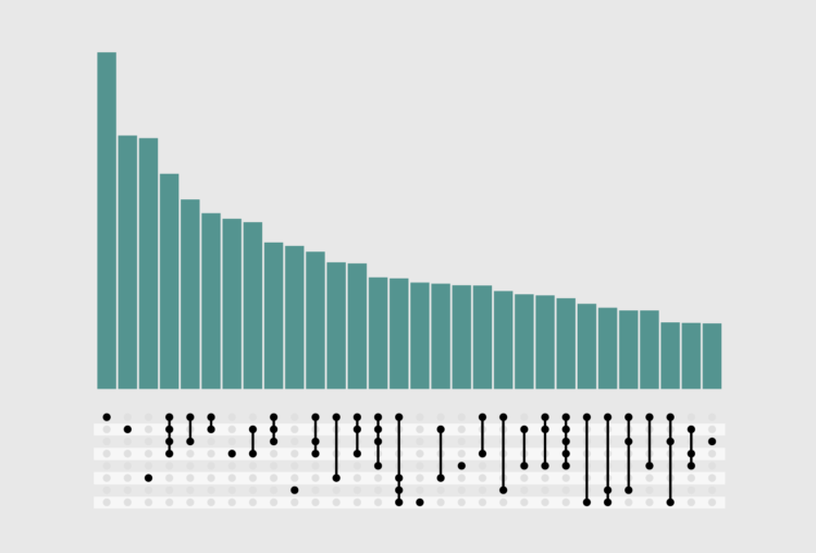
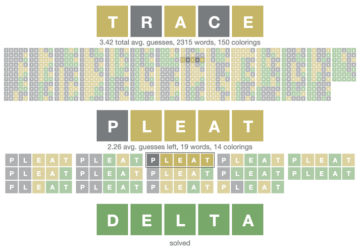
    The game Wordle has a lot of speculation online about what is the “best” first word. If we are exploring optimal strategies to solve the original game in the least number of guesses, most of it is wrong.

    For humans, almost all of these words are great! However for optimal strategies, we need to examine all of the guesses, not just the first word. It turns out, it’s possible to solve 99% of all puzzles in only 4 guesses or with an average of ~3.42 guesses per win, but not with most of the “best” words found online.

    I don’t play because I am a not-so-good-with-words person, but also there can only be one true Wordle.

  • Scale of the Tonga eruption

    January 24, 2022

    Topic

    Maps  /  Reuters, satellite imagery, scale, Tonga, volcano

    Manas Sharma and Simon Scarr used satellite imagery to show the scale of the Tonga eruption, which spurted a 24-mile cloud that grew to 400 miles in diameter in an hour. Notice the little Manhattan in the bottom left corner in the image above.

    However, instead of leaving it at that, Sharma and Scarr animated the eruption over familiar geographic areas to better see how big it was. The cloud was big enough to cover whole countries.

  • How N95 masks work

    January 21, 2022

    Topic

    Infographics  /  coronavirus, mask, N95, Washington Post

    In efforts to reduce further spread of the virus, the US is set to distribute millions of free N95 masks across the country. Aaron Steckelberg and Bonnie Berkowitz for The Washington Post illustrated how the masks work.

    Early in the pandemic, N95 masks were hard to get. My wife, who is a healthcare worker, described how she and her colleagues would have to reuse N95 masks and store them in paper bags hanging on the wall. It’s good to see so many N95s on their way to households now.

  • Joke machine learning projects to advance your career

    January 21, 2022

    Topic

    Statistics  /  humor, Jess Peter, machine learning, Pudding

    In an automated job climate that analyzes resumes and inspects social profiles, it can be a challenge to find the job that’s right for you. Luckily, Jess Peter for The Pudding put together a satirical set of tools to combat the recruiting bots. Generate a fake resume with a specified level of experience, define a profile pic for your socials, and then use that fake image of your face for the video interview.

    I wonder if someone has ever done this in real life. This had to have happened at least once, right?

  • Members Only

    Boring Charts – The Process 173

    January 20, 2022

    Topic

    The Process  /  boring, whizbang

    Thinking about the differences between boring charts and not so boring charts.

  • Statistical Atlas  /  birth

    Declining U.S. Births

    The number of births per month has been decreasing over the past decade. The pandemic seems to have sped up the process in the beginning.

    Read More
  • Death rates by vaccination booster status

    January 19, 2022

    Topic

    Statistical Visualization  /  coronavirus, mortality, Our World in Data, vaccination

    Our World in Data continues their important work on providing and showing up-to-date Covid data. Most recently, they updated death rates in Switzerland by vaccination plus booster status. The rates for the unvaccinated are expectedly much higher, but also the rates for those with a booster are multiples lower than those fully vaccinated with no booster.

  • Analytics for U.S. government websites

    January 18, 2022

    Topic

    Statistical Visualization  /  analytics, government

    With the announcement of free Covid-19 tests through the United States Postal Service, it’s interesting to watch to the analytics for U.S. government websites. USPS has more visitors right now than all the other government pages combined.

  • Global ripple effect from underwater volcano

    January 18, 2022

    Topic

    Maps  /  Tonga, volcano

    An underwater volcano erupted about 40 miles off the coast of the main island of Tonga. Using infrared data from the GOES satellite operated by NOAA, Mathew Barlow animated the ripple from the the source to around the world.

    pic.twitter.com/bYTm3p78lz

    — Dr. Mathew Barlow (@MathewABarlow) January 16, 2022

    The filtered view, which shows band 13 data from the satellite’s sensors, typically to view cloud cover, is really something.

  • Page 67 of 391
  • <
  • 1
  • ...
  • 64
  • 65
  • 66
  • 67
  • 68
  • 69
  • ...
  • 391
  • >

Analyze, visualize, and communicate data usefully, beyond the defaults.

Become a member →

Recently for Members

May 8, 2025
When the data is not what it seems

May 1, 2025
Finding the Right Charts

April 24, 2025
Visualization Tools, Datasets, and Resources – April 2025 Roundup

April 17, 2025
Breaking Out of Chart Software Defaults

April 15, 2025
Line Chart with Decorative Neon Accents

Browse by Chart Type See All →

Choropleth Map Unit Chart Radar Chart Voronoi Diagram Calendar Word Cloud Mosaic Plot Area Chart Barcode Chart Bump Chart

Browse By Topic

  • Visualization

    Seeing data

  • Maps

    Seeing geographic data

  • Infographics

    Explaining data

  • Networks

    Connecting data

  • Statistics

    Analyzing data

  • Software

    Working with data

  • Sources

    Getting data

  • Design

    Making data readable

Get the Book

Visualize This: The FlowingData Guide to Design, Visualization, and Statistics

Available now.

Order: Amazon / Bookshop

Made by FlowingData

  • The Process

  • Data Underload

  • Chart Everything

  • Guides

  • Books

  • Shop

  • About
  • Contact
  • Newsletter
  • LinkedIn
  • Instagram
  • Bluesky
  • RSS
Copyright © 2007-Present FlowingData. All rights reserved.