Communicate to fewer people to reach more.
Dominic Royé mapped river discharge in Europe over the past few months:
A single map for the worst #drought in 500 years in Europe. The river discharge anomaly based on reanalysis data from June to August 12 2022, shows an average negative anomaly of -29%, even reaching less than -62% at some points. #rstats #dataviz pic.twitter.com/LSGMfS52Lm
— Dr. Dominic Royé (@dr_xeo) August 14, 2022
This climate change thing seems real.
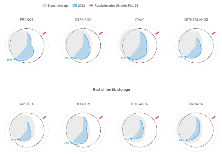
Reuters goes with the radar chart to show gas supplies, as European countries prepare for the winter and possibly no gas from Russia. The circular shape shows the annual cycle, the gray shows the previous five-year average, and the blue shows the current year’s supply.

While reading this NYT article, by Jodi Kantor and Arya Sundaram, on the drawbacks of activity and time tracking for work, the article itself tracks your reading behavior. You see counters for the time you spend reading and scrolling, clicks, keystrokes, idle time, and active time. It comes complete with snippy comments and a final grade — and a bitter taste for productivity tracking.
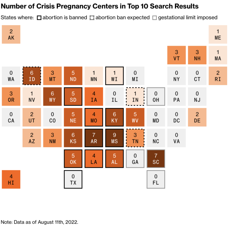
Davey Alba and Jack Gillum, for Bloomberg, found that Google Maps commonly points people to crisis pregnancy centers, non-medical locations that encourage women to follow through with pregnancy, when they search for “abortion clinic”.
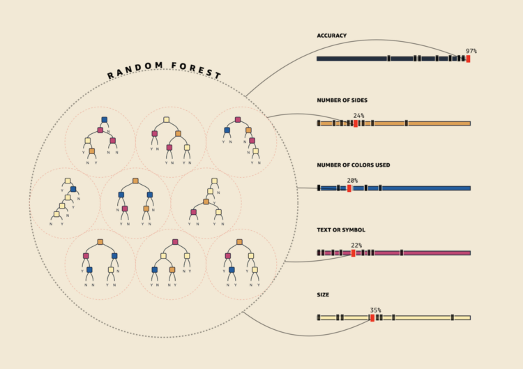
As part of a teaching initiative by Amazon, MLU-Explain is a series of interactive explainers on core machine learning concepts. Learn about training sets, decision trees, random forests, and more. Seems like a good way to spend a Friday night if you ask me.
Jon Keegan and Alfred Ng, for The Markup, identified 37 companies that collect data from connected cars. On where it goes and how the companies profit:
Once a driver gets into a car, dozens of sensors emit data points that flow to the car’s computer: The driver door is unlocked; a passenger is in the driver’s seat; the internal cabin temperature is 86° F; the sunroof is opened; the ignition button is pressed; a trip has started from this location.
These data points are processed by the car’s computers and transmitted via cellular radio back to the car manufacturer’s servers.
As the trip continues, additional information is collected: the vehicle location and speed, whether the brakes are applied, which song is playing on the entertainment system, whether the headlights are on or the oil level is low.
The data then begins its own journey from the car manufacturer to companies known as “vehicle data hubs” and on through the connected vehicle data marketplace.
Charles Piller, for Science, highlights the work of Matthew Schrag, who uses image analysis to look for falsified data, recently scrutinizing a link between a protein and Alzheimer’s:
“So much in our field is not reproducible, so it’s a huge advantage to understand when data streams might not be reliable,” Schrag says. “Some of that’s going to happen reproducing data on the bench. But if it can happen in simpler, faster ways—such as image analysis—it should.” Eventually Schrag ran across the seminal Nature paper, the basis for many others. It, too, seemed to contain multiple doctored images.
Science asked two independent image analysts—Bik and Jana Christopher—to review Schrag’s findings about that paper and others by Lesné. They say some supposed manipulation might be digital artifacts that can occur inadvertently during image processing, a possibility Schrag concedes. But Bik found his conclusions compelling and sound. Christopher concurred about the many duplicated images and some markings suggesting cut-and-pasted Western blots flagged by Schrag. She also identified additional dubious blots and backgrounds he had missed.
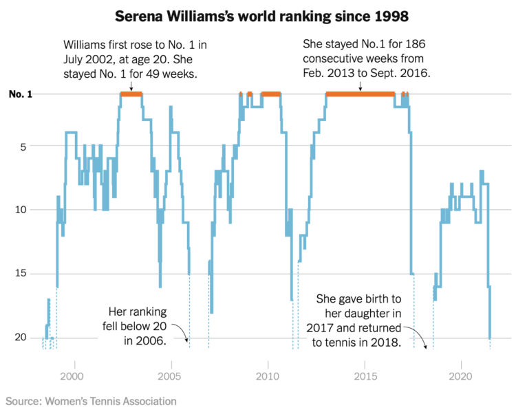
Serena Williams announced her retirement from professional tennis. As is required for any milestone by a great athlete, a step chart from The New York Times shows her world ranking over time.
I like the focus on the higher rankings, which is fitting for the occasion, and dotted lines that indicate the smaller chunks of time Williams ranked below 20.
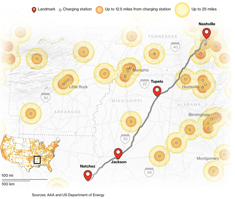
We hear about electric vehicles being the future, but for that to happen, people eventually need to be able to drive long distances without getting stranded. For Bloomberg Green, Kyle Stock and Jeremy C.F. Lin frame this in the context of American summer road trip. If you drive a non-Tesla EV, you’re going to run into some challenges.
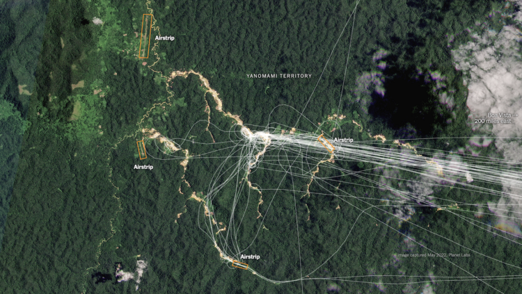
Using a combination of satellite imagery, crowdsourced databases, and analyses, The New York Times identified airstrips used for illegal mining in Brazil:
To confirm these locations and connect them with illicit mining, Times reporters built a tool to help analyze thousands of satellite images. They examined historical satellite imagery to determine that 1,269 unregistered airstrips still appeared in active use within the past year. They documented telltale signs of mining nearby, such as clear cut areas of rainforest and pools that miners use to separate dirt from ore. And they determined that hundreds of the airstrips in mining areas are within Indigenous and protected lands, where any form of mining is against the law.
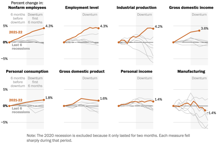
People disagree whether the United States is in a recession or not, because there isn’t a generalized formula you can just plug some numbers into. Instead, the translation of of many economic indicators to a binary definition is more complicated. For The Washington Post, Alyssa Fowers and Kevin Schaul report on work from the National Bureau of Economic Research.
A set of baseline charts show how indicators currently compare to past recessions. Things feels worse, but some indicators show better days. The pandemic, surprise, makes these current times more of a challenge to define.
For Bloomberg, Marie Patino reports on the shifting design choices for mapping weather extremes. The rainbow color scheme and sunny icons aren’t cutting it anymore.
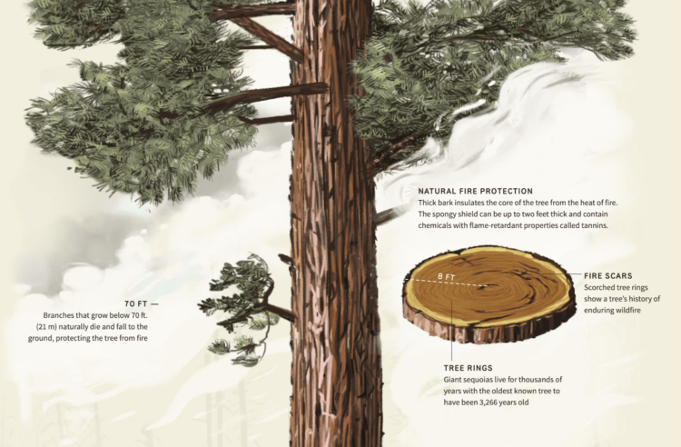
For Reuters, Travis Hartman, Ally J. Levine, and Anurag Rao describe the measures taken to protect giant sequoia trees from wildfire. The trees have their own protections with thick bark and dropped branches. Firefighters help by watering the ground underneath and directing giant flames to other areas.
I’m into the vintage-y illustration. It starts you at the top of the tree and guides you down the trunk to the ground, with highlights along the way.
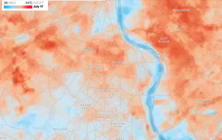
As city centers heat up, people search for cooler areas. For Bloomberg Green, Laura Millan, Hayley Warren and Jeremy Scott Diamond mapped the neighborhoods for a handful of hot cities that have something to cool the area:
Satellite images produced by the European Space Agency, working in part with data from NASA and the US Geological Survey, now have a high enough resolution to allow for temperature variations to be parsed on a street-by-street level. These snapshots of heat differences offer clear evidence of cooling strategies that can counteract what researchers term the “urban heat island effect,” in which city temperatures get that extra boost.
Bodies of water, greenery, and reflective surfaces.
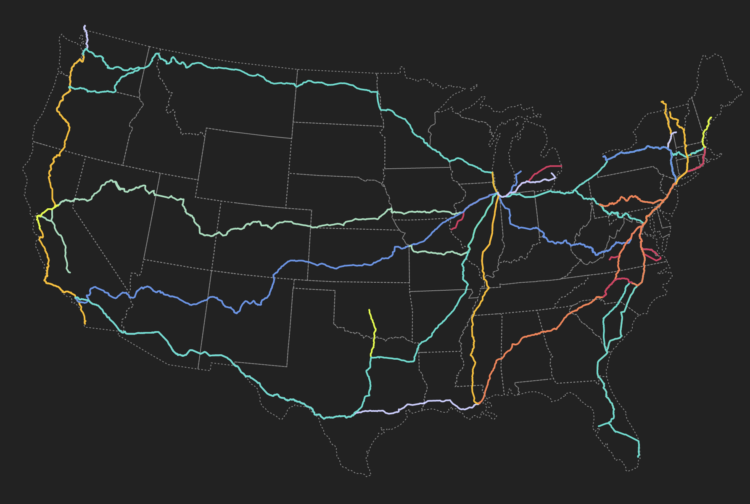
This visual explorer by Rachel Binx lets you see Amtrak routes and stations in the United States. Click on a route. See the stations.
Seeing the routes laid out like this kind of makes me want to take a ride? I rode Amtrak years ago, and it wasn’t my favorite, but maybe it’s different now. I don’t know, I’m still envying the train network in Europe.
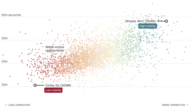
Recently published in Nature, research by Chetty, R., Jackson, M.O., Kuchler, T. et al. suggests that economic connectedness, or friendships between rich and poor, could improve economic mobility. The researchers used Facebook connection data from 70.3 million users, along with demographic and income data. NYT’s The Upshot explains the relationships with a collection of maps and charts.
You can find an anonymized, aggregated version of the data through the Social Capital Atlas. Also, I am very much into this socially-focused use of social media data.
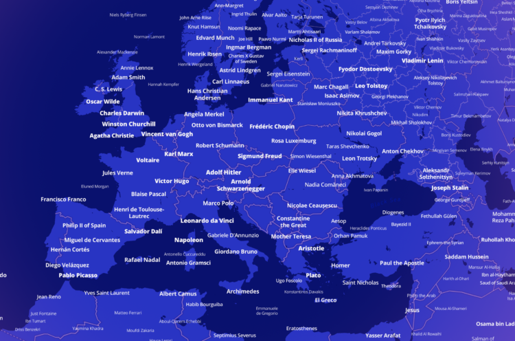
Who is the most famous person born in the place you live? This interactive map by Topi Tjukanov lets you answer that question for anywhere in the world. The pool of possible people comes from a cross-verified database of 2.29 million people, based on Wikipedia entries and Wikidata. You can also see the most notable person per category: culture, science, leadership, and sports.
See also The Pudding’s U.S. map from 2019 that showed the most notable person who lived in each city.
 Visualize This: The FlowingData Guide to Design, Visualization, and Statistics (2nd Edition)
New tools, refined process.