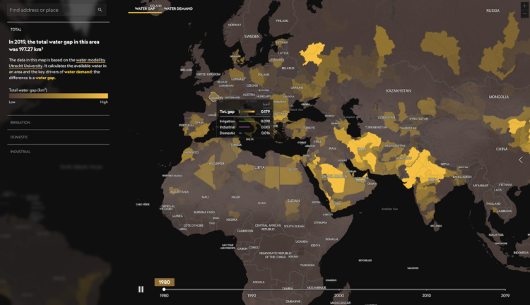
For privacy reasons, there’s a 72-year restriction on individual Census records, which include names and addresses. It’s 72 years today since the release of the 1950 Census. The scanned paper records are available for browsing and downloading.
-
Among 15-year-old students, here’s how 77 countries compare in reading, math, and science. Higher scores are better.
-
For The Washington Post, Bonnie Berkowitz and Artur Galocha report on several facets of Russia’s logistics, from poor protection, to poor communication, to vehicle breakdowns.
-
Members Only
-
Say what you will about circular visualization, but the spiral plays. This one from NASA shows global temperature change over time:
The visualization presents monthly global temperature anomalies between the years 1880-2021. These temperatures are based on the GISS Surface Temperature Analysis (GISTEMP v4), an estimate of global surface temperature change. Anomalies are defined relative to a base period of 1951-1980. The data file used to create this visualization can be accessed here.
This is based on Ed Hawkins’ chart originally from 2016, but watch to the end for some extra sauce.
-
Selecting a color palette for a single chart can be tricky, which is why we see so many charts that just go with defaults. Selecting a color palette for all your charts is a bigger challenge. For Datawrapper, Lisa Charlotte Muth has you covered with a detailed guide that describes the important bits, existing color palettes in the wild, and consideration for your readers.
You’ll want to save this for later. It just stops short of picking the colors for you.
-
Based on polls by Gallup, almost half of U.S. employees thought their employers cared about their well-being early on in the pandemic. That sentiment did not last:
Fewer than one in four U.S. employees feel strongly that their organization cares about their wellbeing — the lowest percentage in nearly a decade.
This finding has significant implications, as work and life have never been more blended and employee wellbeing matters more than ever– to employees and the resiliency of organizations. The discovery is based on a random sample of 15,001 full and part-time U.S. employees who were surveyed in February 2022.
Maybe this is just life’s way of saying it’s healing.
-
For NYT Opinion, researchers Sarah Cobey, Jesse Bloom, and Tyler Starr, along with NYT graphics editor Nathaniel Lash, discuss the potential mutations for the coronavirus. The accompanying graphic zooms in on the amino acids that allow the virus infect human cells. Scroll to see the mutations in the Delta variant and Omicron, and then keep going to see where else we might be headed.
-
Baryon Design collated data for all the vehicles James Bond used across all 25 films. You can see every vehicle used, categorized by type and displayed by time of use.
-
The New York Times analyzed Russian radio communications near Kyiv. The unencrypted transmissions, which anyone with a ham radio could record and even interject in, seem to suggest logistical mistakes early on.
The mixed media piece, driven primarily by audio, adds another dimension to the wideout map views of the invasion.
-
Excess deaths is the difference between expected deaths based on historical data and actual total deaths. It’s an estimate for how many people really died from covid. For Axios, Will Chase and Caitlin Owens charted excess deaths for Republican-leaning states compared against Democratic-leaning states, between March 2020 and March 2022.
-
Members Only
-
Based on estimates from the World Inequality Lab, Bloomberg shows how wealthier individuals’ habits — not just countries’ activities — contribute more to overall carbon emissions.
There’s a 3-D grid map with a square for each country. It transitions from the usual way of looking at national carbon emissions to carbon emissions from the wealthy who live everywhere. You can always count on Bloomberg to keep their graphics spicy.
-
Here’s a fun/alarming weather map from The Pudding. Using data from the Applied Climate Information System, they show the number of days since a record-high temperature in hundreds of U.S. cities. The counters are in the style of those signs in factories that show days since the last injury.
-
Millions of Ukrainians (over three million as of this writing) have left their homes for other countries in a relatively short period of time. Sara Chodosh, Zach Levitt and Gus Wezerek for NYT Opinion put the total as of March 13 into perspective. Over just an 18-day period, Ukraine refugee counts have surpassed counts during those of other refugee crises over one-year periods, since 1975.
-
Childcare is expensive in the United States. So as you would expect, higher-income households tend to use non-parental childcare more, whereas lower-income households tend more towards only parental care. Here are the percentages, based on 2019 estimates from the National Center for Education Statistics.
-
For The Washington Post, Andrew Van Dam, Youjin Shin and Alyssa Fowers plotted the value of imports to Russia by country and whether that country has imposed sanctions or not.
The bumpy alluvial diagram shows values and rank over time with “other countries” split out on the bottom. I wonder if it would’ve been worth splitting no-sanction and sanction countries for the top and bottom instead.
-
For NYT’s The Upshot, Bianca Pallaro and Alicia Parlapiano break down the United States’ $13.6 billion in emergency spending to help Ukraine against Russia.
They start with an overview treemap and then zoom in on each spending category with a new section. A thumbnail for each section keeps you oriented with each static image.
Over the years, the treemap has been NYT’s clear go-to for showing any kind of spending categories. You can see an evolution from interactive tool meant for exploration and the desktop to this most recent piece made to read and work on mobile. It seems like a pretty good indicator for visualization on the web as a whole.
-
Changing the clocks twice a year can be a hassle, so some people in the United States want to permanently keep Daylight Saving Time. However, that also means some areas in the country end up with late sunrise, which means going to work or school in the dark. For The Washington Post, Justin Grieser, Joe Fox, and Tim Meko mapped how sunrise times would change.
-
Members Only