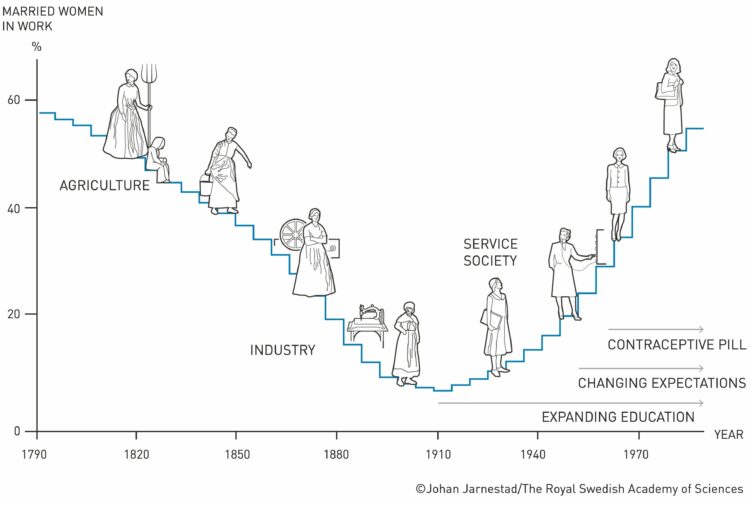
China reported 80,000 Covid deaths since lifting restrictions in early December 2022. But researchers believe the count is much higher, because the figure only includes hospital deaths and the country does not require Covid testing as strictly as before. So, for The New York Times, Pablo Robles, Vivian Wang, and Joy Dong evaluated the change in scale of scholars’ obituaries, which appears to correlate with China’s restriction timeline.
-
Never fear, Sopan Deb, K.K. Rebecca Lai, and Eve Washington, for The New York Times, are on the case with a comparison of LeBron James’ scoring timeline against other top scorers. They also provide breakdowns of how James scored his points, which show an all-around game rather than a hard skew towards a single type of shot.
-
All The King’s Buckets. pic.twitter.com/lzIultYSee
— Kirk Goldsberry (@kirkgoldsberry) February 8, 2023
LeBron James passed Kareem Abdul-Jabbar for all-time points in the NBA, and somehow I did not see a single cumulative line chart that shows James against previous players. This 3-D animation by Vanna Bushong and Kirk Goldsberry will have to do.
-
For South China Morning Post, Victor Sanjinez and Dennis Wong used a visual story to show why Pele was so great at football and in life. Illustrations mixed with a few charts makes for a good explanation of the-man-the-legend’s career.
-
If you’re searching for a new job, it’s worth looking in different industries — instead of doing more of the same elsewhere, or in the other direction, switching to a completely new occupation. Maybe your current industry is saturated, but a different industry might require your skills.
This searchable chart shows the industries that people work in, given a specific job.
-
I wasn’t paying much attention to the Chinese balloon that the U.S. shot down — until this graphic by JoElla Carman for NBC News floated by. The balloon was 200 feet tall, which makes the Thanksgiving parade Snoopy balloon look tiny and about equivalent to the wingspan of a Boeing 747.
-
NASA’s Center for Near Earth Object Studies tracks large objects, such as asteroids, that have passed Earth or are headed towards it. Reuters visualized the nearest objects in the database.
The graphic starts at Earth’s surface, and you get farther away as you scroll down. Speed is plotted on the horizontal, symbols are scaled by the object’s minimum diameter, and yellow indicates objects on the way.
Illustrations after the initial graphic do a good job of providing scale for if any of these objects hit us.
-
You know those funny or weird screenshots from Google Street View that enter your feed every now and then? Sometimes there’s an odd-looking building or a person in a puzzling situation. Neal Agarwal put those in one place so that you can randomly find find yourself in the Wonders of Street View.
That is a big chair.
-
For Bloomberg, Joe Mayes, Andre Tartar, and Demetrios Pogkas show shifts in public opinion in the UK, based on Bloomberg UK’s Levelling Up Scorecard. I’m into the gradients to show the opinion switches within groups.
-
The Doomsday Clock is a metaphorical clock that symbolizes a catastrophic end to the planet due to human self-destruction. Midnight represents an event and the time represents the “minutes” away from the event. The numbers are fuzzy, as you might imagine. In any case, Amanda Shendruk for Quartz used a connected scatterplot on a clock view to show how the “estimate” has changed since 1947.
-
George Santos, currently a U.S. representative, seems to lie about his background and qualifications. Someone will look into the details, show that they’re questionable, and the Santos story changes. For The Washington Post, Azi Paybarah, Luis Melgar and Tyler Remmel show this evolution through the lens of the Santos campaign’s about page.
-
Reddit user nerdydancing tracked her earnings on each shift for four years. If any dataset promised stories behind each data point, it is probably this one.
-
In a story about how scientists are using drones to fight plant extinction, Reuters Graphics uses a blend of video, illustration, and statistical graphics. I like the part in the middle where the mixed media seamlessly comes together.
-
Researchers at Google built a model that generates music based on brief text descriptions:
We introduce MusicLM, a model generating high-fidelity music from text descriptions such as “a calming violin melody backed by a distorted guitar riff”. MusicLM casts the process of conditional music generation as a hierarchical sequence-to-sequence modeling task, and it generates music at 24 kHz that remains consistent over several minutes. Our experiments show that MusicLM outperforms previous systems both in audio quality and adherence to the text description. Moreover, we demonstrate that MusicLM can be conditioned on both text and a melody in that it can transform whistled and hummed melodies according to the style described in a text caption. To support future research, we publicly release MusicCaps, a dataset composed of 5.5k music-text pairs, with rich text descriptions provided by human experts.
I’m not entirely sure I like where this road goes, but the results are impressive.
-
For The Washington Post, William Neff, Aaron Steckelberg, and Christian Davenport show the contrast between NASA and SpaceX using a scrolly tour through 3-D rocket models.
-
Members Only
-
Fabio Crameri, Grace Shephard, and Philip Heron in Nature discuss the drawbacks of using the rainbow color scheme to visualize data and more readable alternatives:
The accurate representation of data is essential in science communication. However, colour maps that visually distort data through uneven colour gradients or are unreadable to those with colour-vision deficiency remain prevalent in science. These include, but are not limited to, rainbow-like and red–green colour maps. Here, we present a simple guide for the scientific use of colour. We show how scientifically derived colour maps report true data variations, reduce complexity, and are accessible for people with colour-vision deficiencies. We highlight ways for the scientific community to identify and prevent the misuse of colour in science, and call for a proactive step away from colour misuse among the community, publishers, and the press.
-
Using the third dimension in visualization can be tricky because of rendering, perception, and presentation. Matthew Conlen, Jeffrey Heer, Hillary Mushkin, and Scott Davidoff provide a strong use case in their paper on what they call cinematic visualization:
The many genres of narrative visualization (e.g. data comics, data videos) each offer a unique set of affordances and constraints. To better understand a genre that we call cinematic visualizations—3D visualizations that make highly deliberate use of a camera to convey a narrative—we gathered 50 examples and analyzed their traditional cinematic aspects to identify the benefits and limitations of the form. While the cinematic visualization approach can violate traditional rules of visualization, we find that through careful control of the camera, cinematic visualizations enable immersion in data-driven, anthropocentric environments, and can naturally incorporate in- situ narrators, concrete scales, and visual analogies.
-
How to Animate Packed Circles in R
Pack circles, figure out the transitions between time segments, and then generate frames to string together.