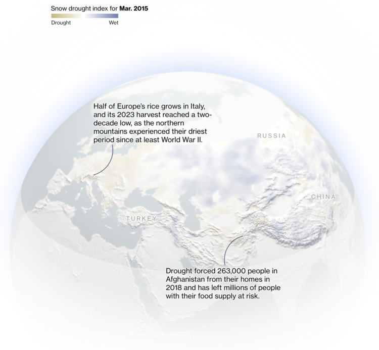
A warming climate has meant less snow in the northern hemisphere, which is a problem when agriculture depends on melting snow to grow crops. Bloomberg reports on the current snow drought situation.
A warming climate has meant less snow in the northern hemisphere, which is a problem when agriculture depends on melting snow to grow crops. Bloomberg reports on the current snow drought situation.
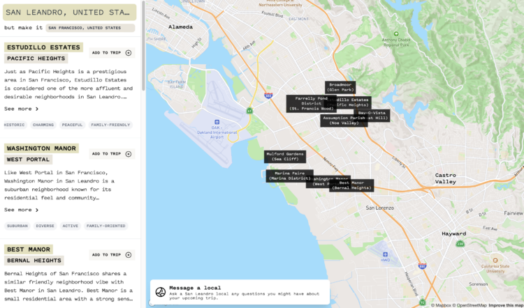
If you’re traveling to a new city, it can be tricky to figure out where things are and what the places are like. However, if you had a tool that set the context of the new city in terms of the neighborhoods in a city you know, you might get a better feel for the new city. Raymond Kennedy made an app (that appears to rely heavily on the OpenAI API) that lets you search the unfamiliar city against the familiar. [via Waxy]
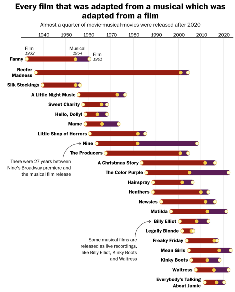
For The Washington Post, Hanna Zakharenko charted all the movies that were adapted from musicals that were adapted from movies. So the above shows the timelines for original movies. Then the musicals that came after. Then the movies again, with songs. Got it.
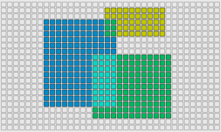
We often talk about visualization in terms of restrictions and rules, as if you must limit your possibilities to make charts the right way. As you might have guessed, there are other options.
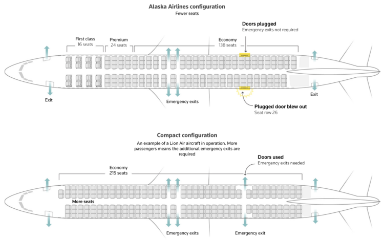
A refrigerator-sized panel popped off a Boeing 737 MAX 9 during the ascent of an Alaska Airlines flight. Reuters illustrates what that panel is for, other airlines with the same configuration, and where they travel.
In the 2000s, if you wanted to make interactive or animated visualization for the web, Flash was the main option. When Flash lost support and fell off the internet, a solid decade of great visualization no longer worked.
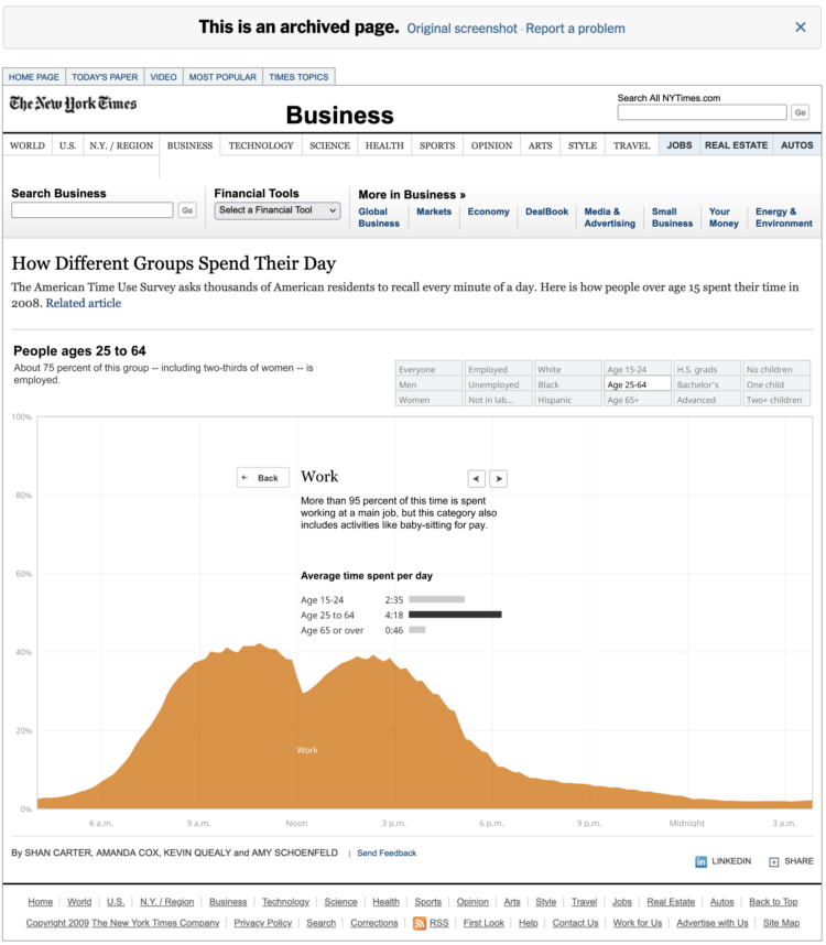
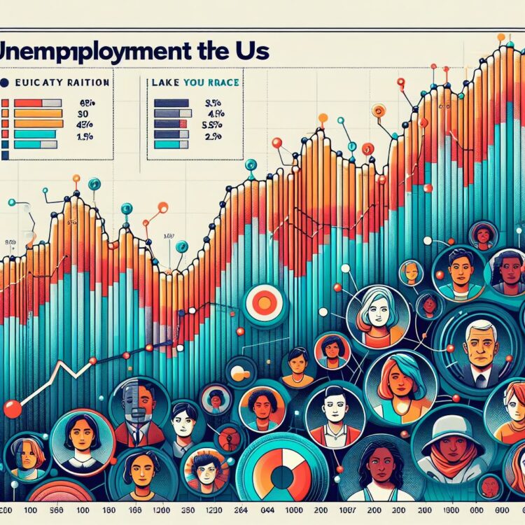
The New York Times has resurrected their archives with a Flash emulator. So pieces that were relegated to static thumbnail images are back. See the box office streamgraph that once upset many, the multi-line chart showing jobless rates for people like you, and the interactive stacked area chart on how people spend their day.
NYT is using the open source Ruffle as their Flash emulator. I hope other news outlets follow. It’s great to see my favorite visualizations working again. [via EagerEyes]
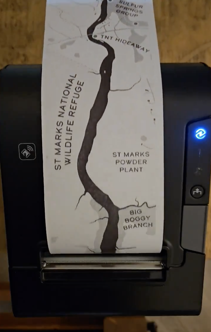
Aaron Koelker used a receipt printer to print a six-foot long map of the Wakulla River in Florida. He outlined his process with Adobe Illustrator and the printer. I kind of want a thermal printer now.
See also: grocery receipt with charts.
The classic coin flip is treated as a fair way to make decisions, assuming an even chance for heads or tails on each flip. However, František Bartoš was curious and recruited friends and colleagues to record over 350,000 flips. There appeared to be a slight bias.
For Scientific American, Shi En Kim reports:
The flipped coins, according to findings in a preprint study posted on arXiv.org, landed with the same side facing upward as before the toss 50.8 percent of the time. The large number of throws allows statisticians to conclude that the nearly 1 percent bias isn’t a fluke. “We can be quite sure there is a bias in coin flips after this data set,” Bartoš says.
There is probably more than one caveat here, but even though there were a lot of flips, they only came from 48 people and the bias varied across flippers.
Of course, if you’re trying to get a call in your favor, maybe try to catch a glimpse of which side is up and choose accordingly. Couldn’t hurt.
There were many AI-based things in 2023. Simon Willison outlined what we learned over the year:
The most surprising thing we’ve learned about LLMs this year is that they’re actually quite easy to build.
Intuitively, one would expect that systems this powerful would take millions of lines of complex code. Instead, it turns out a few hundred lines of Python is genuinely enough to train a basic version!
What matters most is the training data. You need a lot of data to make these things work, and the quantity and quality of the training data appears to be the most important factor in how good the resulting model is.
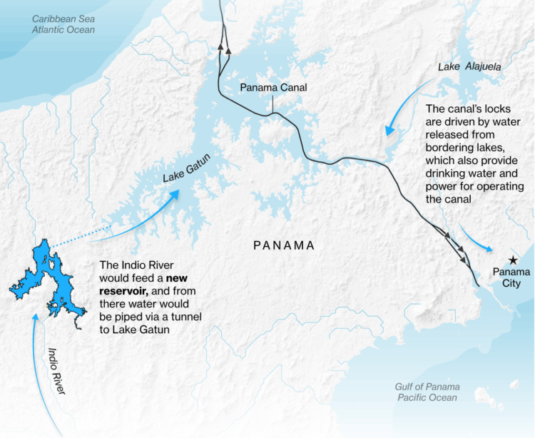
For Bloomberg, Peter Millard and Michael D. McDonald report on the efforts to maintain water levels in the Panama Canal.
Falling levels limit the number of ships that can pass through the waterway and that’s a problem when a quarter trillion dollars worth of trade pass through every year.

With each new AI-based tool that comes out, I begrudgingly kick the tires to see what kind of charts it spits out. I need to know when it’s time to hang the old data boots and switch careers. My most recent test subject: Microsoft Image Creator, which is powered by the text-to-image model DALL-E 3. These are “beautiful” charts through the lens of the model.
These are fine, I guess. Obviously they don’t show any real data yet. Maybe my queries need to be more specific, but these mostly feel like charts that were made to accommodate every data choice and angle instead of narrowing down to something useful.
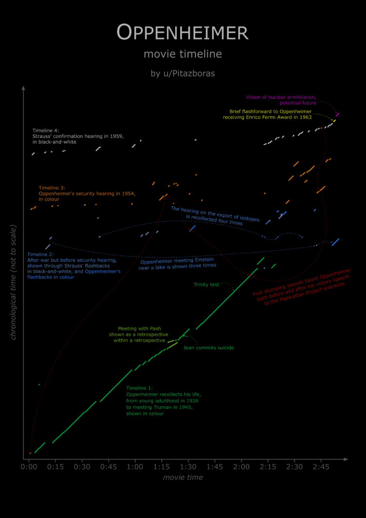
By Reddit user Pitazboras, a movie timeline for Oppenheimer with running time on the x-axis and chronological time on the y-axis. I haven’t seen the movie, so I cannot speak to the accuracy. But it seems confusing.
All Christopher Nolan movies probably deserve a timeline graphic. See also: a flowchart for Inception dream levels.
Data continues on its upwards trajectory and with it comes the importance of visualization. Many charts were made in 2023. If I liked something, it was on FlowingData. These are my ten favorites from the year.

Here is the good stuff for December in the last roundup for 2023.

Recharge, an art installation by Dries Depoorter, uses a system that detects when you close your eyes. Recharge yourself and your phone gets to also.
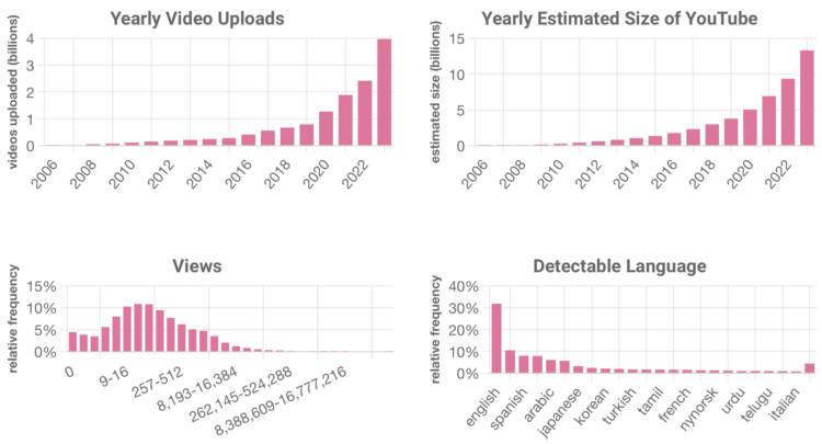
YouTube doesn’t offer numbers for how big they are, so Ethan Zuckerman and Jason Baumgartner estimated the size using a method they equate to drunk dialing.
Consider drunk dialing again. Let’s assume you only dial numbers in the 413 area code: 413-000-0000 through 413-999-9999. That’s 10,000,000 possible numbers. If one in 100 phone calls connect, you can estimate that 100,000 people have numbers in the 413 area code. In our case, our drunk dials tried roughly 32k numbers at the same time, and we got a “hit” every 50,000 times or so. Our current estimate for the size of YouTube is 13.325 billion videos – we are now updating this number every few weeks at tubestats.org.
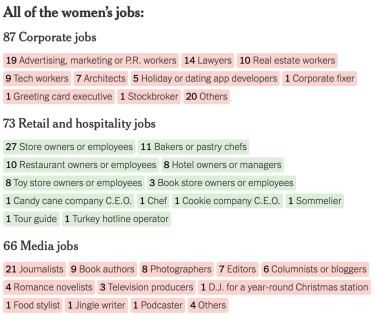
NYT’s The Upshot looked at 424 holiday movies released by the Hallmark and Lifetime networks since 2017. Like most forms of entertainment, the movies look identical from a zoomed out view. There’s a protagonist female who feels lost, finds her way and love in the process.
Get in closer and you see the nuances. Sometimes a couple has to save a candy shop instead of a bakery.
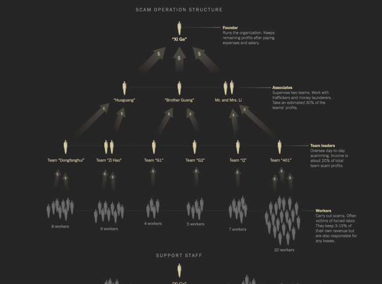
Neo Lu was scammed into a labor camp. In an effort to escape and expose the operation, he began to send information to The New York Times from within.
Mr. Lu said he pleaded to be freed, but his captors refused. They put him to work as an accountant, and over months he tracked millions of dollars in illicit income and managed their day-to-day expenses.
While he was still inside the camp, Mr. Lu contacted The New York Times. He sent hundreds of pages of financial records and photos and videos of the site, hoping to expose the operation at some point.
I was probably slack jawed most of the time while reading this. The graphics and photos about the inner workings and how the scam works, dubbed “pig butchering,” move the story forward.
Here are some fun things to make with data in case you’re looking for a chart-ish distraction.
Kurzgesagt illustrates the scale of the tiniest of things and the biggest of things by zooming in and out, but unlike videos before, they focus on human scale by comparing everything against it at each step.
You’ve probably seen the Powers of Ten, which demonstrates the scale of things by zooming farther and farther away from the universe and then back in to the microscopic level.
However, once people fall out of view, you lose a sense of magnitude. It’s just this is really big and that is really small. With focus on the individual, the Kurzgesagt rendition keeps the scale close as if you’re standing right next to it instead of traveling to an unreachable place.
 Visualize This: The FlowingData Guide to Design, Visualization, and Statistics (2nd Edition)
New tools, refined process.


