 ArcGIS can do a lot for you in terms of speeding up the mapping process, which is great, but here’s my dilemma: do I really want to put in all the time to figure out how to use the software?
I think the basics is good enough for me and any further than that, I’ll let a mapping expert take over. However, I know that spatial analysis is something I’m going to pursue, so… I’m really back and forth.
On the one hand, ArcGIS has a lot of functions, but on the other hand, it’s not especially easy to use all those functions. For example, I was doing a join between two data tables, but it wasn’t working at first because the column on one table didn’t have leading zeros (e.g. 1 instead of 01). By “not working” I don’t mean that columns weren’t joining. I mean that I couldn’t select this column and that column to join by, so I couldn’t even get to the step where I knew I had to change something. It’s little things like that that bug me and make me think that ArcGIS is inflexible.
Plus, it sure does like to crash.
I don’t know.
I probably just need more experience. How about this. I’ll just learn what I have to, but I’m not going to go out of my way to become an ArcMap expert. Yeah, that sounds OK to me.
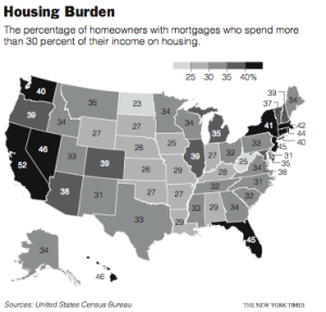
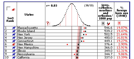
And on that note, here’s the map I made. Color scale was the main thing I had to fuss with. Too many shades of gray lead to a muddled graphic in the paper even if it looks fine on screen. The map shows the percentage of people who spend 30% or more of their household income on housing. Of course, California leads the way.
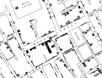 If you’ve read any books on visualization, without a doubt, you’ve seen John Snow’s now famous cholera map. In 1854, people were dying in large numbers and high frequency, but nobody knew what was going on. John Snow

 Karl Broman has an amusing list of the
 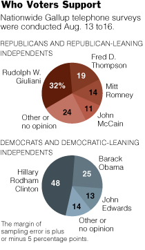 The first graphic changed form a few times. It began as a bubble chart to a stacked bar and then to the pies. An editor quickly pointed out that the bubble chart indicated that the percentages were separate, but they should be represented as a whole. Good point, so I toyed around with a stacked bar chart, but it just didn’t look right, given the alloted space. Hence, the pie charts. I’m not a big pie chart fan, but this one seems to work for me.
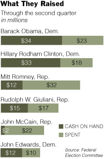 A graphic about the amount of money candidates have spent, have, and raised, this graphic’s stacked bar chart base was fairly straightforward. However, it’s the styling and organization that took the most time, as is often the case. I’ve come to learn that it’s very easy to make a graph, but it’s the styling and organization that really makes a graphic worthy of being in the paper.
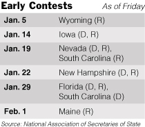 Other than the fact that the calendar is changing from day to day and the whole primary versus caucus stuff is kind of confusing, this graphic was pretty straightforward. I put in shades of gray to make things more readable.
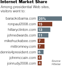 I thought this
 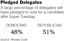 Clearly very straightforward, Pledged Delegates, on the contrary, took the most time out of all five graphics. The construction was simple, but finding the correct numbers took time. Schedules are changing, the definition of a pledged delegate is different by state, and the whole nomination process is fuzzy. Nevertheless, towards the end of Friday, some somewhat reliable numbers came in.
 With that being said, I came across
  On a somewhat related note: have you ever wondered what you look like as a Simpsons character? Well now you can
 Visualize This: The FlowingData Guide to Design, Visualization, and Statistics (2nd Edition)


