Five of my graphics ran in the paper today in a special labor day weekend segment, What to Expect When You’re Electing. The past few days, I and those I talked to have been referring to them as the labor day graphics, so I was surprised to see them go today. Nice Sunday treat.
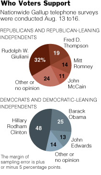 The first graphic changed form a few times. It began as a bubble chart to a stacked bar and then to the pies. An editor quickly pointed out that the bubble chart indicated that the percentages were separate, but they should be represented as a whole. Good point, so I toyed around with a stacked bar chart, but it just didn’t look right, given the alloted space. Hence, the pie charts. I’m not a big pie chart fan, but this one seems to work for me.
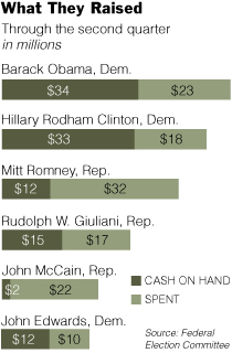 A graphic about the amount of money candidates have spent, have, and raised, this graphic’s stacked bar chart base was fairly straightforward. However, it’s the styling and organization that took the most time, as is often the case. I’ve come to learn that it’s very easy to make a graph, but it’s the styling and organization that really makes a graphic worthy of being in the paper.
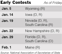 Other than the fact that the calendar is changing from day to day and the whole primary versus caucus stuff is kind of confusing, this graphic was pretty straightforward. I put in shades of gray to make things more readable.
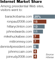 I thought this presidential Web site data from Hitwise was pretty interesting. Based on estimates, we can see what presidential Web sites are getting the most traffic. The tricky part was getting the wording right for the headline and lead-in so that readers would know what the percentages meant.
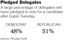 Clearly very straightforward, Pledged Delegates, on the contrary, took the most time out of all five graphics. The construction was simple, but finding the correct numbers took time. Schedules are changing, the definition of a pledged delegate is different by state, and the whole nomination process is fuzzy. Nevertheless, towards the end of Friday, some somewhat reliable numbers came in.
That’s all. It was fun putting this group of graphics together. I got to learn about the nomination process and most importantly, learned more about style and organization. Good stuff.
As I sat at my desk this week, working on these things (and one other coming soon), I thought to myself, “I can’t believe I’m getting paid to do this. This is too entertaining.” You know, this whole internship has never really felt like work, which I think is a good sign that I’m headed in the right direction towards data visualization.
 Visualize This: The FlowingData Guide to Design, Visualization, and Statistics (2nd Edition)