• Membership
  • Books
  • Projects
  • Learning
  • Newsletters
  • Member Login
  • See the World Through SimCity’s Eyes – One Up On OnionMap

    September 10, 2008

    Topic

    Apps, Maps

    Michael comments, “Onionmap is nothing when compared to this Chinese site…They’ve practically mapped out the entire Shanghai (and quite a few other China cities) in a SimCity-like fashion! Amazing stuff!” He’s completely right. Edushi maps Shanghai with great detail. While OnionMap looks like Google Maps with SimCity sprinkles, Edushi is just straight up SimCity.

    Unfortunately my three years of Chinese classes in high school did me no good, and I don’t understand a thing on the site. Maybe someone can translate and let us know what Edushi is all about. Chinese CitySearch?

    [Thanks, Michael]

  • Winner of the Personal Visualization Project is…

    September 9, 2008

    Topic

    Self-surveillance

    Like what you see here? Subscribe to the feed to stay updated on what’s new in data visualization.

    Last week was the end of our FlowingData personal visualization project. I asked readers to collect data about themselves or their surroundings and then visualize it some way. Thank you to everyone who participated. It put a smile on my face every time I got an email with “summer project” in the subject line :).
    Read More

  • Interactive Graph Visualization System – Skyrails

    September 8, 2008

    Topic

    Network Visualization

    Skyrails is an interactive graph visualization system that looks a lot like a video game. Explore relationships, visit nodes, and immerse yourself in the data. As I watch the demo video on YouTube, I feel like I’m seeing another world.

    You’ve got the standard ball and stick view. Whether it’s useful for analysis or deeper understanding of relationships between whatever is up for debate, but one thing’s for sure – it looks cool. Plus the code is open source.

    [Thanks, Atilla]

  • Flowchart Shows You What to Say During Sex

    September 5, 2008

    Topic

    Misc. Visualization  /  flowchart

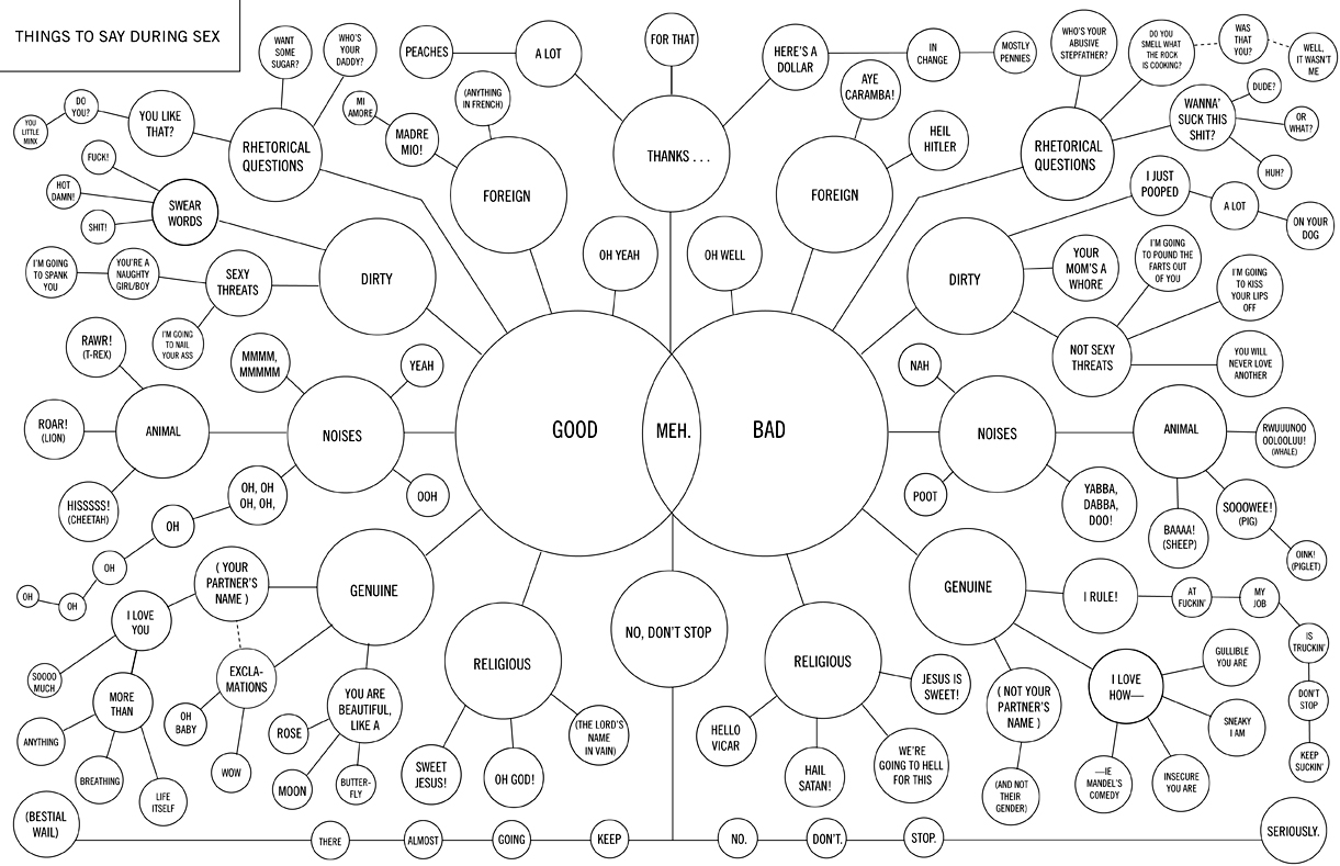
    This flowchart shows you what to say during private time with your special friend. Say goodbye to confusion and hello to deep conversations. Start from the middle of the chart and work your way out. Never again will you be at a loss for words.
    Read More

  • How to Create a Real-Time Web Traffic Map for Your Site

    September 3, 2008

    Topic

    Maps, Projects

    I was exchanging email with Rob a few days ago, and he brought up that I might see a slight boost in traffic from Australia because he had spread the word (thanks!) at a statistics conference. I immediately went over to Google Analytics, and indeed, there was an increase in traffic from the land down under.
    Read More

  • Mozilla Labs Ubiquity Plugin Makes Mashups Easy

    September 3, 2008

    Topic

    Software

    Mashups have been around for a while now, but for the most part have required at least a little bit of web development. Maybe it’s a line of javascript or thousands. Mozilla Labs, with the Ubiquity plugin, aims to make mashup-making accessible so that everyone can view data how they want everywhere on the Web. Use natural language like “map this” to stick a map into your email or get Craigslist offerings out of the list and onto a map.

    For version 0.1, the application looks interesting. Check out the demo (or even install the plugin yourself):

    [Thanks Colin and Jodi]

  • Nike+ Human Race 10K – Racing Around the World

    September 2, 2008

    Topic

    Self-surveillance

    Nike+ is a device you hook up to your shoe and iPod Nano to track your running patterns and receive feedback while you’re running. Already a million people around the world have been training with the device, with the U.S. putting up 2.4 million global training miles. This past Sunday was “the day the world stopped to run” in the Nike+ Human Race 10K.
    Read More

  • Best of FlowingData: August 2008

    September 2, 2008

    Topic

    Best of FlowingData

    Last month, FlowingData had a pretty good month moving up to rank 4,130 on Technorati and growing from about 4,000 subscribers to 4,500, so our community has grown a bit. Thank you to all of you who have been spreading the word!

    In case you missed them, here are some of the best posts from August:

    • Watch the Rise of Gasoline Retail Prices, 1993 – 2008
    • It’s Like Google Maps with Sim City 2000 – OnionMap
    • Map of Olympic Medals in Bubble + Geographic Form
    • Britain From Above – Beautiful Use of Satellite Technology
    • Visualize Genomes and Genomic Data – Circos
    • Beginner’s Guide to FlowingData – A Guided Tour
    • Is There a Market for Premium Online Data Visualization?
    • Awesome Olympics Coverage By The New York Times
    • Many Eyes Adds Wordle to its Extensive Visualization Toolbox
    • 3 Worthwhile Alternatives to the Pie Chart
  • Tracking Hurricane Gustav – How Hard is it Going to Hit?

    August 31, 2008

    Topic

    Maps  /  New York Times

    Stamen has taken a step towards the concrete with their recent Hurricane Tracker for MSNBC. From what I can tell, it updates every couple of hours or so. The tracker shows where Hurricane Gustav has been and where it’s headed and provides information on wind speed, ground speed, and location.

    From the map we see a development from tropical depression in the Caribbean Sea, to a big category 4 over Pinar Del Rio, and then something between a category 3 and 2 as it moves over New Orleans. Gustav dwindles to a tropical storm as it moves towards Dallas. With mandatory evacuations of New Orleans starting yesterday, here’s to hoping everyone finds somewhere safe to stay.

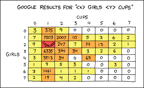
  • Google Results for X Girls, Y Cups

    August 30, 2008

    Topic

    Miscellaneous

    Some will find this amusing while others won’t get it at all. If you don’t get it, consider yourself lucky. Have a good weekend, everyone.

    [Thanks, Canna]

  • How Open Should Open Source Data Visualization Be?

    August 29, 2008

    Topic

    Visualization

    I used to ride my bike to school, and I always forgot my U-lock. Instead of riding back for it, I’d just stash my bike unlocked in between a cluster of bikes. I told my friend jokingly, “It’ll be OK. 98% of people are good.” One day I got out of class, and my bike was stolen.

    I was cleaning up some Actionscript in preparation for a tutorial post on how to make your own animated Walmart map, but a couple of bad memories involving stolen code and bad knockoffs (of my work) stopped me midway. I had to think:

    Is releasing my code the best thing to do?

    I’m sure the consensus is a resounding yes, but what’s to stop some lazy person from ripping off my code and pawning it off (or worse, selling it) as their own? What if I want to sell my visualizations? I am after all a lowly graduate student. It’d be nice to have another income stream.

    On the other hand, had others before me not released their work under that wonderful BSD license, I would not be able to do what I do. At least not as easily. Modest Maps? Free. TweenFilterLite? Free. Flare Visualization Toolkit? Free. If I don’t follow suit, does that make me selfish? Yes, it does.

    Giving Back to the Community

    I’ve heard that phrase, giving back, so many times in both the real-life sense and the digital one, but it never made much sense to me. I mean, I got it, but I never really got it.

    Perhaps I never understood it, because I wasn’t using much of the community’s resources nor did I have anything to give back. I have something to give back now. I can help people learn in the same way that others before me have and still do. I’m incredibly thankful to those who maintain these open source projects and still help me out from time to time when there’s really nothing in it for them.

    The least I can do is continue to promote this idea of openness and help this small field of data visualization flourish into what it deserves to be. It’s why I blog, and it’s why I should give back, but to what extent?

    Making the Case for Open Source Data Visualization

    My dilemma brought me back to a Data Evolution post on open source data visualization. It highlighted three things:

    1. Open Tools – As in freely available software tools like R and Processing.
    2. Open Code – How often have you seen a visualization and wondered, “How did they do that? If only the code were available.”
    3. Open Data – Oh so important in data visualization. The core. Open data means more people can try out different methods.

    It’s not always possible to attain all three. For example, we pay money for software because the companies would not exist otherwise. It’s a business, and to think that software companies would develop a bunch of free software is unrealistic. Also, oftentimes, data just can’t be shared – usually because of privacy issues. Lastly, open code doesn’t make sense a lot of the time. The DE post grades The New York Times with a D for openness, but they’re a news business, not a visualization repository.

    While we can’t always attain all of three things, there’s no reason why we can’t try to strive towards that ideal. As someone I know likes to say – strive for perfection. You might not reach that standard, but you could end up with something close.

    Open source is a development method for software that harnesses the power of distributed peer review and transparency of process. The promise of open source is better quality, higher reliability, more flexibility, lower cost, and an end to predatory vendor lock-in.

    Tweeting Thoughts

    I of course tweeted this in the middle of the night while watching the day’s remaining olympic events – to release code or not to release code. Here are are some of the replies:

    @rpj: To release, always! (When legally possible.)

    @ehrenc: re: code. You could always release half the code :)

    @pims to release code. There’s some brilliant people around that can build on top of what you did. Open world :)

    As for me, well, let’s just say you should expect to see tutorials – complete with code – in the coming weeks.

  • Keep Track of Presidential Race from Many Perspectives – perspctv

    August 28, 2008

    Topic

    Apps

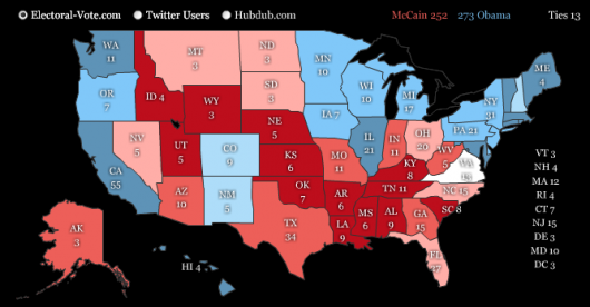
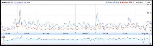
    Keep track of what’s getting reported about the presidential race in somewhat realtime with perspctv. It’s a nicely done news dasboard that updates on its own showing updates from CNN, Twitter, and the Blogosphere. It also shows poll results, predictions, daily reach, and search volume.

    They’ve got charts (above); they’ve got maps:

    they’ve got timelines:

    and they’ve got widgets:

    In essence, it’s a news aggregater, but it’s a really good one and a great dashboard for you election junkies.

    [Thanks, Iman]

  • Look at My Neato Lollipop Chart – Widgenie

    August 27, 2008

    Topic

    Ugly Charts

    As some commented on an earlier post, FusionCharts provides an easy way for people to hack together statistical graphics – sometimes not so attractively – and put the results on their websites. Widgenie serves as case in point. The concept of the application is all well and good. Upload some data and embed the “interactive” graphic on your blog, website, etc.

    The realization of that idea however, needs some work. Aside from my difficulties logging on, changing my password, and non-flexible data upload, the widgets are, for the most part, just FusionCharts out of the box. Like the lollipop I made (below)?

    [via ReadWriteWeb | Thanks, IA_chrissie]

  • Plummeting Infographics from I.O.U.S.A – A Nation in Debt

    August 26, 2008

    Topic

    Infographics

    I haven’t seen I.O.U.S.A. yet, but from the online bonus clips, it looks like it could be a good watch for you infographics junkies. The documentary examines the growing national debt and the consequences it will have on its citizens, so the source material sort of lends itself to plummeting time series charts with dramatic flare.

    Here’s one showing personal savings rate over time:

    Deficits and social security over time:

    Debt-to-GDP projections:

    A $53 Trillion Federal Financial Hole:

    Those are just the bonus clips. I’m sure there are plenty more in the actual documentary.

    [Thanks, @samkim]

  • One Week Left for Personal Visualization Project

    August 25, 2008

    Topic

    Summer Project

    A quick announcement – I just wanted to remind everyone (and point out to new readers) that there’s just one week left until the end of our summer project on personal visualization. I admittedly haven’t done a very good job of motivating all of you to this, but if you’d like a chance to win, submit by the end of September 1. Eternal glory is at stake.

  • History’s Greatest Journeys – Wanderlust from GOOD

    August 25, 2008

    Topic

    Maps  /  good, Graham Roberts

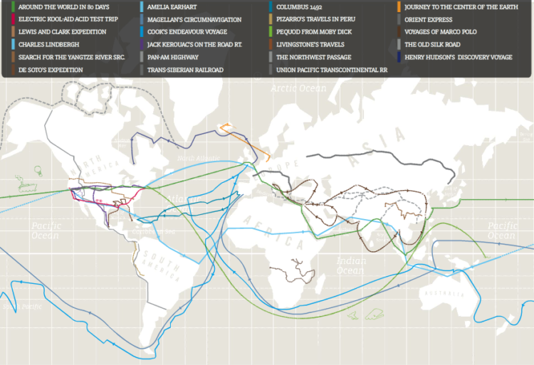
    GOOD Magazine, in collaboration with Graham Roberts, maps the most famous journeys in history – some fiction, some non-fiction. Wanderlust includes trips like Around the World in 80 Days and Journey to the Center of the Earth to the voyages of Marco Polo and Charles Lindbergh’s transatlantic flight. However, it’s not just a map with journey lines on it; Wanderlust is a history lesson. Select a trip for a summary and explore highlights of the journey.

  • Why is MC Hammer Talking About Analytics?

    August 22, 2008

    Topic

    Miscellaneous

    “Analytics, at the end of the day, is going to be the endgame.” Ok, MC Hammer. If you say it is, then I will believe you. Have a nice weekend everyone, and remember, despite what you’ve heard, you’re never too legit to quit.

    [via Juice Analytics]

  • Amusing Disney Org Chart – From Walt on Down

    August 22, 2008

    Topic

    Infographics  /  business, Disney

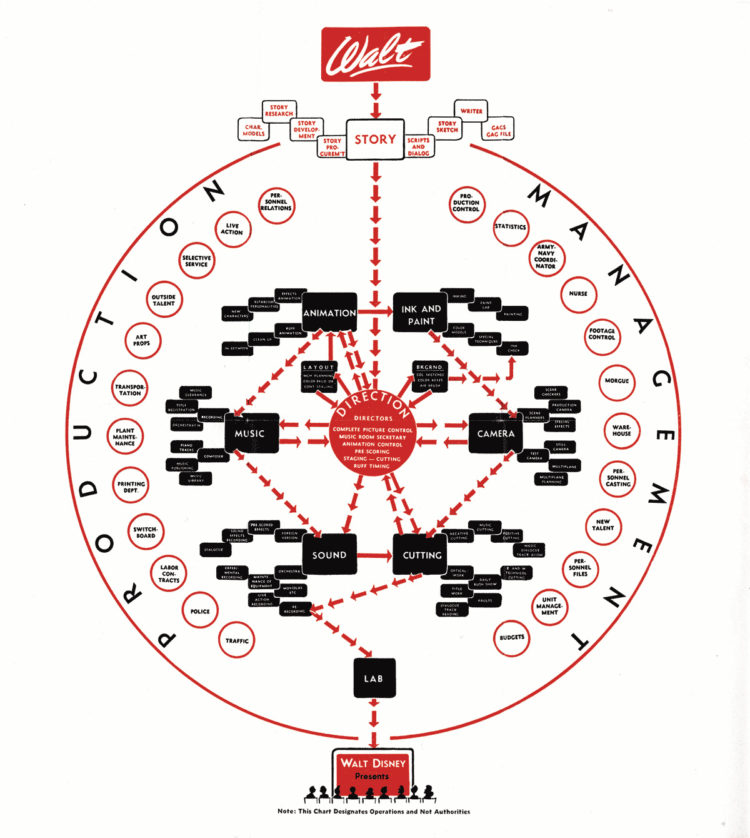
    I’m not sure how old this Disney org chart is, but I’m guessing very. Ink and paint? What are those? In any case, it’s amusing. Why are nurse, army coordinator, police, and morgue on there? The animation business is clearly more complex than I thought.

  • Fleshmap: Studies of Desire – Touch, Look, and Listen

    August 21, 2008

    Topic

    Data Art  /  Fernanda Viegas, Martin Wattenberg

    Fleshmap is a new project by Martin Wattenberg and Fernanda Viégas that explores human desire from three points of view – touch, look, and listen.
    Read More

  • LEGO-powered Project Time Management

    August 20, 2008

    Topic

    Miscellaneous

    Speaking of physical graphs, looks it’s time management with my favorite childhood pastime – LEGOs! Each row represents an hour and each color indicates a different project. I’m gonna go out by myself a big, red bucket of LEGOs now.

    [via infosthetics]

  • Page 407 of 426
  • <
  • 1
  • ...
  • 404
  • 405
  • 406
  • 407
  • 408
  • 409
  • ...
  • 426
  • >

Get access to courses, tutorials, and more resources.

Become a member →

Recently for Members

October 8, 2026
Draw attention visually

October 1, 2026
Charts we made along the way

September 24, 2026
Visualization tools, datasets, and learning resources — September 2026 roundup

September 17, 2026
When the visual trade-offs are worth it

September 10, 2026
Application of charts and data

Second Edition

Visualize This: The FlowingData Guide to Design, Visualization, and Statistics (2nd Edition)

New tools, refined process.

Order: Amazon / Bookshop

Browse by Chart Type See All →

Streamgraph Bar Chart Race Packed Bubble Chart Histogram Timeline Slope Chart Dot Map Moving Bubbles Table Parallel Sets

Browse By Topic

  • Visualization

    Seeing data

  • Maps

    Seeing geographic data

  • Infographics

    Explaining data

  • Networks

    Connecting data

  • Statistics

    Analyzing data

  • Software

    Working with data

  • Sources

    Getting data

  • Design

    Making data readable

Made by FlowingData

  • The Process

  • Data Underload

  • Chart Everything

  • Guides

  • Books

  • Shop

  • About
  • Contact
  • LinkedIn
  • Bluesky
  • Instagram
  • RSS
Copyright © 2007-Present FlowingData. All rights reserved.