• Adrian Holovaty released templatemaker yesterday. Adrian is probably best known as the guy, featured on YouTube, who played the MacGyver theme song. So clearly, he is a man a many talents.

    Anyways, templatemaker is a Python script to extract data from text, um, HTML. For example, you could pass a review page from a site like Yelp, or several pages, and the script will “learn” the template. Once a template is established, you can extract the stuff that changes (e.g. ratings, restaurant name). Here, in Adrian’s words:

    You can give templatemaker an arbitrary number of HTML files, and it will create the “template” that was used to create those files. (“Template,” in this case, means a string with a number of “holes” in it, where the holes represent the parts of the page that change.) Once you’ve got the template, you can then give it any HTML file that uses that same template, and it will give you the raw data: “The value for hole 1 is ‘July 6, 2007’, the value for hole 2 is ‘blue’,” etc.

    It’s under the BSD license, so all the more reason to use it. I haven’t used it yet, but looking forward to it.

  • Maps of War

    As a representation of history over time and space, Maps of War does a pretty good job of displaying the information in the form Flash animations. It’s quite simple really. The animation starts centuries back (e.g. 2000BC) and moves to geographic regions. In the above map, I watched who has controlled the middle east, beginning 3000BC up through 2006.

  • Okay, so this video has been posted probably on thousands of blogs already, but you know what, I don’t care. Hans Rosling gives an amazing talk on poverty and life around the world, and he uses his interactive exploratory tool, Trendalyzer (acquired by Google), to show the different levels of health, education, and money around the world. Trendalzyer: useful, yes, but not the main point of the talk. Watch Rosling’s talk all the way through. You won’t be disappointed.

  • There was a Sharp Rise Seen in Applications for Citizenship, as reported in The Times today, and of course there was a graphic to complement that article that showed the rise in applications over the years as well as a by-country breakdown for 2006.

    Surge Seen in Applications for Citizenship

    Graphics in The Times always site the source, which was Department of Homeland Security in this case. I thought, “Do they have some kind of source who they actually call to get this data?” Thinking such a thing, I feel pretty dumb now. In fact, I always see that source on all of the graphics, and have just assumed that there was some connection between The Times and the source.

    Wrong.

    So lazy me finally decided to look into things, and you know what, the Department of Homeland Security has a whole section on their website for Immigration Statistics. There are freely available spreadsheets, reports, publications, and even a little something on data standards and definitions, prepared by none other than the — Office of Immigration Statistics. Very pleased.

    It’s kind of sad that this is just now news to me, but better now than never, eh?

  • Twittervision 3D

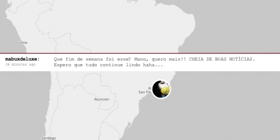
    Twittervision is a Google Maps mashup using the Twitter RSS feed. As people post to Twitter, you see the map move from location to location all around the world. It’s really simple, but there’s something entertaining about it that I can’t quite put my finger on. Maybe we just like to peak into other people’s lives. Anyways, I don’t know how recent this is, but Twittervision now has a third dimension which is equally as entertaining as the original.

  • Swarm Theory, by Peter Miller, talks about how some animals, as individuals, aren’t smart, but as a group or a swarm, they can do amazing things. The above is a flock of starlings that can change shapes even though no single bird is the leader.

    Can we apply swarm theory to social data analysis? As individuals, we might not be able to hold onto or understand a dataset, but as a group, we can come at a dataset from different perspectives, look at very small parts, and then as an end result — extract real, worthwhile meaning.

    That’s how swarm intelligence works: simple creatures following simple rules, each one acting on local information. No ant sees the big picture. No ant tells any other ant what to do. Some ant species may go about this with more sophistication than others. (Temnothorax albipennis, for example, can rate the quality of a potential nest site using multiple criteria.) But the bottom line, says Iain Couzin, a biologist at Oxford and Princeton Universities, is that no leadership is required. “Even complex behavior may be coordinated by relatively simple interactions,” he says.

    It reminds me of that common saying, or maybe it’s a quote, about how if you put a bunch of monkeys in a room with typewriters, you’ll eventually get the works of Shakespeare via the magic of probability. While the whole monkey thing is a bit far-fetched, swarm theory is certainly worth my attention.

  • We need to interact with others. We crave connections with friends and strangers. Something inside makes us need to converse with others so that we don’t go crazy. As I work from home, I’ve begun to understand this a bit more, and I’ve found myself checking Facebook and Twittering perhaps just a little too much. I think that it’s these connections is what has made social networks so popular.

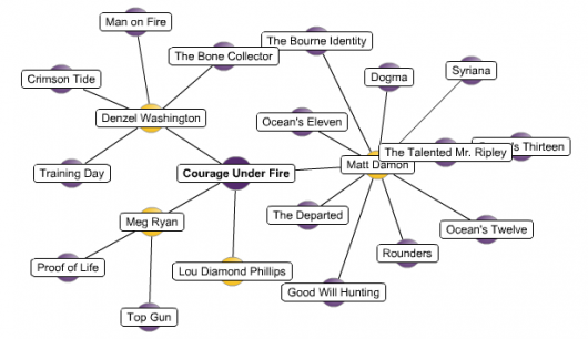
    How can we visualize these ever so important connections. An obvious option is with, well, lines.

    Pretty, yes. Useful? Umm, hmm, not really. The number nodes grows to greater than 20, and it becomes this cloud/blob-type thing. What meaning can we take away from visualization like this other than, there’s a lot of nodes and links, and they’re all interconnected (other than a few outsiders)?

    Okay, so here’s another option — instead of using lines to show connections between nodes, we can use clustering. Nodes that are similar, appear closer together.

    Clustering Social Networks

    We can see some patterns now with the clustering and coloring, but when the network groes to thousands, it’s easy to see how things can get kinda gross. I think the natural next step here is to sample, provide an overview, and if the user wants to go deeper, sample some more.

    The big question: how do we know what to sample? What weight can we give each sample? How can we get a sample that properly represents the entire network (or a small, specific part of it)?

  • Akamai: Network Performance Comparison

    Akamai is a technology company that deals with routing and online business. They optimize routing over the Internet using the data they collect from servers setup in 71 countries. Or I guess, in their words

    Akamai’s technology – at its core, applied mathematics and algorithms – has transformed the chaos of the Internet into a predictable, scalable, and secure platform for business and entertainment. The Akamai EdgePlatform comprises 20,000 servers deployed in 71 countries that continually monitor the Internet – traffic, trouble spots and overall conditions. We use that information to intelligently optimize routes and replicate content for faster, more reliable delivery. As Akamai handles 20% of total Internet traffic today, our view of the Internet is the most comprehensive and dynamic collected anywhere.

    Wait, that’s not the good part. They use Flash-based visualization to display how good they really are. I did a network performance comparision for a route from New York to Hong Kong, and in turn, the viz showed the public internet path and a much-improved Akamai path. Less packet loss and lower latency for Akamai. It’d be interesting to know how those routes are depicted, because I imagine, the routes aren’t really always straight line vs parabola, Akamai vs public internet. Very pretty though.

  • Weight loss is a difficult task for many, further complicated with so many diets — Atkins, Jenny Craig, etc — and lack of motivation. Fatsecret aims to make weight loss easier by providing the tools to track your weight loss, write about it, see what others are doing, and share your progress.

    There’s a couple of graphs (built by Flash) on the homepage. The first, a pie chart, shows the proportions of fatsecret users on certain types of diets. You can see the proportions for this week, this month, or all time.

    Then towards the bottom — a bar chart showing the average weight loss of fatsecret users for specified diets. Again, you can see for this week, this month, and all time.

    fatsecret: avg weight loss

    Every user has her own homepage which shows a line graph of her progress as well as the average weight loss of fatsecret members on the user’s same diet.

    Fatsecret seems like quite of an active site with plenty of posting, tips, and member interactions, which makes me pretty happy. Next step: interactive tools.

  • CitiStat Buffalo

    I was flipping through the channels the other night and came across a televised CitiStat meeting for June 1. A bit of a coincidence since I happened to be looking at the CitiStat website earlier that day. What’s CitiStat, you ask? Well it’s like a spin-off of CompStat, a program in NYC and LA, that makes police officials accountable for their actions by looking at data — number of homicides, where they happened, what’s being done, etc. CitiStat, in Buffalo, is the same thing, but for the Police, Fire Department, and whatever else they can think of, and seemingly not quite as reputable.

    Anyways, they were talking to some city official about fire department employees that were IOD, um, that’s injured on duty (but I must’ve heard IOD like a billion times). There was some discrepancy on the definition of IOD. As a result, the data was worthless. The police commissioner spoke as well with his own IOD numbers. After that, there was a lot of arguing and as a result, a meeting was agreed upon. Well, not really. They agreed that they would schedule some meeting, but it’s been a year of “What is an IOD?” Pretty sure that won’t be settled for a while.

    They were also able to agree that the number of IODs was somewhere between 50 and 200. Yay.

    So despite the fact that the CitiStat program is two years old, there’s still lots to be done. Officials aren’t used to recording and looking at data, and it’s clear, few even had any notion that data could be useful. However, I am glad that they’re making the effort — even if all of the data is stored on a bunch of inconsistent Excel spreadsheets :P.

  • Chronoscope is a work-in-progress time series visualization tool that lets you explore data similar to that of Google Finance. It’s written in Java, unlike Finance, which uses Flash/Javascript, and uses the Google Web Toolkit as the hook. After a quick look-see, it’s certainly still in alpha, and I’m not quite sure when beta will be available to the public. The browsing is pretty nifty though. I wonder how hard it’d be to do it Flash?

  • Everyone’s familiar with tag clouds, but Aaron Bassett put a slight twist to the now commonplace clouds. Aaron calls them Focus Clouds. Basically, they’re still tag clouds, but instead of weighting tags by number of times used, there’s some weight given to how recent a tag is. There’s also some simple highlighting going on with related tags.

    The idea is that the focus cloud then gives you an idea of what is currently of interest. Aaron’s code is available on his blog. The code is a bit buggy, but interesting nevertheless.

  • I went to Swivel, to see how they did with the same Big Mac data I visualized on Many Eyes. Swivel uses a Google Maps interface with an overlay:

    Big Mac Map (Swivel)

    It looks nice, but it was incredibly slow when I tried to zoom in or browse the map. Actually, not just the map was slow, but the whole page. Maybe some caching issues? Exploratory graphics isn’t really Swivel’s high point at the moment. I also find it a little strange that the overlay is the same color as that of the maps on Many Eyes.

  • I was playing around at Many Eyes, and it was amazingly easy to map some data on the Big Mac. The data set was simply two columns: country name and the cost of the Big Mac in that country. I chose the mapping visualization option, and voila, data was mapped. Awesome.

  • My mom recently, um, as in yesterday, got in a car accident. She was making a left turn at a light, and someone coming from the opposite direction decided to run a red light, sending my mom’s car in a 90-degree turn. Fortunately, my mom only suffered minor burns from the airbag deployment; however, the car was totaled. The first thing that my mom did today — the day after this major accident — she went to work.

    This got me to thinking, what is enough to motivate someone to change her behavior? For some, when something really drastic happens, like a car accident, they gain a new outlook on life and vow to “live life to the fullest” or “value every moment”. Then there are others, like my mom, who move along, because all they want is for their lives to be normal again.

    I wish I knew where to look for related research, but a quick search on Google Scholar didn’t give me a whole lot.

    Let’s see here… what motivates people to change their behaviors?

    • A significant, personal event
    • Change in surroundings
    • Coercion

    Surely, there’s more. I’m going to dwell on this some more.

  • Flash or Processing? For now, Flash.

    For quite a while now, I’ve been back on forth on my data viz weapon of choice — Flash or Processing. With Processing free and designed for artist, I naturally started here. There were some drawbacks of course like non-extensive (just decent) documentation, and it was a lot of learn by example. There were a lot of examples that were just chunks of code that I had to interpret. Also, written in Java, Processing applets were often slow to load in the browser, and there often seemed to be compatibility issues.

    SO, I’ve set Processing aside, and enter Flash.

    I’ve been playing around with a few examples from Flash Kit and Entheos, and to be quite honest, it’s pretty fun. I like the interface, (I’m still getting used to it) and although I haven’t used much ActionScript yet, I’m looking forward to learning it. Still waiting on my Flash book from Amazon, Macromedia Flash Professional 8 Hands-On Training, which is taking forever to get here.

    I’ll just have to go through more tutorials until the darned thing arrives.

  • The folks with STATIC!, a project led by the Interactive Institute in Switzerland, have been working on some really cool stuff. Their research is focused on interactive design that not only brings brings up energy awareness, but makes people want to change their behaviors.

    One of their projects, the Flower Lamp, was chosen as one of the best inventions of 2006 by Time Magazine.

    lampa.jpg

    Basically, when a lot of energy is being used in a house, the lamp closes. When less energy is being used, the light opens, so to make the lamp more beauty, there has to be a change in behavior by the consumer. I haven’t been able to figure out where the energy data is coming from though. Probably some separate mechanism that hooks into the power gauge in the garage.

    There’s plenty of other STATIC! projects like the Power Aware Cord, Appearing Pattern Wallpaper, and the Energy Curtain. Some of their stuff seems more art than anything else, but still very cool.

    It would be interesting to put a more data-centric spin to these STATIC! projects.

    Hmm… I’ll have to think about this one.

    Anyhow, the theme across all projects is certainly important as I progress — producing visualizations that increase awareness and motivate people to change their behavior, even if just by a little bit.

  • What makes a visualization good? It allows people to see what they never would have seen otherwise? It’s pretty? The visualization is interactive? Simple? Probably all of the above, and yeah, it’s probably common sense, but… why is there so much bad viz out there?

    Perhaps people don’t have the skills to create effective visualization. I, myself, don’t yet possess the necessary skills to create great viz, so that’s definitely a limiting factor. Whether it’s in Flash, Processing, or whatever, honed skills is essential.

    In my eyes, the more serious problem, is that some don’t have the eye or logic for good viz. It’s great when the user can interact with the data, but if the user interface sucks, then the viz fails. Viz can easily get very complicated as we build, add more features, and eventually forget what our primary goal was in the first place.

    When the user has a viz tool she can use, then it’s at this point, the viz should show the user something they never expected (or confirms a suspicion — although I like the idea of surprise). From here, the user can decide what she wants to do, but it’s my hope that anything I create will make people aware of their surroundings and motivate change in a positive direction.

    I feel like I’m rambling…

    So yeah, um, effective visualization — expertise, simplicity, mind-blowing factor.