Are you ready for another deconstruct/reconstruct exercise? I just posted a time series plot in the FlowingData forums that shows suicide rates and unemployment rates in Japan. Here are questions worth considering:
- What is the graph trying to show? Does it succeed?
- Is this the appropriate type of plot of this type of data?
- What would make the data more clear?
At a glance, the graph almost looks fine, but on a slightly deeper than superficial look, there are some clear problems.
 Visualize This: The FlowingData Guide to Design, Visualization, and Statistics (2nd Edition)
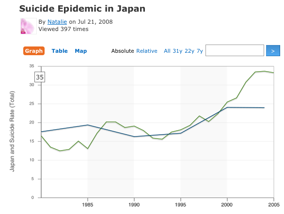
This graph suggests a strong correlation. if that’s the intent, then the graph is working well. however this isn’t true.
It is misleading to show 2 variables using 2 different scales on the same chart. unemployment depicted here is ppl unemployed for more than 12 months as a % of total unemployed, whereas suicide rates are per 100,000 population. The fact that the line charts are superposed is purely coincidental. Choosing a different scale for either series would have resulted in a very different graph.
To establish correlation, the textbook way is with a scatterplot, complete with its regression line. The problem is that they are more difficult to interpret by people who have no knowledge of statistics. Besides, since there are so few data points for the suicide rates, the results are not convincing.
BTW Japan’s long-term unemployment rate is typical of OECD countries, whereas its unemployment rate is very low and its suicide rate, much higher than average.
The vertical axis label does much to set expectations for the chart:
“Japan and Suicide Rate (Total)”
The data sources are all very slow, or not responding at all, so I’ll have to let it go until later.
http://bp2.blogger.com/_8rpY5fQK-UQ/SJBuTtIWAgI/AAAAAAAAClA/3QB-pz8p7hY/s1600-h/SPIN2.png
jon – i put the suicide and unemployment data here: http://datasets.flowingdata.com/japan-suicides/rates.xls
Pingback: Suicide Rates in Japan » PTS Blog
Nathan: I didn’t notice your link until after waiting for Swivel to share its data. It doesn’t like opening a link in a new tab. Anyway, I got my data, and did a little analysis in Suicide Rates in Japan.
Jake: “The Art of Spin” – gotta love it. I have to admit that I don’t know where your numbers come from for the top chart.
Jake used the same numbers, didn’t he? He just didn’t use the unemployment rates for the years there wasn’t data for suicide rate.
Hi Jon-
1) Took population and multiplied by the unemployment rate to get # of unemployed.
2) Took population and by suicides per 100,000 / 100,000
3) Divided # of suicides by # of unemployed
2) Took population and multipled by suicides per 100,000 and divided that # by 100,000 to get # of suicides
Jake –
(a) You should multiply not by population but by potentially employed population. At least in the US, only working age people who want to work can be considered unemployed.
(b) The long term unemployment rate is not percentage of potential workers who are unemployed. It is the percentage of unemployed people who have been unemployed for a year or longer. This makes the math more complicated since you also need to factor in the “reguler” unemployment rate.
Revised….
http://bp3.blogger.com/_8rpY5fQK-UQ/SJDmQv17K0I/AAAAAAAAClg/5MBOFMkwoJw/s1600-h/SPIN2.png
Epidemics occur when there is a significant increase (or decrease) of an event. One of the ways to present this graph would be the story that unemployment and suicide are highly correlated. The title says, “Suicide Epidemic in Japan”; this would suggest there is an ‘outbreak’. If so, there should be some attempt within the graph to show that *each* increase in unemployment corresponds to an increase suicide and conversely i.e. *each* decrease in unemployment corresponds to an specific decrease.
Since our data is yearly (not very fine considering how suicide and unemployment is measured, but hey, at least the OECD is gathering something), I think some sort of year-over-year % change would not only tell the story better, but would help to show or refute the correlation.
lol, just as I click submit, I went to Jake’s graph which has % change. Jake’s da man! =)
Howdy from Tableau Software! I really enjoy these challenges so I thought I’d participate this time. You can see my blog post here:
http://www.tableausoftware.com/improve-this-graph-001
Or just a direct link to my visualization:
http://www.tableausoftware.com/files/Japan_suicide_rates_0.png
Also, even by normalizing the unemployment or the suicide rate, the sampling intervals are obviously different by a factor of five.
Also, even by normalizing the unemployment or the suicide rate, the sampling intervals are obviously different by a factor of five.