• It’s been a couple of days here in Madrid. It’s about 6:00am in the morning and I really should get back to bed. I’m incredibly jet lagged though, so that’s not really an option. The past couple of nights I’ve woken up at 4:30am and have had trouble falling back asleep. Anyone who knows me, knows that I’m very much a night person and always wake up late, so obviously, I’ve been feeling a little off the past couple of days.

    Anyways, the past couple of days have been interesting. I flew in on Wednesday, and was extremely tired. I only slept maybe an hour on the plane. Once I came in, I got lost for several hours looking for the hostel and then the Medialab. That was fun.

    I’ve joined this group of three graphic designers / media artists. We’re dealing with a good bit of migration data in a project now known as Humanflows, and a good bit of data means a lot of Statistics fun.

    Um…

    Loopdee loo…

    OK, I’m finding myself in a bit of a daze at the moment, so I think I’ll pause it here, and resume a coherent thought later…

    Have a good weekend :)

    On a completely unrelated note, I just had real hot chocolate for the first time. I mean, it was like melted chocolate with cream. Delicious.

  • I came across the San Francisco Police Department Incident and Reporting Tool, and at first glance it looked like Oakland Crimespotting with the map and incidents, but not as sleek or fluid.

    I was about to click away, but then I saw movement on the map. In addition to recent incidents, the map also has police unit tracking. You can see where certain units are at any given time as well as a video feed. That’s pretty cool. However, it doesn’t seem live, because every car is Officer Heinz, every car shows the same video, and the timestamp on the video shows November 2004. I guess it’s just a demo or prototype right now.

    How cool would it be if that were live though? I can imagine plasma screens on the walls of every gang’s central control station. Crime could be transformed forever.

  • McDonald’s Big MacWe all know fast food is incredibly bad for us and yet we still eat it. Why? Because it has tons of fat and tastes delicious. Nevermind that we will die a few days earlier for every French fry we eat.

    Over at Calorie Counter, they try to make us feel guilty with numbers. Check out the Carl’s Jr. Double Six Double Dollar Burger with 1,520 Calories and a delicious 111 grams of fat. I’m a little surprised that it beat out the Burger King Triple Whopper with cheese. I shudder just thinking about eating one of those.

    Anyways, there’s a whole lot of numbers here but not an incredible amount of meaning. How bad is bad? How much fat should I consume per day? Is 111 grams of fat bad? If yes, how will it directly affect me? Yes, 111 grams of fat is bad for you. You will directly feel the effects as you sit on the toilet in the morning wondering why it is taking you so long to take a dump. Now that’s context.

    Also, with all the numbers, I bet all the tables would benefit from some kind of chart or, at the least, a simple infographic. Any takers? We should have a contest for who can make fast food the least appealing using nutritional data and without bending the truth.

  • Every day during the summer I walked past “Moveable Type” in The New York Times lobby. Since my adviser was one of the people working on it, I had the privilege to see it up close before the actual opening.

    The picture is nice, but it’s nothing like standing there and experiencing the news. It’s especially nice to be in the middle of the two walls of panels (there’s a panel behind the photographer) and you get bits and pieces of the day’s paper and archive coming at you visually and um, auditorily. These bits and pieces are coming parsed from the paper in an intelligent (statistical) way. Listen to the NPR clip below to find out more. There’s also a video on The Times page.

    Really, really great. Or as my adviser would say, “so sexy.” If you’re ever in the area, you should definitely take a look.

  • Many Eyes now has more detailed mapping functionality with the help of ESRI data. It was really only a matter of time before this happened. It’s come to the point where I almost instantly think ESRI when I think maps–that and The Times maps department (who frequently uses ESRI data :). Anyways, this is pretty nice looking stuff. They’ve got bubbles, color coding, and multiple maps in matrix form (to compare).

    I didn’t get a chance to look at the maps in depth, but one thing that I noticed is that the region bubbles are only labeled if they’re at least a certain size. If they’re smaller than that threshold, then it’s just the bubble. I’m not sure what the threshold is, but I feel that it could be a bit lower so that more labeling can happen.

    There’s also (of course) zoom-in, zoom-out, and panning– features we have come to expect from online mapping applications. Zoom and pan gets a little sluggish when there are multiple maps, but the feature still feels pretty useful.

    [via Many Eyes]

  • When people I know can’t decide whether or not go to graduate school, I always encourage them to do so, because cool stuff like this happens. First I get to intern at The New York Times and now I’m headed to Madrid, Spain for two weeks to attend the Visualizar workshop. As you might have guessed, it’s a visualization workshop, and it’s headed by Benjamin Fry, Bestiario and Adrian Holovaty. I’m not sure who Bestiario and Adrian (although I will soon), but Ben is most recently known, or I guess most widely known for his work on Processing with Casey Reas.

    There are ten projects, of which one I think I will be collaborating on. I’m not really sure how it’s going to work yet. Unfortunately I’m going to miss the conference part of Visualizar, because I couldn’t get to Spain soon enough on such short notice. I’m headed back to Buffalo on Monday (I’m in Los Angeles for the week) and then my flight to Spain is on Tuesday.

    Sorry in Advance

    Sorry in advance as my posts on FlowingData become a little sporadic during these two weeks, but I’ll be sure to write about the goings on in Spain while I’m there. I’m pretty sure it’s going to be really interesting and extremely educational.

  • Graphwise LogoGraphwise launched a few weeks ago, but I’m just hearing about it now, so I guess there hasn’t been a whole lot of buzz about this new application.

    The Graphwise group has got a spider crawling the Web for data in HTML data tables and as a result, has accumulated a pretty big data warehouse. There’s currently 2,766,560 extracted tables in the Graphwise database. That’s pretty good, and I think they’re building on a pretty good idea. However, Graphwise advertises itself as three pieces of a three-piece puzzle — get data, visualize, and share.

    To say the least, the visualize and share portions need work. Here’s a visualization from the front page:

    Graphwise Graph Example

    I…I…don’t know what to say. Why the 3-d bars with the gradient background and the giant, semi-transparent Earth in the foreground blocking everything? It makes me want to throw up. It seriously looks like someone threw up data on the screen — data vomit. The javascript-enabled graphs seem to be making the browsing experience pretty sluggish too.

    Am I being too harsh? My conscious is yelling at me for calling the graphs regurgitated food.

    OK, OK. So to sum things up — the data warehousing and Web crawling are great. The spiders are clearly doing their job, so thumbs up for that. As for the visualizations, I, well, uh, it needs work (along with all the other junk that comes with running these types of data-centric applications).

    [via Swivel]

  • When I talk about data, people often zone out or don’t really see the interest. Why does this happen? People just don’t understand the wonder that is data and how much of their life is led by data. With that in mind, why would people share their data? You can’t share something you don’t know exists. Off the top of my head, here’s 100 reasons to be interested in, want to share, and get excited about data.
    Read More

  • While on the topic of maps here’s a Microsoft Virtual Earth mashup — US Demographics Visualizer. It allows the user to map US census data by county. Map population, age, ethnicity, election results, and income. It’s not quite as responsive as the Competitive Edge Explorer, but if you’re looking to explore country-wide census data, then it’s worth taking a look at.

  • I have not yet achieved that elusive zero-byte graphics program, but I do believe that bulk, in programming or in writing, can sometimes be an inverse measure of clarity and thought. Users dislike “bloatware” not only because it is a pig that wastes their computers’ resources but also because they know it usually reflects design-by-committee and sloppy thinking.

    Leland Wilkinson. The Grammar of Graphics. 2005.
  • GOOD Magazine is really growing on me. Have you subscribed yet? All of your subscription costs go to the charity of your choice, and by all, I mean 100%. My subscription money went to Ashoka.

    In their most recent awareness animation, GOOD Magazine takes you inside the business of death.

    Throughout the developed world the business surrounding death has often been an uneasy topic of discussion. Originating in the mid-19th Century, the modern funeral has evolved into an economic and cultural monster, with a vast network of supporting industries and myriad options for your earthly remains.

    The amount of money put into casket, tombstone, plot etc. is kind of frightening. As if a death in the family isn’t troubling enough.

  • Eco-viz Challenge LogoEyebeam, an art and technology research center, has posted two eco-viz challenges to get artists and technologists thinking about data visualization and the role it plays in raising environmental awareness. The first challenge is to create an eco-icon that signals something about the environment. It might be displayed as a sign or on a cell phone. The second challenge is to create an eco-viz that focuses on a data set and displays the data in a novel way.

    This is exactly why eco-viz has become so important. Consumers (myself included) don’t know how they’re wasting resources and the effect they’re having on the environment. All consumers know is that the longer they leave the lights on or the higher they turn up the heat, the more money they have to pay at the end of the month. If consumers are consistently wasteful, then a high bill won’t seem that unusual. A few more dollars per month isn’t enough to get someone to turn the thermostat down a few degrees.

    As Peter B. Crabb put it in Control of Energy-depleting Behavior (1992)

    [P]eople do not use energy; they use devices and products. How devices and products are designed determines how we use them, which in turn determines rates of energy depletion.

    The deadline for the eco-icon challenge is coming up soon — November 5. There’s more time until the eco-viz deadline — December 8.

    [via EcoViz]

  • Despite being surrounded with ads, this money clock was kind of, um, interesting. Put in how much you earn hourly, monthly, or annually, and it displays a running clock of dollars and cents for how much you’ve earned while watching the clock. It was amusing at first, and then kind of depressing after a few seconds.

    P.S. Happy Halloween!

  • Flare Logo Tom from Stamen Design and Hadley from the GGobi group kindly pointed me to the recently ported Flare visualization toolkit. Developed by Berkeley’s Jeffrey Heer, Flare looks extremely useful for anyone who is interested in developing interactive visualizations (e.g. time series, stacked bar, pie charts, graph) for the Web that run in the Adobe Flash player.

    There’s a pretty good tutorial that I, as a beginner, found straightforward. I ran into some problems when I was trying to “import a library into another project,” but per Jeffrey’s suggestion, I upgraded to Adobe Flex 3 beta (currently a free download). That cured my problems. Adobe Flex is apparently still a little rough around the edges. Oh right, and the tutorial provides instructions on how to develop with Flare in the Flex Builder environment.

    I’m currently going through the demos to gain a better understanding of both Flare and Actionscript, and it looks very promising. I’m pretty excited about what I can do once I’ve improved my Actionscript programming skills.

    Check out some screenshots from the Flare demo reel after the jump.

    Read More

  • Linkin Park Songs on Last.fm

    On Last.fm, someone took snapshots of some Linkin Park songs, compared them, and concluded that all Linkin Park songs look are the same. I guess at a glance, the songs might appear the same because of the dark chunk towards middle left, but it kind of stops there. Sure, there’s some loud to soft and soft to loud alternation, but who likes songs who are loud (or soft) throughout?

    The beginning of the post:

    Each image above shows the audio level in (roughly) the first 90 seconds of a Linkin Park song. The tempo has been adjusted for a few tracks for better visual alignment.

    Wait a minute. The tempo was adjusted for better visual alignment? If you’re adjusting the tempo, then really, all songs can be made to look the same. On top of that, we don’t know the x-axis or y-axis units. Finally, there’s a lot more to a song other than dynamics — such as key, tempo, rhythm, and lyrics.

    Read More

  • The Competitive Edge Explorer is a mapping project from the MIT Laboratory for Mobile Learning. It’s not just some hodge podge Google Maps mashup. The Explorer was written in Processing and has an intuitive and responsive user interface. As the user switches through datasets or zooms in and out, the map changes instantly. A total of eight datasets, including education, income levels, and housing costs, are available and can be selected at the same time to compare different areas according to different variables. The Explorer is yet another example for how maps offer the user a familiar visualization (just like timelines) for data.

    It would be especially cool if the Explorer was not just for Boston, but for the entire U.S. or even better, the world. Of course, finding that much data seems impossible now, but hey, it doesn’t hurt to hope.

  • Part of the AIM network, it’s another online application to create and share timelines. As I’ve said before, timelines are very intuitive in displaying both data and information, so it’s not surprising that these applications are springing up. The circaVie user interface feels a bit easier than xtimeline, and I like circaVie’s style and design a lot more too. In particular I like the timeline scrolling; it feels a lot like the iPhone interface. Try it out for yourself using your AIM screenname.

  • I just found this in my draft folder from a while back. It’s kind of old news, but I think it’s still worth mentioning.

    Gun control advocates failed to gain local government and law enforcement agencies’ access to gun sales data.

    The House Appropriations Committee defeated two attempts by gun control advocates to strip four-year-old restrictions on the use of information from Bureau of Alcohol, Tobacco, Firearms and Explosives tracing gun sales. The votes were a victory for the National Rifle Association and came despite the Democratic takeover of Congress in January.

    One side argues that gun sales data will help law enforcement agencies track gun dealers who sell guns illegally. The other side argues that there’s privacy at stake, and there’s a chance that police officers’ identities could be inferred. A big victory for gun rights advocates, or so the the article might suggest.

    My opinion — even if gun sales data were given to law enforcement, how could anyone guarantee data integrity? I think it’s fair to say that dealers selling guns illegally aren’t going to provide accurate reports. Sell a gun under the table with cash, don’t report it, and the data doesn’t reveal much. Am I missing something here?

  • World Visualization Day LogoI thought Robert was just thinking out loud when he wrote his post on World Visualization Day, but I was apparently wrong. There’s now a simple World Visualization Day site, a World Visualization Day Facebook group, and a first pass at a logo.

    World Visualization Day aims to take visualization out of the ivory tower of academia and bring it to the people. On one day of the year (which still needs to be decided), there will be events throughout the world for the general public to become aware of the power and usefulness of visualization, and to learn how to use it.

    I think this is an excellent idea. Nobody outside of the field seems to have a clue about what visualization is. It’s always funny to talk to my mom about what I do. Despite all the nodding and mm hmm-ing, I know it’s all completely over her head.

    It gets even worse when I start talking to people about Statistics. The eyes glaze over, and I just know they’re not even listening. Nobody seems to know what Statistics is outside of sports figures and standard deviation. “If I were doing what you were doing, I’d be a sports statistician.” Sure that’d be cool, but you know, there’s more to Statistics than the number of touchdowns Randy Moss has scored this season (It’s 10 by the way. He’s my top fantasy football player :).

    What about a World Statistics Day?

    I’m tempted to ask for a World Statistics Day, but what would that even involve? A bunch of results from analyses? Theory? Algorithms? It would probably end up looking a lot like a World Visualization Day. Statistics results always seem to be more compelling when accompanied by some sexy visualization.

    Nevermind. I’m getting off-topic. So yeah, World Visualization Day, check it out. It’d be fun to see all of the world’s top information and data visualists (?) putting together pieces to show everyone what visualization really is.

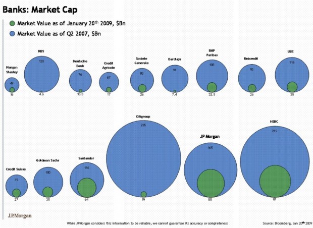
  • Are bubble charts effective? This seems to be a recurring question. Some say people suck at comparing areas in the form of bubbles, or rather, people are horrible with areas, period. Others argue that it just takes some getting used to; the eye has to be trained, and once that’s done, the bubbles are good to go.

    In any case, here is an alternative to the bubbles — bars. The beer data from a previous post are charted (2006 shipments on the left, and 2005 shipments on the right). The advantage of bars over bubbles is that users only have to compare heights; however, numbers are going to clutter quickly as more observations are added.

    People should just train their eyes. Bubbles are so much more fun. They’re bubbly.