This is a guest post by Simit Patel of InformedTrades, which offers free advice on trading stocks.
While many investors use economic and fundamental factors to identify investment opportunities — i.e. whether a company has good management and is in a growth industry, or how it will be affected by macroeconomic conditions — ultimately the price of an asset comes down to two things: supply and demand. The demand for buying vs the demand of selling. By visualizing the movement of price assets, we can gain an understanding of the psychology of the market as a whole, and thus what direction the price will go.
Let’s look at the exchange rate of the Euro vs. the US dollar to see how this works.

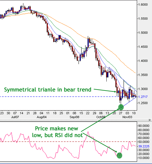
The Euro-US dollar exchange rate has been in steady down trend since July of 2008. Recently, however, the market has been consolidating some of its movements. You’ll notice the price makes a triangle shape of late; in other words, it is making lower highs and higher lows on a daily basis. Put simply, its range is contracting. The triangle is identified by drawing two trendlines — one that tracks the fact that highs are declining, and another one that shows that lows are rising.
For traders, there is one key question: when is the market going to break out of the triangle? When the market breaks out of the triangle, it would suggest that the battle between buying and selling demand has been won by one side (at least for the short-term). As such, many traders will short sell (i.e. place a bet that the price will fall) if the price breaks out of the triangle to the downside; conversely, they will enter a buy order if the market breaks out of the triangle to the upside. In the chart above, the EURUSD exchange rate fell below the bottom triangle line, and then proceeded to fall even more. It was a sign that selling demand has the upper hand.

 Visualize This: The FlowingData Guide to Design, Visualization, and Statistics (2nd Edition)

Bollinger Bands might be interesting for this, they are based on the std deviation over 2 periods: http://en.wikipedia.org/wiki/Bollinger_bands
My first comment on this blog is to affirm Ben’s suggestions. Bollinger Bands area great visualization tool for market analysis if used appropriately and analyzed as one factor in a larger set.
Yes, bollinger bands can be a useful tool. In my opinion they work especially great in markets that are rangebound and not clearly trending in one particular direction; in such scenarios, they tend to bounce off the bands and return to the mean.