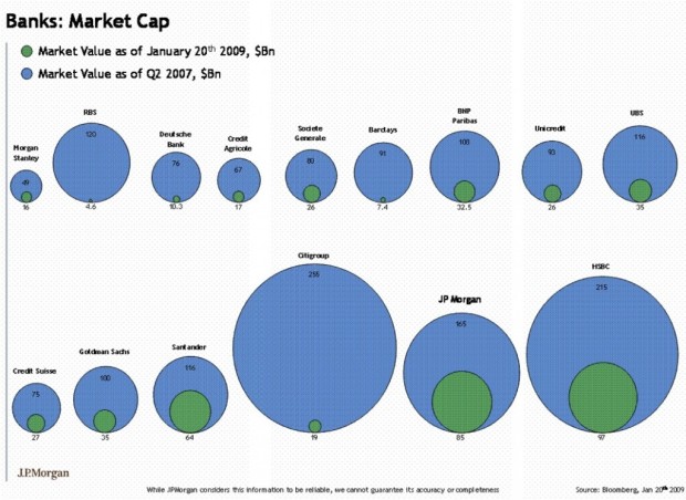
• Are bubble charts effective? This seems to be a recurring question. Some say people suck at comparing areas in the form of bubbles, or rather, people are horrible with areas, period. Others argue that it just takes some getting used to; the eye has to be trained, and once that’s done, the bubbles are good to go.

    In any case, here is an alternative to the bubbles — bars. The beer data from a previous post are charted (2006 shipments on the left, and 2005 shipments on the right). The advantage of bars over bubbles is that users only have to compare heights; however, numbers are going to clutter quickly as more observations are added.

    People should just train their eyes. Bubbles are so much more fun. They’re bubbly.

  • Maybe someone can help me with this. I’m shifting focus from static graphics (with Adobe Illustrator) and moving onto dynamic data visualization with Flash and Actionscript. Does anyone have any book or site suggestions that you’ve found particularly helpful in data visualization?

    I have three books sitting in front of me right now:

    1. Hands-on Training for Macromedia Flash Professional 8 from Lynda
    2. Essential Actionscript 2.0 from O’Reilly
    3. Macromedia Flash 8 @work from Sams

    I started going through Essential, and I’ve clearly forgotten what a chore it is to learn a new programming language in the early beginnings. To read books about code is particularly boring to me. Although I suppose it’s necessary. I’ve also read a lot of the Hands-on book, which wasn’t exactly my cup of tea either. Going through the tutorials reminded me a lot of the ArcGIS crash course I took earlier this year. “Click this to do that, and click that to do this. Click this and that to do that and this. After you’re done, voila. You get this…and that.”

    For an idea of what I can do already: I mainly have R, PHP, and some Processing behind me, and then there’s the computer science courses I took in undergrad at Berkeley, which I guess has been about four years ago now.

    So if anyone has any ideas or suggestions on what books to read, online resources to check out, or aspects of Actionscript and/or Flash I should focus on, please, I am all ears.

  • GOOD Magazine is “media for people who give a damn.”

    While so much of today’s media is taking up our space, dumbing us down, and impeding our productivity, GOOD exists to add value. Through a print magazine, feature and documentary films, original multimedia content and local events, GOOD is providing a platform for the ideas, people, and businesses that are driving change in the world.

    My favorite part of the magazine is the transparency section, which is a series of graphics displaying data in one way or another. The graphic (or video, I guess) above shows what companies are paying to advertise in New York City. The Walmart graphic I talked about earlier is in the most recent GOOD.

    What if…

    What if instead of just a section, there was an entire magazine that was a transparency section? Now that would be awesome. It could be a mix of the media & design in GOOD with some real statistical graphics. It would be a complete visual experience with of course a short blurb on each, but the magazine would focus on the graphics to inspire change and improve awareness. (Picture good. Words…. baaaad.)

    Each issue would hover around a specific theme like the environment or economics; or even better, each issue could be more specific covering U.S. pollution or the decline of toy sales. I wonder how hard it would be to start something like that. Online first, print second? Is there a magazine already like this? If there isn’t, there needs to be.

  • Icastic has a fun (and growing) collection of (currently) 247 hand-drawings from contributors who have shown how they see time. Some are very detailed works of art while others are concise sketches. From words, objects, to people, the collection is a nice spectrum of imagination.

  • We look up at the starry sky and we sense a fear of not comprehending and being engulfed, a fear of the unknown, and simultaneously we experience a longing for the inaccessible, impenetrable darkness.

    Lisa Jevbratt. The Prospect of the Sublime in Data Visualization. 2004.
  • American store square footage

    Speaking of Walmart, if we took all of the Walmarts in the world and clumped them all together, they’d cover Manhattan (with some stores sinking in the water). Walmart is the bottom bubbles; McDonald’s is represented by the second from the bottom set.

    I’m slightly surprised that McDonald’s doesn’t cover more. Although, I guess Walmart stores are pretty big compared to McDonald’s restaurants. I’m not really surprised that Walmart area is greater than Manhattan area though. In fact, I thought it would have been more with all the Walmarts in the world. Hmmm…

    Into the Artistic Section

    As for this graphic, well, if it were supposed to be statistical, I’d say I didn’t I like it. It’s not meant to be statistical though. The goal is to show that Walmart is humungo. I get the graphic’s main point, which is… the point. To that end, I couldn’t care less about proper scales, utility, and what not. Take it for what it is and enjoy.

    This Walmart graphic goes in the artistic section of viz, opposed to the pragmatic side (as Robert explains). There are three other graphics similar in feel to this one that cover sugar consumption, student debt, and solar power.

  • TISE Journal LogoTechnology Innovations in Statistics Education (TISE) is a new e-journal that was just announced yesterday. The use of technology (e.g. data visualization) has become extremely important in teaching statistical concepts to newbies, and so this new journal will be really useful; computers have allowed students to explore and experiment in ways students couldn’t do with just paper and pencil. TISE explores these alternatives.

    Technology Innovations in Statistics Education (TISE) publishes scholarhip on the intersection between technology and statistics education. The current issue includes papers by George Cobb (who challenges the introductory statistics curriculum to radically innovate to adapt to new technology), Beth Chance et. al, (who provide an overview of the use of technology to improve student learning), Wlliam Finzer, et.al, (who describe software innovations for improving student access to data), Dani Ben-Zvi, (preliminary research results on using Wiki in statistics teaching), Daniel Kaplan (on the role of computation in introductory statistics), and Andee Rubin (an historical overview of technology in statistics education.)

    These papers can be read at http://tise.stat.ucla.edu. Please click on the “subscribe button” to join the mailing list to be informed of future released.

    TISE is seeking scholarly papers for Volume 2 that address any of these themes:

    • Designing technology to improve statistics education
    • Using technology to develop conceptual understanding
    • Teaching the use of technology to gain insight into and access to data

    The first issue is already online. Take a look. I’ve had the opportunity to work with some of the knowledgeable and active members of the editorial board, so TISE looks to be very promising.

  • Raw, fine-grain data is still a bit hard to come by. Summary statistics (i.e. data that came from some analysis), on the other hand, are often easy to find. A lot of the time the data is already online or just a simple phone call away.

    The National Center for Education Statistics, a part of the U.S. Department of Education, offers a bunch of data including, but not at all limited to, poverty and math achievement, average science scores overall and by grade level, and quantitative literacy.
    Read More

  • Social Data Analysis

    I stumbled across the Social Data Analysis workshop, happening as part of CHI 2008. It is being organized by none other than IBM Visual Communication Lab’s Martin Wattenberg and Fernanda Viégas in addition to UC Berkeley’s Jeffrey Heer and Maneesh Agrawala.

    The goals of this workshop are to:

    • Bring together, for the first time, the social data analysis community
    • Examine the design of social data analysis sites today
    • Discuss the role that visualizations play in social data analysis
    • Explore how users are utilizing the various sites that allow them to exchange data-based insights

    We seek researchers and practitioners whose work explores social data analysis and/or social uses of visualizations. We hope for a lively mix of people actively involved in building sites and academics who study the dynamics of social software.

    The workshop happens during CHI, April 5-10, and you need to submit a 2-4 page position paper by October 31, 2007. Oh and by the way, it’s in Florence, Italy. Not too shabby.

  • Pollster Poll Results

    It almost feels like I see a new poll every day for who’s leading in the presidential race. There’s usually a good amount of fluctuation within a single poll with sampling margin of error and then of course the numbers vary across multiple polls. This can be confusing at times, so Pollster put all the results in one scatter plot. Then they stuck a smoother through all the points (for each candidate), and just like that, the viewer gets a general sense of how each candidate has been doing.

    Keep in mind that the amount of noise (or bumps in the curve) is going to vary depending on the type of estimation you use, so I wouldn’t place the smaller curves under too much scrutiny. I’m not sure what method Pollster is using, but it’s interesting to see the overall trends. Could we be looking at a double New Yorker election?

    Pollster also offers the raw poll data, so in case you want to have some of your own fun, there’s data waiting for you.

    [via Mike Love]

  • Watch Walmart quickly expand like a deadly virus from the movie Outbreak. It’s particularly interesting to see Walmart “infect” an entire small region with multiple new stores opening at the same time in one area. There looks to be somewhere around 30 stores opening per year (rough guess) across the country, so I wonder what the map looks like now. It’s probably all blue except in those deserted Midwest regions. I wonder what the world map looks like.

    Random quote:

    When I lived in Maine, there wasn’t much to do, so when we were bored on a Friday night, we’d go hang out at Walmart.

    That’s kind of sad, but uh, if that’s your thing, well, no, still sad.

  • When I was in NYC and my wife was in Buffalo, New York we talked on the phone almost every day, usually around ten in the evening. I was at my friend’s place one night, and at 10:05pm, my wife called.

    The first thing she said was, “Where are you?”

    I told her I was at my friend’s.

    My wife quickly replied, “Ha! I knew it!”

    Confused, I asked, “How did you know?”

    “Because otherwise, you would have called me at exactly 9:58.”

    Am I really that predictable? First it was the Chinese food, and now I had been accused of call time predictability. Of course there was only one way to put this dispute to rest — look at the data.
    Read More

  • Dear Many Eyes,

    From the moment I stared into your thousands of solid black eyes, I knew we had something special. Since the day we met you’ve shown me the silver lining in my data and pointed out details that I never would have found on my own. You’re never pushy or arrogant about it; you always let me learn for myself. You believe in my natural pattern-finding ability the same way I believe in your big, beautiful exploratory tools.

    Many Eyes, I want to tell you something. I just want to, well, let you know why you’re so high up on my bookmark list. You should also know there’s some ways that you can improve, but please don’t take it personally. I just want you to be all that you can be.

    Sincerely,
    Nathan

    Read More

  • World Freedom Atlas is an online geo-visualization tool that shows a number of freedom indicators so to speak. For example, you can map by a number of indexes such as raw political rights score, civil liberties, political imprisonment, freedom of religion, freedom of speech, or torture. If I’ve counted correctly the data comes from 42 datasets divided into three categories:

    1. What It Is
    2. How To Get It
    3. What You Get

    What It Is covers data such as political rights and civil liberties while How To Get It is data on government structure and education system. I’m not really sure What You Get is though. There’s GDP and some economic indexes, so it could be something like quality of life. Maybe someone can explain it better?

    The mapping and plots are pretty standard, but what stands out is the number of datasets that have been formatted in such a way the user is able to map things quickly and easily. It would be really cool if the data was explained a little better, so that I could “browse” the data a bit more efficiently, and even better, if there were some way to compare indicators against each other. Nevertheless, worth exploring a bit.

  • I just saw Stranger than Fiction. The main character, Harold Crick, spends much of his life counting. He counts the number of steps it takes for him to walk from his home to the bus stop; he brushes his teeth 76 times every morning; he takes a 45.7-minute lunch break and a 4.3-minute coffee break.

    So much counting and tracking. Sounds kind of familiar. Maybe a little too familiar? Nah.

    71 words. 320 characters. Nine sentences. Wait, now ten. Eleven. Err, twelve…

  • If you have a blog, I’m sure you’ve heard of the the ever so popular ProBlogger blog. To celebrate, Darren is giving away $54,000 worth of prizes! The current giveaway is for two 20-inch USB monitors, and all you have to do is post about the giveaway (hence this post :). They’re going to have a random drawing some time Friday night. If you don’t need the monitor, there’s a whole lot of other cool stuff being given away in the next few days.

    At the Times, I got used to using a super sexy Apple high resolution wide screen to create graphics, but back at home I’ve just been using my laptop and a not-so-hot 1280p 19-inch LCD screen. It’s true what they say about productivity and screen real estate — especially with visualization. I sure wouldn’t mind having these two 20-inch monitors.

  • What the heck’s a data guy? According to Gerard, who studied computer science and economics in college

    It means that I’m the type of person who, instead of planning for a vacation like a normal person, will write a script to pull down airline data for all possible destinations and routes, load the data into R and perform a regression analysis to find the best time to buy.

    Oh, so that’s what a data guy is. I guess that makes me a data guy.

    This should be good for Swivel, who has seemed to be missing the “data guy” piece of the puzzle. Will Swivel’s visualization tools improve? Will data become more reliable on Swivel? I don’t know. It’s possible. There’s definitely a lot of work to be done, so one person won’t be enough, but hey, it’s a start. It’s not often that I see a computer science / economics person. I’m an electrical engineering and computer science / statistics person myself, and I like to see people with dual backgrounds (even if they did go to the other school across the bay).

    That being said, applications like Swivel, Many Eyes, and Data360 make me wonder where all the statisticians are. I see mathematicians, designers, economists, and businessmen. Come on statisticians. Show yourselves. The world needs you.

  • Beer Shipments in 2006Anheuser-Busch (Budweiser), Miller, and Coors lead the way in beer. Albeit, this is shipment data, not sales data, so take the numbers with a grain of salt.

    The extreme dominance of the top three American beers was somewhat surprising to me, because I never see people order any of those three at restaurants. However, I gave it a few more seconds of thought. I’m thinking parties, sporting events, and drunken nights. The American beers go down easier (because they’re like water), so it’s easier to get drunk. To get drunk, people drink more. So I guess the watery dominance isn’t that surprising. I guess when people buy beer for taste at restaurants, they look to different brands.

    Anyhow, I’m really starting to become a fan of these bubble charts. They’re really easy to read and can quickly spruce up a hard-to-read table of numbers. They also seem to scale decently. By well, I don’t mean in like the thousands, but in the tens, I think the bubbles can hold their own.

    What kind of beer do you prefer?


  • UCLA Statistics has a pretty extensive list of resources on how to use R and GRASS. For those unfamiliar, R is a programming language and environment for statistical computing and graphics. GRASS is an open source geographic information system (GIS). And of course, both are completely free and completely useful.

  • The StatGrad discussion board is now online — a place where stat students can hang out.

    Red CouchOne of the things I miss most about going to school is hanging out with my cohort. I work from home in Buffalo, and I get bored and restless pretty easily. When I was at school and feeling restless, I could just go down to the stat lounge, sit on the ridiculous-looking Ikea couch, and relax with some classmates. We never sat around and talked about probability theory or the law of large numbers (ok, maybe we did sometimes), but because we were all stat students, we all had this data-ish way of thinking. Know what I mean?

    That’s what I’m hoping for StatGrad. I’m not interested in finding help for specific stat problems or trying to answer R questions. There are plenty of books and online resources for that type of stuff. I’m just hoping that StatGrad can become a place where stat grad students can hang out when they’re bored. Complain about undergrads, discuss anything interesting happening in our field, look for job opportunities, and stay up to date on calls for papers.

    Join StatGrad now. I know you want to. Please? Come on, I’m bored.