The Known Universe from the American Museum of Natural History shows a view of the universe, starting from the Himalayas and quickly moving out to the edge where all is black and scary – made possible by the records in the Digital Universe Atlas.
Read More
-
-
Did we all see this? Phillip Niemeyer of Double Triple pictures the past ten years in this Op-Chart for The New York Times. Each row is a theme, and each column represents a year. For example, the champion rep for 2007 is Tiger Woods or collagen as the fad of 2002. Oh how times change.
Have a happy new year everyone. Be safe.
[via WeLoveDataVis]
-
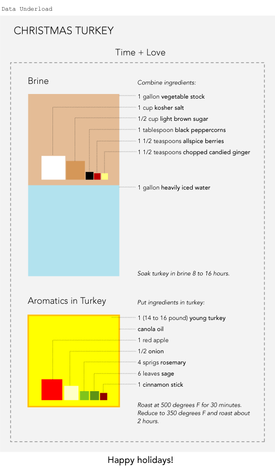
Merry Christmas, everyone! I hope you’re having a great holiday season so far. Good food, good company, and more good food.
This will be my last post for the year, but don’t fret. FlowingData will return to its regularly scheduled programming January 1. Take a look through the archives if you start to go through withdrawl. Don’t worry – it’s all going to be okay.
See you all next year.
-
This experiment (below) by graduate student Pedro Miguel Cruz shows the decline of Maritime empires during the 19th and 20th centuries .
Pedro explains:
I don’t wanna call this small experiment of information visualization neither information art. Either way sounds too pretentious – as the visuals are not very sophisticated or elegant, and the way that the information is treated doesn’t enable the extraction of advanced knowledge. Although, it works very well as a ludic narrative. I ultimately found it very joyful.
So sit back and enjoy. It’s fun to watch.
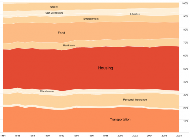
Let’s for a second consider an alternative to view this data more analytically for some more insight and what not. I’m thinking an area graph ala Fernanda Viegas and Martin Wattenberg’s History Flow for Wikipedia dynamics could be interesting. What do you think?
-
In celebration of Information Aesthetics’ birthday, Moritz Stefaner of Well-formed Data adapted his elastic lists concept to all five years of infosthetics posts. Each white-bordered rectangle represents a post, and colors within rectangles indicate post categories.
Select categories on the right, and the list updates to show related categories. Similarly, filter posts by year, author, and/or number of categories. Select a rectangle to draw up the actual post.
Go on, give it a try for yourself. Excellent work.
And then head over to infosthetics and wish it a happy birthday.
-
Statisticians are generally behind the times when it comes to online applications. There are a lot out-dated Java applets and really rough attempts at getting R, a statistical computing environment, in some useful form through a browser. So imagine my surprise when I tried this tool by Jeroen Ooms, a visiting scholar at UCLA Statistics.
It actually works pretty well, and for a prototype, it isn’t half bad.
Read More -
This interactive by Las Vegas Sun describes how in the long run, you’re going to lose every single penny when you throw your hard-earned money into a slot machine. In the short-term though, it is possible to win. It’s all probability. It’s also why statisticians don’t gamble. Nobody plays a game that he’s practically guaranteed to lose, unless you’re a masochist – or you’re Al Pacino in that one horrible sports gambling movie with Matthew McConaughey.
One clarification on the snippet about payout percentage.
Here’s what the graphic reads:
This is the ratio of money a player will get back to the amount of money he bets, which is programmed into the slot machine. If a machine has payout percentage of 90 percent, that means 90 percent of the money someone bets should statistically be won back. It means a player is not likely to lose 10 percent of the amount initially put into the machine, but rather 10 percent, on average, over time.
The wording is kind of confusing. To be more clear – over time, on average, you’d lose 10% of the money you put in per bet. This is an important note, because it’s how casinos make money. For example, when you play Blackjack perfectly (sans card-counting), you’ll lose on average 2% (or something like that) per hand, so play long enough, and you’re going to lose all your money.
Imagine you have two buckets. One is filled with water. The other is empty. Transfer the water back and forth between the two buckets. Some of the water drips out during some of the transfers. Eventually, all the water is on the ground.
Ah yes, intro probability is fun. Play the virtual slot machine and do some learning for yourself.
[Thanks, Tyson]
-
It was another interesting and sometimes exciting year for FlowingData. To think, I was beaming when there were 7,000 of you at the beginning of 2009. Now there’s almost four times that many of you, just over 26k. It’s crazy. I’m scared. Hold me.
Here are the top posts of 2009 based on traffic:
- 27 Visualizations and Infographics to Understand the Financial Crisis
- Unemployment, 2004 to Present – The Country is Bleeding
- How Long People Live in America
- Little Red Riding Hood, the Animated Infographic Story
- Maps of the Seven Deadly Sins
- Pixel City: Computer-generated City
- Fox News Makes the Best Pie Chart. Ever.
- Choose Your Own Adventure – Most Likely You’ll Die
- 37 Data-ish Blogs You Should Know About
- Mapping and Animating Growth of Target Across United States
-
You know when you go to another country and have no clue what the coins of the local currency are worth? I always end up with a giant handful of international coins, which doesn’t go well when I try to spend a Euro in Canada. The US vending machine won’t take my Canadian quarters either, or my pesos.
Read More -
It was a huge year for data. There’s no denying it. Data is about to explode.
Applications sprung up left and right that help you understand your data – your Web traffic, your finances, and your life. There are now online marketplaces that sell data as files or via API. Data.gov launched to provide the public with usable, machine-readable data on a national scale. State and local governments followed, and data availability expands every day.
At the same time, there are now tons of tools that you can use to visualize your data. It’s not just Excel anymore, and a lot of it is browser-based. Some of the tools even have aesthetics to boot.
It’s exciting times for data, indeed.
Read More -
Thank you sponsors. You keep FlowingData up and running, and I wouldn’t be able to handle the growth otherwise. We just hit the 26k-subscriber mark a couple of days ago. Yikes.
Check out what these fine groups have to offer. They help you understand your data:
Xcelsius Engage – Create insightful and engaging dashboards from any data source with point-and-click ease.
NetCharts – Agile Performance Dashboarding™ for business users.
Business Intelligence – Visual data analysis made easy. Try 30 days for free.
FusionCharts – Convert all your boring data to stunning charts. Download your free trial now.
Xcelsius Present – Transform spreadsheets into professional, interactive presentations.
Tableau Software – Data exploration and visual analytics in an easy-to-use analysis tool.
InstantAtlas – Create and present compelling data reports on geographic maps.
Email me at nathan [at] flowingdata [dot] com if you’d like to sponsor FlowingData, and I’ll get back to you with the details.
-
Bestiario, the group behind 6pli and a number of other network projects, released their most recent project – Canvi & Temps – that explores the complexity of science since the early 1920s.
Read More -
your.flowingdata got a couple of cool updates recently. One is based on your interactions with others on Twitter and the other helps you find relationships in your actions.
Twitter Mentionmap
The first is the Twitter Mentionmap created by Daniel McLaren. It’s a network visualization (above) that lets you explore how you (or other Twitter users) interact with others.
It’s not focused on the data that many of you are used to seeing on YFD, but it’s always been my plan to bring in other data sources. So when I saw Daniel post the original Mentionmap, I jumped at the chance to get a version for YFD. It seemed like a good first step to branching out. Get it? Network, branching out. Oh nevermind.
By the way, Daniel used his constellation framework to build this. It’s called asterisq. It’s worth a look if you’re looking to visualize network data. Daniel can also help you with customization and design.
Read More -
I bet you wake up every morning wishing, “I wish there was an easier way to decide what cereal to eat! There’s so so many choices that I get a headache just thinking about it.” Well say goodbye to headaches. You wish is now reality. From Eating the Road is this flowchart to help you figure out life’s greatest challenge: what cereal to eat.
-
The end of 2009 is looming, and it’s about time to make this year’s picks for best visualizations. I was sifting through the archives the other day. The selection is going to be tough. I need your help.
What was the best visualization of 2009?
It can be something I’ve posted or not; it can be serious or humorous; interactive or for print; art or analytical; map or chart. To jog your memory, here is some of the visualization stuff we’ve seen this year, and here are my picks for last year for reference.
So what do you think?
-
What if you could see all the individual bits of information scattered across the Web in one view and then interact with it in a meaningful way? This is what Microsoft Live Labs’ new Pivot experiment tries to do.
Pivot makes it easier to interact with massive amounts of data in ways that are powerful, informative, and fun. We tried to step back and design an interaction model that accommodates the complexity and scale of information rather than the traditional structure of the Web.
The goal is to let users make connections between pages, data points, photos, etc that go beyond links, with what the developers call collections. The below video is a demonstration and explanation:
Pivot’s ability to display lots of thumbnails and then reorganize and zoom in on them is the tool’s foundation. The transition between each view involves a flutter of thumbnails, which sort of provides a link between data arrangements. The browsing behavior looks a lot like that of Photosynth, a Live Labs project that lets you browse giant bundles of photos.
Jeffrey Heer et. al. wrote a paper on these transitions a while back. I can’t really say whether it works or not. I suspect it’s more about a fun factor once you get into higher volumes of data than it is about making connections. That’s not to say it’s not important, of course. After all, most of the Web is about entertainment in some form or another.
All in all, it’s an interesting concept, and it will be fun to see where the Live Labs team takes the project.
Pivot is currently by invitation only, but I have a handful of invites (10 to be exact) for you guys. Download Pivot from here, and then use this activation code: 3C5D 19BD B7DA 3186. Come back here and let us know what you think in the comments.
[Thanks, Jeff]
-
How to Make an Interactive Area Graph with Flare
You’ve seen the NameExplorer from the Baby Name Wizard by Martin Wattenberg. It’s…
-
Nebul.us is an online application, currently in private beta, that aggregates and visualizes your online activity. Enter your information for Twitter, Facebook, Flickr, etc and install a plugin in Firefox to record your browsing behavior. Get something that looks like the above, sort of a donut-polar area chart hybrid. Nebul.us calls it a cloud.
Read More


 Visualize This: The FlowingData Guide to Design, Visualization, and Statistics (2nd Edition)


