Designers Matt Robinson and Tom Wrigglesworth looked at ink usage of some commonly-used typefaces, by hand-drawing them with ballpoint pens.
Read More
-
-
I’m sure a lot of you love The Beatles. I’m not a huge fan myself, but for those who are, you will love these graphics from designer Michael Deal.
The graphic up top shows the level of collaboration between group members. The level of shared authorship was a lot higher early on and then pretty much died off before the breakup.
Read More -

Today is Data Privacy Day 2010, apparently. Was there a Data Privacy Day 2009? I dunno. To be honest, I didn’t even care all that much about data privacy a couple years ago.
But it’s grown in importance as everything goes digital (and Google acquires every business under the sun).
Take a moment and think about what Google knows about you. Correspondence and contacts via email, schedule via calendar, interest via feed reader, purchases via Checkout, and most importantly your day-to-day via search. How do you feel about a single company knowing that much about you? Don’t you want to know how they use all that data and more importantly, how they protect it?
Read More -
David Spiegelhalter is a Professor of the Public Understanding of Risk at Cambridge University. He studies the choices we make, and how those choices can have an effect later on.
Read More -
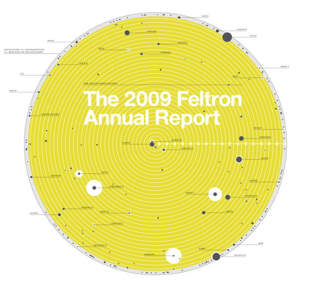
Nicholas Felton’s personal annual report on his life is now up. For those not in the know, Felton makes this report every year based on data he has collected about himself. People see the report, and think to themselves, “I want that for my life.”
Read More -
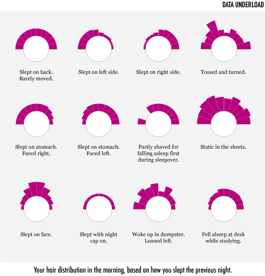
Your hair distribution in the morning, based on how you slept the previous night.
-
Since you’ll be trying every single drink recipe in the engineer’s guide this weekend, you’re most likely going to drop some food on the ground. Consult this flowchart to decide whether to eat it. Results may vary by individual.
Food on the ground, food on the ground. Looking like a fool with your food on the ground.
-

Seeing as the weekend is just about here, I’m sure many of you can find a use for this guide. It’s drink recipes hand-drawn like schematics to some circuitry system. I like how color wasn’t an option, so instead they used 42 stripe and dot patterns to differentiate ingredients.
See the full version here [pdf].
My sister sent this one along, but I couldn’t find the original source. Anyone know?
-
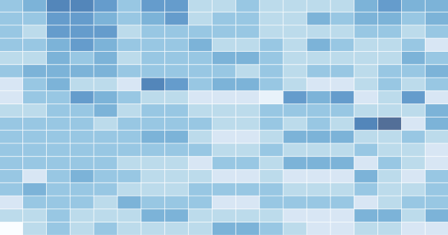
How to Make a Heatmap – a Quick and Easy Solution
A heatmap is a literal way of visualizing a table of numbers, where you substitute the numbers with colored cells. This is a quick way to make one in R.
-
Update: I had scheduled this post for next week, but apparently, Data.gov.uk launched today. The site isn’t loading for me right now though. I guess they weren’t prepared for traffic.
Data.gov, a catalog of US data, launched last year. Now it’s the UK’s turn. Well, not yet. But soon. Data.gov.uk is still under lock and key, but it has granted access to some developers. Ito Labs, the group behind mapping a year of OpenStreetMap edits posted screenshots of their maps that show vehicle counts (above).
Here are some comparison maps between 2001 and 2008, by vehicle type.
Read More -
I’m admittedly not very good with historical precedent, but I think we can all agree it’s important to know about the work those have done before us. It makes your own work better and lets you appreciate what others do more (or less).
Read More -
Thank you, sponsors. I wouldn’t be able to do what I do on this blog without you. It seems like FlowingData is growing faster every month, and you guys make that possible.
Check out what these fine groups have to offer. They help you understand your data:
Tableau Software – Data exploration and visual analytics in an easy-to-use analysis tool.
InstantAtlas – Create and present compelling data reports on geographic maps.
NetCharts – Agile Performance Dashboarding™ for business users.
Xcelsius Engage – Create insightful and engaging dashboards from any data source with point-and-click ease.
Business Intelligence – Visual data analysis made easy. Try 30 days for free.
FusionCharts – Convert all your boring data to stunning charts. Download your free trial now.
Xcelsius Present – Transform spreadsheets into professional, interactive presentations.
Email me at nathan [at] flowingdata [dot] com if you’d like to sponsor FlowingData, and I’ll send you the details.
-
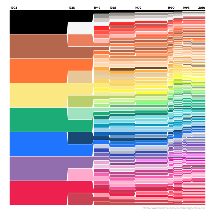
In 1903, Crayola had eight colors in its standard package. Today, there are 120, along with special packs like Gem Tones and Silver Swhirls. What happened? Above, from Weather Sealed, shows the growing color selection (and a few color retirements) in the standard package from 1903 to now.
In 2101, Crayola will hit a color peak and revert to a simpler time. The standard pack will have just two colors: black and Tickle Me Pink (#FC89AC).
[via Waxy Links]
-
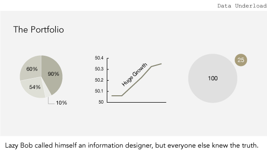
Lazy Bob called himself an information designer, but everyone else knew the truth.
-
It’s funny how data is finding it’s way into everyday objects. There was jewelry a few months ago and coins last month. Now we’ve got this experiment with Christmas ornaments from Really Interesting Group (RIG). The snowman’s head is sized by the number of followers on Twitter; the (rain) bars represent miles traveled per month on Dopplr; the red shows listening habits on last.fm; and finally, the blue one shows apertures you’ve used over the year for photos uploaded to Flickr. Read More
-
How do you compare music visually? You can break it down into data by quantifying the notes, volume, etc and then visualize it with timescapes (above). The horizontal axis represents musical time, from the beginning to end of a piece. Large blocks show similarities to other pieces and smaller noisy chunks show more “fleeting” similarities.
Read More -
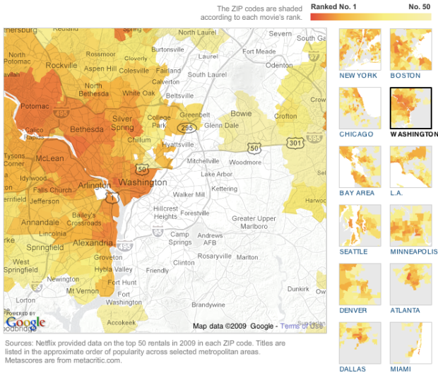
Some movies are popular everywhere. Others are popular only in certain regions. The New York Times, in a nice team effort, maps rental popularity by zip code for large regions in the US.
Read More -
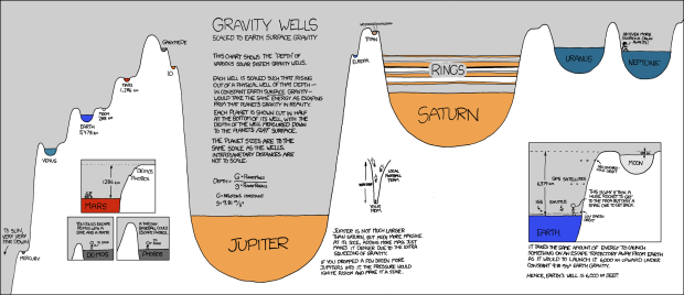
Randall of xkcd has been having fun with data visualization lately. In his latest data-ish comic, Randall explores gravity wells. The height of each well is sized relative to the amount of energy (on Earth) it would take to escape that planet’s gravity. The width of wells are scaled by planet size.
So you’d need one big arse rocket to escape Jupiter.
I know it’s a comic, hand-drawn, and all stick-figurey and stuff, but Randall actually explains the concepts really well. There’s good annotation, clear examples, and he’s made an obscure topic easy to understand.
It’s also entertaining in the Bill Nye the Science Guy (i.e. best Saturday morning show ever) sort of way.
[Thanks, Ricki and Thomas]
-
FYI: A new edition on the current state of the world is coming soon from FlowingPrints. Join the mailing list to be first to know when it’s available. I’m only going to take orders for one week this time around, so please please make sure you sign up. More info coming next week.
Read More
Recently for Members
Second Edition
 Visualize This: The FlowingData Guide to Design, Visualization, and Statistics (2nd Edition)
 Visualize This: The FlowingData Guide to Design, Visualization, and Statistics (2nd Edition)
New tools, refined process.
Browse by Chart Type See All →


