
I’m 96% sure this isn’t true. [Mark Goetz via dataviz]
I’m 96% sure this isn’t true. [Mark Goetz via dataviz]
A big thank you to FlowingData sponsors. They keep the virtual lights on around here and allow FlowingData to keep growing.
I can also tell you that all of them show up in the sidebar because I know they’ll be useful to many of you. Check out the data tools these fine groups have to offer:
InstantAtlas – Create and present compelling data reports on geographic maps.
Tableau Software – Data exploration and visual analytics in an easy-to-use analysis tool.
Xcelsius Engage – Create insightful and engaging dashboards from any data source with point-and-click ease.
Business Intelligence – Visual data analysis made easy. Try 30 days for free.
RWW Graph Contest – ReadWriteWeb Interactive Graph Contest
Create an interactive graph and enter to win a trip to Web 2.0!
Xcelsius Present – Transform spreadsheets into professional, interactive presentations.
You should have received your Census survey by now. Did you fill it out and mail it yet? If not, get to it. Tim Meadows can only do so many door-to-doors.
Read More
We’re inventors – we’re creators. And that’s the most important thing about what we do. And I think we should welcome failure every once in a while.
Hannah Fairfield – NYT Graphics Editor, Malofiej 18, March 2010
Last year at Malofiej, one of the major awards ceremonies for infographics in journalism, The New York Times took home ‘Best in Show’ for their work on box office receipts from 1986 to 2008. I’m sure most of you saw it. It was non-traditional. It was an adaptation of Lee Byron’s streamgraph, which he had previously applied to last.fm music listening habits – a smoothed stacked area chart at the core.
Read More
With his usual cleverness, Christoph Niemann illustrates the everyday as Google maps. My favorite is the omelet highway. Oh what a twisty and confusing highway this GPS-less life is.
Read More

Yesterday was the Interactive Infographics panel at South by Southwest, and if Twitter is any indication of how it went, I’d say the panel had a captivated audience. I wouldn’t expect anything less from the four panelists, Ben Fry (Processing), Shan Carter (NYT), Casey Caplowe (Good), and Eric Rodenbeck (Stamen)
Unfortunately, I didn’t get to attend, but luckily I was able to follow the play-by-play on Livefyre (sort of a cross between chat and forum) along with some excellent notes from @jpmarcum and @bryanconnor. Here are the important bits I was able to glean.
The bulk of the time was spent showcasing the work from the four groups. I think you can find most of the projects through FlowingData. Just use the search form on the bottom right of this page. The good stuff came towards the end during the Q&A.
Read More

Designer Christopher Harrell talks about, with a dose of various embedded graphics, pointing your skills toward something good. Harrell’s video was one of the winners in the What Matters to You scholarship competition for Vancouver Film School. It looks like home video, but that just adds to the charm.
Read More
In 1870, Francis Walker oversaw publication of the United States’ first Statistical Atlas, based on data from the ninth Census. It was a big moment for statistics in the United States as the atlas provided a way to compare data on a national level using maps and statistical graphics.
What continues to amaze me about these old illustrations is the detail – all done by hand. That’s ridiculous. The kicker is that a lot of this stuff looks way better than a lot of what we see nowadays. Here are some selections from the 1870 atlas.
Read More
If people put data on the Web – government data, scientific data, community data – whatever it is, it will be used by other people to do wonderful things in ways they never could have imagined.
— Tim Berners-Lee, TED, February 2010
Tim Berners-Lee, credited with inventing the World Wide Web, comes back to TED a year after his call for open, structured data with a quick update. Spoiler alert: things are looking good – and they’re only going to get a lot better. But you already knew that, right?
Read More
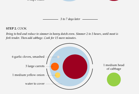
For as far back as I can remember, I’ve always had corned beef and cabbage on St. Patrick’s Day, or at least on the week of.

How to split up the US – Geographic clusters based on social network connections on Facebook. [thx, przemek]
Rise of the Infogeeks – Lots of graphic designers have taken a liking to information graphics.
Bay Area Rapid Transit (BART) gives augmented reality a go – Point your iPhone at the station and get info on when the next train is coming.
Google Public Data Explorer – Trying to get more mileage out of the Trendalyzer acquisition. [thx, eric]
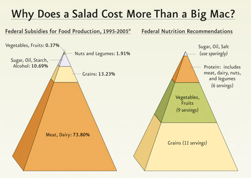
Here’s the idea. The government recommends a diet for healthy living (right pyramid), but at the same time there are billions of dollars of lopsided subsidies (left pyramid) whose distribution doesn’t look anything like the former. The Physicians Committee for Responsible Medicine (PCRM) used the above 3-d pyramids to present this information.
Interesting point. Funky presentation. Discuss (remakes highly recommended).
[via The Consumerist]
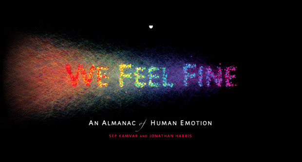
The opening page of We Feel Fine: An Almanac of Human Emotion reads a quote from “a woman in Maine.” It sets the stage for the rest of the book.
I have a problem I’m sure many other bloggers face: I am perfectly comfortable sharing intimate details about my emotions with complete strangers I meet online but shy away from expressing my true feelings to anyone I know in real life.
For those unfamiliar, We Feel Fine is a project from Jonathan Harris and Sep Kamvar that’s been online since 2006. At its core, the goal is to show the emotions of the authors behind millions of blog posts on the Web by looking for sentences that start with “I feel” or “I am feeling.” It’s an interactive artwork “authored by everyone.”
Read More
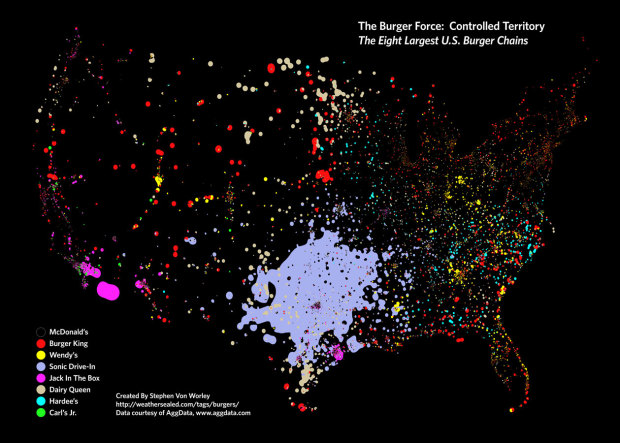
In a follow up to his McDonald’s map, Stephen Von Worley of Weather Sealed maps the dominating burger chains across the United States. McDonald’s obviously has a stronghold in a lot of areas but not all of them. Most noticeable is Sonic Drive-in with over 900 restaurants in Texas alone. Personally, I’m rooting for Carl’s Jr. and In-n-Out.
[via We Love Datavis]
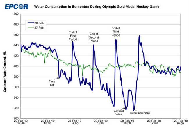
EPCOR, the water utility company that runs the fountains up in Edmonton, Canada released this graph yesterday. It’s water consumption during the Olympic gold medal hockey game, overlaying consumption of the previous day. How much do Canadians love their hockey? A lot.
The first period ends. Time to pee. The second period ends. Time to pee. The third period ends. Time to pee. Consumption goes way down when Canada wins and during the medal ceremony.
Finally, when it’s all said and done, the rest of the country can relieve itself, figuratively and literally.
[via contrarian | thanks, @statpumpkin]
In an effort to put transit data from the Toronto Transit Committee to better use, MyTTC provides a trip planner to help you find the best route from point A to point B. This video, compete with smart arses sitting on a couch, provides a peek into how the underlying algorithm works.
[Thanks, Canna]

Big news for all you Edward Tufte fanboys and girls. He will be joining the Recovery Independent Advisory Panel who will advise The Recovery Accountability and Transparency Board. The Board’s purpose is to track and explain how the $787 billion in stimulus funds is being put to use.
I’m doing this because I like accountability and transparency, and I believe in public service. And it is the complete opposite of everything else I do. Maybe I’ll learn something. The practical consequence is that I will probably go to Washington several days each month, in addition to whatever homework and phone meetings are necessary.
Whether Tufte will have a direct impact on graphs like these, I’m not so sure, but it certainly won’t hurt. I mean the man does know a thing or two about dispersing information.
[Thanks, Yuri and @tbeauchamp]

Footprints – Every building footprint, and nothing else, in Montgomery County, Ohio. It’s interesting how buildings can define an area.
Data, data everywhere – The Economist reports on the explosion of big data and the challenges that come with it.
Q&A With Shawn Allen of Stamen Design – Always interesting to hear from these guys [thx, tim].
The Case For An Older Woman – Another thoughtful analysis from the okcupid group on why men should be more open-minded to dating older women.
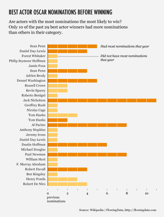
There’s this article on CNN, from The Frisky, that has this little theory about who is most likely to win the Oscar for best actor:
[T]he Oscar generally goes to the dude who has the most best actor and best supporting nominations under his belt already.
That seemed like a curious statement. Didn’t Forest Whitaker, Philip Seymour Hoffman, and Jaimie Foxx recently win on their first nominations for the coveted award? Okay, so Hoffman was actually up against a bunch of other newbies, but what about the rest?
Only 10 out of the past 29 winners, or just over a third, had the most nominations their year. Take a look at the data since 1980. Is the theory valid? You decide.
Read More


 Visualize This: The FlowingData Guide to Design, Visualization, and Statistics
Available now.
