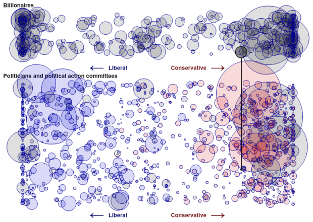
• Membership
  • Newsletter
  • Projects
  • Learning
  • About
  • Member Login
  • The future of self-service banking

    September 9, 2010

    Topic

    Misc. Visualization

    Too many slots. Too many buttons. Spanish bank BBVA and design consultancy IDEO rethink the ATM:

    ATMs were first introduced over 40 years ago and since then many features have been incrementally added to the machines, in order to fulfill the dream of a truly “automated teller”. Modern ATMs offer a wide range of banking transactions; nevertheless the actual interaction has remained largely untouched.

    Fewer slots. Fewer buttons. More privacy and personalization.

    [via]

  • Social life of Foursquare users mapped

    September 9, 2010

    Topic

    Maps

    Foursquare, the location-based social network, lets people share their location with others in the form of checkins. Map all of those checkins, and you get a sense of social hotspots across a city. This is what Anil Bawa-Cavia did in his project archipelago. Based on 845,311 checkins and 20,285 locations, he mapped activity for New York, London, and Paris.

    In these maps, activity on the Foursquare network is aggregated onto a grid of ‘walkable’ cells (each one 400×400 meters in size) represented by dots. The size of each dot corresponds to the level of activity in that cell. By this process we can see social centers emerge in each city.

    Here are the maps for each city.
    Read More

  • Faith and poverty in the world

    September 8, 2010

    Topic

    Statistical Visualization

    Using data from a recent Gallup report showing a correlation between wealth and faith, Charles M. Blow reports in graphic form. Each sphere, sized by population, represents a country. Spheres are colored by dominant religion in that country.
    Read More

  • Various ways to rate a college

    September 8, 2010

    Topic

    Network Visualization, Statistics

    There are a bunch of college ratings out there to help students decide what college to apply to (and give something for alumni to gloat about). The tough part is that there doesn’t seem to be any agreement on what makes a good college. Alex Richards and Ron Coddington describe the discrepancies.
    Read More

  • Poll: What do you use to analyze and/or visualize data?

    September 7, 2010

    Topic

    Polls

    I asked this same question a couple of years back. I wonder: has the software that people use for visualization and data graphics changed at all? Punch your answer in the poll below. If you select ‘other’ let us know your tool of choice in the comments.

    P.S. I know many of you use a combination of these. Pick your favorite if that’s the case.
    Read More

  • Tracking firefly trails in the forest

    September 7, 2010

    Topic

    Misc. Visualization

    Physicist Kristian Cvecek hangs out in the forest sometimes to take these beautiful pictures of firefly trails, using slow shutter speeds on his camera. Even better than the long exposure shot of a Roomba. [via]

  • Simple data converter from Excel

    September 6, 2010

    Topic

    Apps, Statistics

    If you’ve ever created an interactive graphic or anything else that requires that you feed in data, you will love this barebones data conversion tool by Shan Carter. Copy and paste data from Excel, which I feel like I’ve done a billion times, and then take your pick from Actionscript, JSON, XML, and Ruby. Simple, but a potential time saver. [via]

  • Statistical literacy guides for the basics

    September 3, 2010

    Topic

    Statistics

    You can get pretty far with data graphics with just limited statistical knowledge, but if you want to take your skills, resume, and portfolio to the next level, you should learn standard data practices. Of all places, UK Parliament has some short and free guides to help you with basic statistical concepts. They provide 13 notes, each only two or three pages long that can help you with stuff like how to adjust for inflation, confidence intervals and statistical significance, or basic graph suggestions [pdf]. I like.

    [via | Thanks, @joemako]

  • Problem solving flowchart (slightly crass)

    September 3, 2010

    Topic

    Miscellaneous  /  flowchart

    Flowchart Friday, anyone? This one describes the process to solve all of your problems. Unfortunately, sometimes in life, you just end up going around in circles. That’s what Maury Povich taught me.

    [via]

  • Mapping the moves of New York residents

    September 2, 2010

    Topic

    Maps

    A couple of months back, WNYC’s The Brian Lehrer Show asked listeners who have moved to or away from New York some questions. They asked current zipcode, previous zipcode, year of move, and some other questions. BLS then posted the data and let information and data folk have a go at it. Here are the results.
    Read More

  • Discuss: Graphs on Old Spice YouTube campaign

    September 2, 2010

    Topic

    Discussion

    I trust we’ve all seen the OldSpice YouTube campaign by now? This graphic from Know Your Meme categorizes videos by who they were directed to and how many views they received. For example, a video to Joe Blow would be in the low-profile category, while responses to Alyssa Milano go to the high-profile category.
    Read More

  • Real-time match display for the US Open

    September 1, 2010

    Topic

    Misc. Visualization

    The tennis US Open is in full swing, and since you’re at work, you probably need a way to keep up with all of the matches. In a collaboration between the US Open and IBM, this real-time display shows you what’s going on during any given match.
    Read More

  • FlowingData is brought to you by…

    September 1, 2010

    Topic

    Sponsors

    A big thank you to FlowingData sponsors for their support. They help me keep the lights on. Check ’em out. They help you understand your data.

    Splunk – Leading software used to monitor, report and analyze live streaming IT data as well as terabytes of historical data – located on-premise or in the cloud. More than 1,850 organizations in 70 countries use Splunk to gain valuable insights from their IT data.

    Tableau Software – Combines data exploration and visual analytics in an easy-to-use data analysis tool you can quickly master. It makes data analysis easy and fun. Customers are working 5 to 20 times faster using Tableau.

    Want to sponsor FlowingData? Email me for details.

  • What different sorting algorithms sound like

    September 1, 2010

    Topic

    Misc. Visualization

    Last month we saw sorting algorithms visualized in rainbow technicolor. Now, by Rudy Andrut, here they are auralized.

    This particular audibilization is just one of many ways to generate sound from running sorting algorithms. Here on every comparison of two numbers (elements) I play (mixing) sin waves with frequencies modulated by values of these numbers. There are quite a few parameters that may drastically change resulting sound – I just chose parameteres that imo felt best.

    It sounds like someone is playing on old Atari game. Warning: may cause seizures. Watch it in action in the video below.
    Read More

  • Best of FlowingData – August 2010

    August 31, 2010

    Topic

    Best of FlowingData

    It’s been a hectic month. With one month left until my thesis defense, there’s no letting up, and it’s time to turn on the after burners. It’s definitely been interesting though, culling everything I’ve learned these past five years.

    As it turns out, writing for FlowingData is actually a nice break from thesis-writing every now and then, so I’ve managed to keep things up and running around here. Thanks to everyone who has sent suggestions. You’ve been a big help. And of course, thanks to all who continue to share FlowingData. Much appreciated.

    In case you missed them, or you’re new, here are the top posts from this past month.
    Read More

  • How to visualize data with cartoonish faces ala Chernoff

    The goal of Chernoff faces is to show a bunch of variables at once via facial features like lips, eyes, and nose size. Most of the time there are better solutions, but the faces can be interesting to work with.

  • A house that knows when you’re happy and sad

    August 30, 2010

    Topic

    Data Art, Self-surveillance

    Auger Loizeau, in collaboration with Reyer Zwiggelaar and Bashar Al-Rjoub, describe their smart-home project Happylife. It monitors facial expressions and movements to estimate a family’s mood, displayed via four glowing orbs on the wall, one for each member.
    Read More

  • The beauty of data visualization

    August 30, 2010

    Topic

    Infographics  /  David McCandless

    Connoisseur of scaled rounded rectangles, bubbles, and triangles, David McCandless of Information is Beautiful talks data visualization in recently posted TED talk (below). He explains how information design can help us get through information glut on the Web and how simple charts can show patterns that we never would have seen otherwise. He uses his own works and collaborations as evidence.
    Read More

  • Asteroid discoveries over past 30 years visualized

    August 27, 2010

    Topic

    Maps

    This animation by Scott Manley of the Armagh Observatory shows a beautiful view of the past 30 years of asteroid discoveries, using data culled by Ted Bowell and company.

    As time passes, asteroids are highlighted white and then colored by how closely they come to our inner solar system. Earth crossers are red, Earth approachers are yellow, and all others are colored green.

    What you get is a view of the solar system’s planets and asteroids orbiting the sun and these beautiful sparkles in sky. As automated sky scanning systems come online in the 1990s, we see waves of discoveries. Then starting at the beginning of 2010, we see a discovery pattern as a result of the Wide-field Infrared Survey Explorer, which has been tasked with mapping all infrared light in the sky.

    Watch the full video below.
    Read More

  • Map of who owns the Arctic

    August 27, 2010

    Topic

    Maps

    Do you know who owns the Arctic? As it turns out, it’s a pretty messy subject:

    In August 2007 Russian scientists sent a submarine to the Arctic Ocean seabed at 90° North to gather data in support of Russia’s claim that the North Pole is part of the Russian continental shelf. The expedition provoked a hostile reaction from other Arctic littoral states and prompted media speculation that Russia’s action might trigger a “new Cold War” over the resources of the Arctic.

    Luckily things are at least a little more in control now though. Well, sort of. Canada, Denmark and the US still need to define their continental shelf limits. Keep in mind that the shelf can be more than 200 nautical miles from these countries’ coastal baselines.

    The International Boundaries Research Unit provides this map [pdf] of claimed boundaries and areas that will potentially be claimed in the future.

    [via]

  • Page 333 of 392
  • <
  • 1
  • ...
  • 330
  • 331
  • 332
  • 333
  • 334
  • 335
  • ...
  • 392
  • >

Analyze, visualize, and communicate data usefully, beyond the defaults.

Become a member →

Recently for Members

May 15, 2025
Step Chart, Enhanced

May 8, 2025
When the data is not what it seems

May 1, 2025
Finding the Right Charts

April 24, 2025
Visualization Tools, Datasets, and Resources – April 2025 Roundup

April 17, 2025
Breaking Out of Chart Software Defaults

Browse by Chart Type See All →

Streamgraph Pictogram Barcode Chart Beeswarm Parallel Sets Bar Chart Race Small Multiples Parallel Coordinates Dot Map Strip Plot

Browse By Topic

  • Visualization

    Seeing data

  • Maps

    Seeing geographic data

  • Infographics

    Explaining data

  • Networks

    Connecting data

  • Statistics

    Analyzing data

  • Software

    Working with data

  • Sources

    Getting data

  • Design

    Making data readable

Get the Book

Visualize This: The FlowingData Guide to Design, Visualization, and Statistics

Available now.

Order: Amazon / Bookshop

Made by FlowingData

  • The Process

  • Data Underload

  • Chart Everything

  • Guides

  • Books

  • Shop

  • About
  • Contact
  • Newsletter
  • LinkedIn
  • Instagram
  • Bluesky
  • RSS
Copyright © 2007-Present FlowingData. All rights reserved.