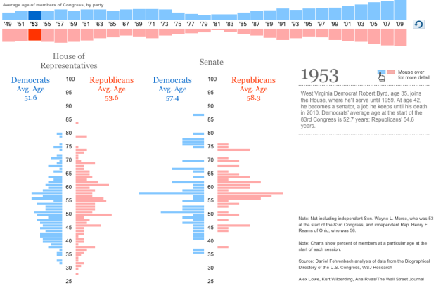
I don’t know about you, but I tend to associate Congress with an older generation. Just how hold are the folks who make up the Senate and House of Representatives? Alex Lowe, Kurt Wilberding, and Ana Rivas report for The Wall Street Journal with this interactive timeline and histograms.
The top shows average age of members while the histograms below show the distribution of ages for the current year. Roll over elements for details on age groups, etc.
On initial load, the animation plays through the years and the histograms change with it. So what you see is a subtle shift of the pyramid up the age scale. Sort of. The shift is actually so subtle that’s it’s pretty hard to notice. Maybe wider bins that cover a range more than a year would make the shifts more obvious? That might have made the fluctuations look more like this, which I think was the inspiration for this WSJ piece.
It’s good work, but I almost want to say it’d be better as a series of histograms per decade so that you can see everything at once. It’s hard to to say without actually trying it for myself though. What do you think?

 Visualize This: The FlowingData Guide to Design, Visualization, and Statistics (2nd Edition)
Couldn’t say, because I can’t see it. I surf the web with javascript turned off, and I’m normally willing to turn it on at respectable sites to see dynamic content. In this case, that wasn’t enough, since it wanted me to allow ad-tracker sites too.
Tip to slide hucksters: if you want your painfully created infographic to be seen by the computer literate public, you shouldn’t tie it to ad trackers and data snoop sites, even if you earn a nickel doing so.
I think it would be helpful to introduce another relevant variable to the graph: Average life expectancy over time. It stands to reason that as life expectancy goes up, so will the age of elected officials.
One way this correlation could be represented is by showing by what percentage the rise in the age of Senators and Representatives tracks the rise in average life expectancy of the U.S. population at large.
It would be good if the mouseover action included a list of the officials who are at each age, rather than just more detail on the percentages.
The manipulation of the y-axis scale in the top plot clearly overemphasizes the effect of age over time in a deceptive way. There isn’t even a scale to warn the reader that a modification has been made, though it seems that 50 years has been subtracted from each bar. An x-axis scale for the lower histogram ought to also be provided. Epic fail.
Pingback: This x That: Know This: Juan Williams on the termination of his… | weeklypop
Pingback: links for 2010-10-22 | KevinBondelli.com: Youth Vote, Technology, Politics
I didn’t look at the website, but the graphic you have suggests the intervals aren’t one year at a time. Rather, they represent each Congress, which is a two-year duration. Given this unusual feature, it’s probably a good way of showing the data–treating each Congress as it’s own average. Each election can change the average because the people (representatives and senators) can change.
Pingback: Mathew Analytics LLC » Blog Archive » Interesting Links #1