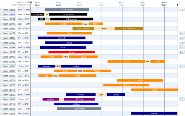
Booking flights became so much easier when it all shifted online, but it hasn’t changed in years. You put in your preferred dates and times and you get a long list of options. Oftentimes those listings can be a pain as you browse through all of your options. Oh the burden of choice. Hipmunk tries to make flight search easier with a visual interface.
As usual, you enter your origin and destination but instead of plain HTML tables, you get something like the above, and you can sort the options from least to greatest amount of agony. Rectangle lengths represent flight times and are color-coded by airline. Flights with the same take off and arrival times, but priced higher are hidden to help you narrow down quicker.
Hipmunk is still in the early stages, but a quick search shows a lot of promise.


 Visualize This: The FlowingData Guide to Design, Visualization, and Statistics