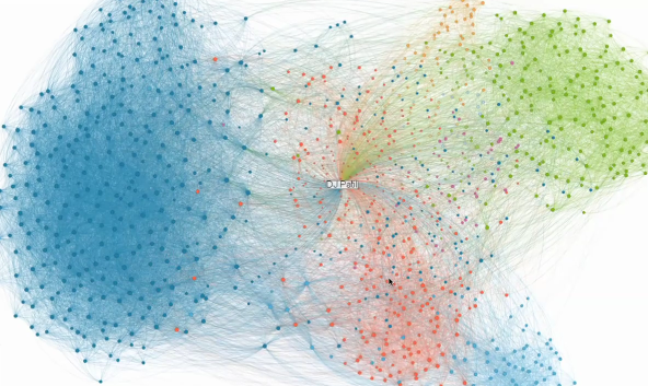
• Membership
  • Newsletter
  • Projects
  • Learning
  • About
  • Member Login
  • Billionaires’ favorite politicians

    November 1, 2010

    Topic

    Network Visualization  /  contributions, election, forbes

    Jon Bruner for Forbes reports on billionaire contributions to politicians over the past four years:

    The billionaires on the Forbes 400 list have given more than $30 million to politicians and political action committees since 2006, along with millions more in soft money to politically active groups. Although Forbes 400 members give about 15% more money to Republicans than Democrats, they fund groups across the political spectrum.

    On the top are the billionaires, sized by the amount of donations, and on the bottom are the politicians, sized by amount of contributions received. Click on either or use the drop down menus to see the connections.

    It lacks some polish, and I’m not totally sure what measurements are used for vertical and horizontal placement, but worth clicking around.

    [Thanks, @JonBruner]

  • The Election on Twitter

    November 1, 2010

    Topic

    Infographics  /  election, interactive, nytimes

    In what seems to have become an expectation during all major events, a Twitter tracker from the New York Times shows you what candidates are getting the most and least buzz. Each circle represents tweets from a candidate, retweets, and tweets direct at, colored appropriately by party. Press play and they grow and shrink over time. Select a specific candidate(s) to see the specific breakdowns.

  • Data Underload

    Data Underload #24 – My Candy

    One pound for them. Nine pounds for you. Happy Halloween. Watch out for…

    Read More
  • Stat concepts to the tune of Gershwin

    October 29, 2010

    Topic

    Statistics

    Stat people will probably find this amusing. For the rest, this might make your head explode. Gurdeep Stephens and Michael Greenacre perform classic songs but use statistical concepts for lyrics. Here’s Summertime, originally by George Gershwin, turned into a song about statistical modeling (video below).

    It’s summertime,
    Statistical modelling is easy,
    Data are fitting,
    Explained variance is high.
    Your data are rich,
    And your model’s good-looking,
    So hush, statisticians, don’t you cry…

    Read More

  • Famous logos and brands simplified

    October 29, 2010

    Topic

    Miscellaneous

    How well do you know your logos and brands? Or more importantly, how memorable are company logos that you don’t even need to see the whole thing to recognize where it’s from? Graham of ImJustCreative simplifies logos into basic shapes. The above is Google. That one’s easy. It’s got the shape. It’s got the color. Can you guess the rest?
    Read More

  • Why everyone should learn programming

    October 28, 2010

    Topic

    Coding  /  Daniel Shiffman, Processing

    Daniel Shiffman, assistant professor at the NYU Interactive Telecommunications Program, talks programming, computation, data, and why everyone should learn programming in this interview by Mark Webster.

    It’s not just about saving time. There are certain things you can discover and be creative with with computation that you can’t by hand. They both go together.

    Watch the four-minute interview below. The excitement in Shiffman’s voice alone might want to make you learn some Processing (which he wrote a useful book for).
    Read More

  • How people in your area spend money

    October 28, 2010

    Topic

    Apps

    The personal finance site Mint aggregates spending data from four million users. At the individual level, Mint is useful in that it brings all of your finances into one place. Zoom out and aggregate, and you have spending for a city or a state. This is what Mint Data does.
    Read More

  • Opportunities in Government 2.0

    October 27, 2010

    Topic

    Data Sources

    Vivek Wadhwa talks government data and the (financial) opportunities ripe for the picking:

    What is happening with the opening up of government data is nothing less than a silent revolution. There are literally thousands of new opportunities to improve government and to improve society—and to make a fortune while doing it. Unlike the Web 2.0 space, which is overcrowded, Gov 2.0 is uncharted territory: a new frontier to explore, grow things on, and settle on. It’s fresh soil for unlikely seedling ideas that, if they take root, could lead to very successful ventures. So I encourage entrepreneurs to stake their claims as soon as they can.

    Wait a minute. Hold up. You can do more with government data than awkward dashboards? Bring it.

    [TechCrunch via @ucdatalab]

  • Visualizing NFL statistics

    October 26, 2010

    Topic

    Statistical Visualization

    Sports statistics. Always so many tables. Juice Analytics takes a more visual approach with their interactive:

    Our NFL stats “spike chart” is an easy way to see who’s leading the league in passing, rushing, receiving, tackles, team offense, and team defense. By showing key metrics side by side, you get the full picture of a player or team performance—not just the highlights.

    It’s pretty straightforward. Select a category on the top, such as passing or rushing, and then see how your favorite players rank in four subcategories. Each player is represented by his team logo. Roll over a logo to see a player’s numbers as well as how they rank in all the subcategories, highlighted by a white square.

    Finally, use the search box to find the player of interest. Matching boxes highlight as you type.

    Such a simple idea. Well executed.

    [Juice Analytics]

  • Unemployment rates over this past year

    October 26, 2010

    Topic

    Projects  /  labor, project, unemployment

    I took a look at unemployment rates about a year ago, and I got to wondering if it’s changed at all over the past year. Not really. It’s still stuck in the 9 to 10 percent range, according to the Bureau of Labor Statistics. It looks like it could be a while until things get better.
    Read More

  • Iraq War logs released by Wikileaks shed new light

    October 25, 2010

    Topic

    Maps

    This past Friday, Wikileaks released a second batch of reports on Iraq:

    At 5pm EST Friday 22nd October 2010 WikiLeaks released the largest classified military leak in history. The 391,832 reports (‘The Iraq War Logs’), document the war and occupation in Iraq, from 1st January 2004 to 31st December 2009 (except for the months of May 2004 and March 2009) as told by soldiers in the United States Army. Each is a ‘SIGACT’ or Significant Action in the war. They detail events as seen and heard by the US military troops on the ground in Iraq and are the first real glimpse into the secret history of the war that the United States government has been privy to throughout.

    The New York Times has reported the data in dept with a series of maps, along with a number of articles. One maps shows one of the deadliest days in 2006 in Baghdad, when there were a reported 114 episodes of violence (above).
    Read More

  • Join FlowingData fantasy basketball pool

    October 24, 2010

    Topic

    Site News

    The basketball season is going to start soon (finally). To make the season more interesting, I’m starting a FlowingData fantasy basketball pool, and you’re invited. It’s a combination of data and basketball. Pure awesomeness.

    It’s a $20 chip-in, and winner takes all. Want to join in on the fun? Just email me with “I’m in” in the subject header, and I’ll send over the info. We need at least 10 teams, and the maximum is 20, so the earlier you reply, the better. Let the games begin!

  • How to have an idea

    October 24, 2010

    Topic

    Quicklinks

    Designer Frank Chimero describes how to have an idea with back-of-the-napkin sketches. “Creative people romanticize mistakes and process. But there is no process if you don’t start. No one crumples a blank sheet of paper.”

  • Privacy and the Internet

    October 22, 2010

    Topic

    Miscellaneous

    Simplified. Still a helpful reminder.

    [buriednexttoyou via WeLoveDataVis]

  • Q. What schooling should I take to learn about visualization and data graphics?

    October 22, 2010

    Topic

    Ask FlowingData  /  quicklink

    A few people have asked me this question just this past week. I usually point them to this thread in the forums. Any other suggestions?

  • Find your flight via visual interface

    October 21, 2010

    Topic

    Apps, Misc. Visualization

    Booking flights became so much easier when it all shifted online, but it hasn’t changed in years. You put in your preferred dates and times and you get a long list of options. Oftentimes those listings can be a pain as you browse through all of your options. Oh the burden of choice. Hipmunk tries to make flight search easier with a visual interface.

    As usual, you enter your origin and destination but instead of plain HTML tables, you get something like the above, and you can sort the options from least to greatest amount of agony. Rectangle lengths represent flight times and are color-coded by airline. Flights with the same take off and arrival times, but priced higher are hidden to help you narrow down quicker.

    Hipmunk is still in the early stages, but a quick search shows a lot of promise.

    [Hipmunk via Matt]

  • Average age of Congress over time

    October 21, 2010

    Topic

    Statistical Visualization

    I don’t know about you, but I tend to associate Congress with an older generation. Just how hold are the folks who make up the Senate and House of Representatives? Alex Lowe, Kurt Wilberding, and Ana Rivas report for The Wall Street Journal with this interactive timeline and histograms.
    Read More

  • Visualize This: Sexual health data from national survey

    October 20, 2010

    Topic

    Visualize This

    It’s been a while since I ran one of these, so you must be dying to do some visualizing. For those new around here, Visualize This is a little fun practice we like to run around here to exercise our visualization skills. I post a small dataset, and then you can try visualizing it. Do you have what it takes?

    Deadline: October 27, 2010

    For this round, we’ll take a look at results from the National Survey of Sexual Health and Behavior conducted by Indiana University. They asked over 5,000 participants if they’ve engaged in certain behaviors in the past year. They also asked age and gender.
    Read More

  • Mad Men office floor plan

    October 20, 2010

    Topic

    Maps

    I’ve never seen an episode, but if my Twitter stream has taught me anything, it’s that many of you will enjoy this floor plan of the Mad Men office by @CerpinTaxt. Accurate?

    [Kratkocasnik via Vulture]

  • Page 329 of 392
  • <
  • 1
  • ...
  • 326
  • 327
  • 328
  • 329
  • 330
  • 331
  • ...
  • 392
  • >

Analyze, visualize, and communicate data usefully, beyond the defaults.

Become a member →

Recently for Members

May 8, 2025
When the data is not what it seems

May 1, 2025
Finding the Right Charts

April 24, 2025
Visualization Tools, Datasets, and Resources – April 2025 Roundup

April 17, 2025
Breaking Out of Chart Software Defaults

April 15, 2025
Line Chart with Decorative Neon Accents

Browse by Chart Type See All →

Network Graph Dot Density Map Bubble Chart Heatmap Grid Map Connected Scatter Plot Chord Diagram Square Pie Chart Sankey Diagram Difference Chart

Browse By Topic

  • Visualization

    Seeing data

  • Maps

    Seeing geographic data

  • Infographics

    Explaining data

  • Networks

    Connecting data

  • Statistics

    Analyzing data

  • Software

    Working with data

  • Sources

    Getting data

  • Design

    Making data readable

Get the Book

Visualize This: The FlowingData Guide to Design, Visualization, and Statistics

Available now.

Order: Amazon / Bookshop

Made by FlowingData

  • The Process

  • Data Underload

  • Chart Everything

  • Guides

  • Books

  • Shop

  • About
  • Contact
  • Newsletter
  • LinkedIn
  • Instagram
  • Bluesky
  • RSS
Copyright © 2007-Present FlowingData. All rights reserved.