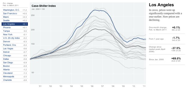
• Membership
  • Newsletter
  • Projects
  • Learning
  • About
  • Member Login
  • Best Picture vs. most popular – Oscar statistics

    February 26, 2011

    Topic

    Statistics  /  movies, Oscar

    William Briggs and John Briggs examine the differences between movies that have won Best Picture and those that were top at the Box Office, based on money, gender, age, and genre. “There was only one Oscar winning movie with a leading actress older than 50: Jessica Tandy in Driving Miss Daisy. Eight women were at least 40 in Oscar winning movies, e.g. Myrna Loy, Bette Davis, Sandra Bullock. However, half of these were just 40 or 41.”

    [via]

  • Life cycle of sad and happy

    February 25, 2011

    Topic

    Miscellaneous  /  flowchart, happiness

    Along the same lines of the happiness flowchart, this graphic by Moritz Resl shows a simplified life cycle between happy and sad. Let’s not forget though that sometimes doing stuff you like leads to sad, and more importantly, doing stuff you don’t like can lead to happy. Have a nice weekend!

    [Moritz Resl via swissmiss]

  • True size of Vatican City

    February 24, 2011

    Topic

    Maps  /  scale, Vatican

    We saw the true size of Africa, relative to the world’s largest countries, by Kai Krause last year. Taking it in the other direction, xefer shows the true size of Vatican City, world’s smallest state, with an area of approximately 110 acres. That’s just big enough to house a handful of national formations and man-made structures.

    [xefer via Map of the Week]

  • Million song dataset available for download

    February 24, 2011

    Topic

    Data Sources  /  music

    Need music data? Get all the data you want and more from the freely available million song dataset, offered by LabROSA at Columbia University and Echo Nest. There’s lots of metadata on song features and your standard stuff like year and artist. There are also several code wrappers and samples to help researchers make use of the data right away.

    [Million Song Dataset via @MacDivaONA]

  • Data visualization meets game design to explore your digital life

    February 23, 2011

    Topic

    Data Art  /  gaming, interactive, social

    The list of one-off applications that visualize your digital life, whether it be your Twitter feed, Facebook updates, or Foursquare checkins, has been growing for a short while. Ben Cerveny and Tom Carden, both Stamen Design alumni, aim to take this idea to the next level with Bloom, with elements of game design.
    Read More

  • Freakonomics is available on Netflix to watch instantly

    February 23, 2011

    Topic

    News  /  freakonomics

    FYI: Freakonomics, the Movie is available to watch instantly on Netflix right now. It is of course based on the highly recommended first book by Steven Levitt and Stephen Dubner. I just watched it last night, and it’s not as good as the book, but still an interesting watch. If anything, it’s worth watching just to see Levitt talk about data. The exchange between Levitt and Dubner is also pretty entertaining.

    I haven’t read the second book, SuperFreakonomics, yet. Thoughts?

  • Who drinks the most around the world?

    February 23, 2011

    Topic

    Maps  /  drinking

    What and how much people drink depends a lot on what country you’re in or what culture you’re exposed to. Personally I grew up in a low-alcohol family. It’s not that we thought it was bad, but just because, well, it didn’t really occur to us to do that. The Economist shows these differences via this world map on average alcohol consumption, according to a recently released report by the World Health Organisation.

    The world drank an average of 6.1 liters per person in 2005, but it was significantly more in Europe and the Soviet states. Hey, you gotta stay warm somehow, right?

    Have a look at this map for legal drinking age. Is there any relationship? Doesn’t seem to be a very strong case.

    [Economist | Thanks, Elise]

  • America is not the best at everything

    February 22, 2011

    Topic

    Statistical Visualization  /  heatmap, nytimes

    Charles M. Blow has a look at some metrics for the International Monetary Fund’s “Advanced economy” countries. As Americans, we like to think that we’re the best at everything, but in many instances, that just isn’t the case. Sometimes we’re the worst.

    [New York Times via @charlesmblow]

  • Every baseball game and play since 1951 on your iPad

    February 22, 2011

    Topic

    Infographics, Software  /  baseball, interactive, iPad

    If you love baseball and have an iPad, you need Pennant, a project by Steve Varga. The app lets you explore every game and play since 1951. See the numbers for your favorite player or team with just a few taps or swipes while you’re plopped on your couch watching the game. Imagine: one hand with an ice cold beverage, iPad on your lap, and the game on in front of you.
    Read More

  • Components of the global water cycle

    February 21, 2011

    Topic

    Maps  /  water, world

    NASA briefly explains the water cycle:

    Water regulates climate, predominately storing heat during the day and releasing it at night. Water in the ocean and atmosphere carry heat from the tropics to the poles. The process by which water moves around the earth, from the ocean, to the atmosphere, to the land and back to the ocean is called the water cycle.

    The three animations above show hourly evaporation, water vapor, and precipitation, based on “data from the GEOS-5 atmospheric model on the cubed-sphere, run at 14-km global resolution for 25-days.” I’m not even going to pretend like I know what I’m talking about, but it is fun to watch the simulated global water movements. Remember, these are based on actual data. They are not closeups of lava lamps.

    [Video Link via Data Pointed]

  • A visual guide to eggs

    February 20, 2011

    Topic

    Infographics  /  cooking, eggs

    I can’t resist. It’s about food and those chickens are just so cute. View the full guide to eggs on culinaut.

  • History of the dunk contest complete with videos

    February 19, 2011

    Topic

    Infographics  /  basketball, interactive, video

    Here’s something to chew on while you wait for the 2011 slam dunk contest to get a move on already. It’s a score history of all of the dunks from 1984 to 2010, complete with video. From the commentator after Michael Jordan’s first dunk in round 3 in 1988: “I like to call that the Chinese Superman dunk. He goes in slanted.”

    [Hoopism via @infochimps]

  • The Grammy winning sales bump

    February 18, 2011

    Topic

    Statistical Visualization  /  Grammy, interactive, music, sales

    A Grammy win is worth way more than a little trophy and some short-lived fame. It’s worth actual cash. As shown in this graphic by Wilson Andrews and Mike McPhate for the Washington Post, album sales two weeks after winning shoot up from two weeks before the awards show.

    Last year, album sales only went up 56 percent for the Taylor Swift album Fearless, compared to a plus 891 percent bump for the 2009 winners, Alison Kraus and Robert Plant. However, considering the relative obscurity of this year’s winner, Arcade Fire, I suspect a bump more like the latter.

    [Washington Post]

  • England crime map comparisons

    February 17, 2011

    Topic

    Maps  /  crime, Guardian, interactive, SpatialKey

    After a sluggish launch by police.uk to unleash local crime data, the Guardian and Doug McCune teamed up to provide a tool that lets you compare crime rates in different England cities:

    The government’s recent launch of police.uk saw a phenomenal public reaction. Within hours of going live, millions of users had attempted to gain access to maps permitting street-level scrutiny of crime incidents across the UK. Dogged by “technical problems”, the site was reported by many to have failed in the face of public interest. Although the servers now seem much more capable of dealing with ongoing demand, we couldn’t help but wonder if we could offer people some alternative ways to compare and contrast crime levels around the country.

    Turnaround time: four days, completely with SpatialKey.

    [Guardian | Thanks, Doug and Simon]

  • Google opens up Public Data Explorer to your data

    February 17, 2011

    Topic

    Apps  /  exploration, Google

    With Google’s recent data-related offerings, it shouldn’t come as much of a surprise that they’ve opened up their Public Data Explorer so that you can upload your own data. Previously, it was only available when you searched for something like “GDP” and a related dataset was supplied by an official provider.

    [W]e’re opening the Public Data Explorer to your data. We’re making a new data format, the Dataset Publishing Language (DSPL), openly available, and providing an interface for anyone to upload their datasets. DSPL is an XML-based format designed from the ground up to support rich, interactive visualizations like those in the Public Data Explorer. The DSPL language and upload interface are available in Google Labs.

    In terms of visualization, there’s isn’t anything new. You’ve got your maps, bar charts, and time series line charts, with the checkboxes on the left (like the snapshot below). Then there’s the chart types available via the charting API.
    Read More

  • National Broadband Map shows how connected your community is

    February 17, 2011

    Topic

    Maps  /  broadband, interactive, Stamen

    To encourage the integration of broadband and information technology into local economies, the National Telecommunications and Information Administration (with some help from Stamen) now provides an exploratory tool for broadband in your community:

    The National Broadband Map (NBM) is a searchable and interactive website that allows users to view broadband availability across every neighborhood in the United States. The NBM was created by the National Telecommunications and Information Administration (NTIA), in collaboration with the Federal Communications Commission (FCC), and in partnership with 50 states, five territories and the District of Columbia. The NBM is a project of NTIA’s State Broadband Initiative. The NBM will be updated approximately every six months and was first published on February 17, 2011.

    There’s a lot of data to look at, but you can search for the city or zipcode that you’re interested in, and get information on what’s available, as shown below. You can also see how your city compares to other locations in the country.
    Read More

  • Sunlight Labs opens up Real Time Congress API

    February 17, 2011

    Topic

    Data Sources  /  API, government

    Sunlight Labs continues its work for a more open government with its recent release of the Real Time Congress API.

    Today we’re making available the Real Time Congress API, a service we’ve been working on for several months, and will be continuing to expand.

    The Real Time Congress API (RTC) is a RESTful API over the artifacts of Congress, kept up to date in as close to real time as possible. It consists of several live feeds of data, available in JSON or XML. These feeds are filterable and sortable and sliceable in all sorts of different ways, and you can read the docs to see how.

    There are seven data types the API will report:

    • Bills
    • Votes
    • Amendments
    • Videos
    • Floor Updates
    • Committee Hearings
    • Documents

    Now someone has to do something with all of this data coming in. Can you think of a useful application for what is essentially an automated government Twitter feed?

    [Real Time Congress API]

  • A close look at troll comments versus real ones

    February 17, 2011

    Topic

    Statistics  /  comments, trolls

    There’s something very strange about the anonymity of the Web that brings out the worst in some people. I don’t get it, but it’s something we have to deal with for now. Courtney Stanton, who wrote a couple of posts that drew the ire of a bunch of trolls, had a look at the troll comments versus the sincere ones.

    I should warn you that the following content does contain adult themes, but it’s the contrast between the groups that’s most interesting (and the good use of Many Eyes).
    Read More

  • How tech tools have changed today’s prostitution business

    February 16, 2011

    Topic

    Statistics  /  prostitution, technology

    Sudhir Venkatesh, a professor of sociology at Columbia University, along with his students, has been studying the sex work industry since the 1990s. In a recent article for Wired, Venkatesh describes how the business has changed over the past couple of decades.
    Read More

  • Data in a physical context

    February 16, 2011

    Topic

    Data Art  /  culture, pie

    We’ve seen this sort of thing before, but it doesn’t ever seem to get old. Peter Ørntoft takes some data and puts it into physical context:

    The project deals with data from a list of the social related interests of the Danish people. The list is the result of an opinion poll from a major consultancy company in Denmark. I have used the context of specific opinion polls within each interest to shape and design diagrams. By doing so the receiver understands more layers of information about the data.

    The graphics above and below show Danish opinion on whether it’s ethical to wear religious symbols in public professions. At their core, they’re just pie charts. Embed them on clothing relevant to the topic though, and somehow they become more than that.
    Read More

  • Page 321 of 392
  • <
  • 1
  • ...
  • 318
  • 319
  • 320
  • 321
  • 322
  • 323
  • ...
  • 392
  • >

Analyze, visualize, and communicate data usefully, beyond the defaults.

Become a member →

Recently for Members

May 8, 2025
When the data is not what it seems

May 1, 2025
Finding the Right Charts

April 24, 2025
Visualization Tools, Datasets, and Resources – April 2025 Roundup

April 17, 2025
Breaking Out of Chart Software Defaults

April 15, 2025
Line Chart with Decorative Neon Accents

Browse by Chart Type See All →

Pyramid Chart Parallel Sets Venn Diagram Choropleth Map Timeline Glyph Chart Calendar Streamgraph Cartogram Gantt Chart

Browse By Topic

  • Visualization

    Seeing data

  • Maps

    Seeing geographic data

  • Infographics

    Explaining data

  • Networks

    Connecting data

  • Statistics

    Analyzing data

  • Software

    Working with data

  • Sources

    Getting data

  • Design

    Making data readable

Get the Book

Visualize This: The FlowingData Guide to Design, Visualization, and Statistics

Available now.

Order: Amazon / Bookshop

Made by FlowingData

  • The Process

  • Data Underload

  • Chart Everything

  • Guides

  • Books

  • Shop

  • About
  • Contact
  • Newsletter
  • LinkedIn
  • Instagram
  • Bluesky
  • RSS
Copyright © 2007-Present FlowingData. All rights reserved.