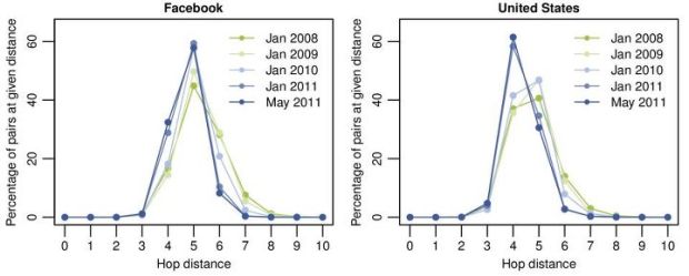
• Membership
  • Newsletter
  • Projects
  • Learning
  • About
  • Member Login
  • Expanded rules for Rock-paper-scissors

    July 8, 2011

    Topic

    Miscellaneous  /  humor, Roshambo

    We already learned how to win Roshambo every time, but there’s actually more to it. Eyemotive provides the expanded rules, namely tiebreakers and unconventional tactics. I hate it when someone lights my paper on fire. It hurts every time.

    [eyemotive]

  • Wow vs. Ah-ha for data graphics

    July 8, 2011

    Topic

    Design  /  art, audience, Juice Analytics

    After attending the Eyeo Festival, Zach Gemignani of Juice Analytics noticed a difference in the approach of artists and his own practices with business-related data:

    The artists are looking for an emotional “wow” moment; our goal is the “ah ha” moment when a user learns something that can lead to productive action. The question that we so often ask: “what can you do about it?” wasn’t a top priority within the Eyeo crowd.

    One group is telling a specific story and the other is searching for one. That’s not to say that one way or the other is bad, however. Each group can benefit from the other:

    Ultimately this art vs. practice dichotomy is natural and healthy. In our work, we are inspired by the fun and energy expressed in artistic visualizations. Data visualization is a tool that can and should be used differently depending on the purpose and the audience. The skill in using the tool can be appreciated equally across these different contexts.

    There’d be a lot less ruffled feathers if we could all remember that.

    [Juice Analytics]

  • Where the aliens are flying their UFOs

    July 7, 2011

    Topic

    Projects  /  featured, sightings, UFO

    I came across some UFO sightings data on Infochimps, from the National UFO Reporting Center, and it seemed like a good excuse to mess around in R. I was just playing around, but the globular result was kind of fun to look at, so here it is.
    Read More

  • Best of FlowingData – June 2011

    July 7, 2011

    Topic

    Best of FlowingData

    We’re already more than halfway through the year. Time…moving…too…fast. Is there a pause button somewhere? In case you missed them, here are the most popular post from the last month:

    1. Largest data breaches of all time
    2. Organizational charts in major tech
    3. All roads lead to philosophy, on Wikipedia
    4. Most common iPhone passcodes
    5. Long-exposure air traffic
    6. Gender and time comparisons on Twitter
    7. Flowchart to decide if you should share that pic of your privates
    8. DataBot mouse makes larger files physically harder to move
    9. Anatomy of a computer virus explained
    10. Analysis of passwords in Sony security breach

    As usual, thanks for sharing, tweeting, and liking. Every little bit helps FlowingData reach a wider audience.

  • Make Sankey flow diagrams with Fineo, sort of

    July 6, 2011

    Topic

    Apps  /  Sankey

    Whenever I post a Sankey diagram (for example, here, here, and here), someone always asks how they can make their own. I’m always surprised that so many people have data where the chart type applies, but in any case, I’ve never had a good answer other than open up Illustrator and do it by hand. DensityDesign tries to make Sankey diagram creation easier with Fineo.
    Read More

  • Access to education where you live

    July 6, 2011

    Topic

    Infographics  /  education, interactive

    If you’re a parent, most likely you want your children to go to the best schools available, but what if you found out that the school that they attend didn’t measure up to the school a couple miles away? Using previously unreleased federal education data, ProPublica helps you compare.
    Read More

  • When crime happens in major cities

    July 5, 2011

    Topic

    Statistical Visualization  /  crime, interactive, small multiples, Trulia

    Does more crime happen during the late hours of the night or in the middle of the afternoon? Trulia Insights uses small multiples to look at crime by hour in major cities, or rather, when it is reported, according to SpotCrime. There appears to be a dip during the 3 a.m. to 7 a.m. hours for all crime types, across all cities. Well, except for Indianapolis, which seems to report incidents with rounded off hours.
    Read More

  • FlowingData is brought to you by…

    July 5, 2011

    Topic

    Sponsors

    A big thank you to the FlowingData sponsors. This little blog wouldn’t be what it is now without them. Check them out. They help you make sense of and communicate with data.

    Tableau Software — Combines data exploration and visual analytics in an easy-to-use data analysis tool you can quickly master. It makes data analysis easy and fun. Customers are working 5 to 20 times faster using Tableau.

    Column Five Media — Whether you are a startup that is just beginning to get the word out about your product, or a Fortune 500 company looking to be more social, they can help you create exciting visual content – and then ensure that people actually see it.

    InstantAtlas — Enables information analysts and researchers to create highly-interactive online reporting solutions that combine statistics and map data to improve data visualization, enhance communication, and engage people in more informed decision making.

    IDV Solutions Visual Fusion — Business intelligence software for building focused apps that unite data from virtually any data source in a visual, interactive context for better insight and understanding.

    Want to sponsor FlowingData? Contact me at [email protected] for more details.

  • Sales receipt redesign

    July 5, 2011

    Topic

    Infographics  /  receipt, redesign

    Design firm Berg rethinks the everyday sales receipt under the premise that registers nowadays are connected to a central system, which has access to data about sales, food, etc.
    Read More

  • Hitler learns topology

    July 1, 2011

    Topic

    Miscellaneous  /  humor, topology

    In another reword of the pivotal scene in Der Untergang, Adolf Hitler learns topology. Still makes me laugh every time.
    Read More

  • Organizational charts in major tech

    June 30, 2011

    Topic

    Miscellaneous  /  humor, org

    Manu Cornet caricaturizes org charts of major tech companies, such as Amazon with its top-down structure and Google with its slightly less structured structure. Drop it like it’s hot.

    [Organizational Charts | Thanks, Ian]

  • Custom maps in Processing

    June 30, 2011

    Topic

    Quicklinks  /  maps, Processing, TileMill

    Till Nagel teaches you how to design custom maps in Processing with TileMill. Could come in handy one day. Saving for later. [via]

  • Takin’ data to the streets. Word.

    June 30, 2011

    Topic

    Infographics  /  Golan Levin, graffiti

    Whenever I’m out late at night with my bottle of black spray paint while climbing onto the highway overpass, I’m always like, “I wish there was an easier way to make pie charts on this street sign. There has to be a better way!” I am sure you can identify. Well fret no more. Golan Levin, an artist and educator, provides you with the open-source pie chart stencil.
    Read More

  • A year of food consumption visualized

    June 29, 2011

    Topic

    Self-surveillance  /  food

    My pending thesis is on personal data collection (i.e. quantified self, personal informatics, self-surveillance, or whatever you wanna call it), so there’s a special place in my heart for projects with data about an individual, no matter who they are. It’s like taking a peek at part of someone’s journal that they’ve decided to make public.

    Designer and architecture student Lauren Manning has documented her life for the past two years, and for her thesis project, she visualized a subset of that data — her food consumption in 2010 — with a variety of over 40 graphics. Instead of sticking with a single, optimized view of her data, she stood back and let the data fly to see what would happen.
    Read More

  • DataBot mouse makes larger files physically harder to move

    June 29, 2011

    Topic

    Internet of Things  /  feedback, mouse

    Files and folders on your computer look and feel the same regardless of how much space on your hard drive they take up. Delete a 5-gigabyte file or a 5-kilobyte file with a simple click and drag of the mouse. Sure, one might take a little longer to delete than the other, but there’s no change in effort on your part. In the real world, we know that’s not true. Otherwise, shipping would probably be free for everything (or at least a flat rate). Jan Barth and Roman Grasy experiment with this idea with DataBot.
    Read More

  • Anatomy of a computer virus explained

    June 28, 2011

    Topic

    Infographics  /  animation, video, virus

    Motion designer Patrick Clair tells the story of Stuxnet, “a Microsoft Windows computer worm discovered in July 2010 that targets industrial software and equipment.” Unlike many viruses and worms, Stuxnet was designed with a specific target — Siemens Supervisory Control And Data Acquisition (SCADA) systems — and left any other systems unharmed. Stuxnet could then increase pressure in nuclear reactors and turn off oil pipelines, all the while showing monitors everything was fine.

    Get the full skinny in Clair’s well done motion graphic video below.
    Read More

  • Elements of Happiness: A happy life depicted in diagrams

    June 27, 2011

    Topic

    Data Art  /  book, happiness, Harvard

    For several decades, Harvard Laboratory of Adult Development has chronicled the lives of hundreds of men from adolescence through adulthood for “an unprecedented database of life histories with which to view the dynamic character of the aging process.” Designer Laura Javier took ten of those cases and visualized them in the Elements of Happiness.
    Read More

  • Dotspotting to make city data more legible

    June 27, 2011

    Topic

    Apps  /  city, dots, interactive, Knight, Stamen

    Last year Stamen Design received a grant from the Knight News Challenge to design and implement Citytracking, a project to help people gather data about their cities and gain some kind of understanding about it. Dotspotting, the phase of the project, just launched. It makes it much easier to put dots on a map.
    Read More

  • Page 311 of 392
  • <
  • 1
  • ...
  • 308
  • 309
  • 310
  • 311
  • 312
  • 313
  • ...
  • 392
  • >

Analyze, visualize, and communicate data usefully, beyond the defaults.

Become a member →

Recently for Members

May 8, 2025
When the data is not what it seems

May 1, 2025
Finding the Right Charts

April 24, 2025
Visualization Tools, Datasets, and Resources – April 2025 Roundup

April 17, 2025
Breaking Out of Chart Software Defaults

April 15, 2025
Line Chart with Decorative Neon Accents

Browse by Chart Type See All →

Density Plot Dot Plot Choropleth Map Gantt Chart Donut Chart Moving Bubbles Unit Chart Treemap Slope Chart Area Chart

Browse By Topic

  • Visualization

    Seeing data

  • Maps

    Seeing geographic data

  • Infographics

    Explaining data

  • Networks

    Connecting data

  • Statistics

    Analyzing data

  • Software

    Working with data

  • Sources

    Getting data

  • Design

    Making data readable

Get the Book

Visualize This: The FlowingData Guide to Design, Visualization, and Statistics

Available now.

Order: Amazon / Bookshop

Made by FlowingData

  • The Process

  • Data Underload

  • Chart Everything

  • Guides

  • Books

  • Shop

  • About
  • Contact
  • Newsletter
  • LinkedIn
  • Instagram
  • Bluesky
  • RSS
Copyright © 2007-Present FlowingData. All rights reserved.