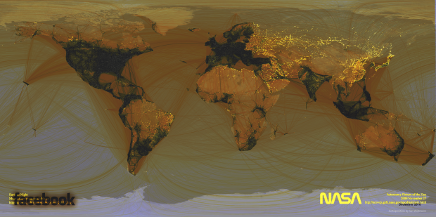
Remember the Facebook connections map from a while back? It showed digital friendships around the world by connecting locations with arcs. Visual arts graduate student Ian Wojtowicz mashed that with NASA’s well-known map showing Earth at night, and the above is what you get.
The black areas represent Facebook coverage, and the yellow areas are where there are people not using Facebook. It’s like the map by Thorsten Gaetz with more granularity.
Here’s a closer look at Asia:

And South America:

So simple. It makes me wonder what other maps we can mash together.
[The UnFacebook World | Thanks, Ian]
 Visualize This: The FlowingData Guide to Design, Visualization, and Statistics (2nd Edition)
Hmm, what exactly means to “mash” the maps? What about overplotting issues?
I agree, it would be too nice if “those who facebook don’t shed any light any more” could be shown on the map – no, I don’t think I meant this philosophical in any way …
I think the FB-hole in China is interesting – is there another site in particular they like to use instead?
Map of social network dominance:
https://flowingdata.com/2009/06/08/world-map-of-social-network-dominance/
China has QQ (www.qq.com) but it different with facebook.
Equivalent to Facebook in China would be 开心网 (Kaixing)
Would be interesting to see this interposed with proxy data and Facebook location to map original access point – I’d guess that the 1st tier Cities with large foreigner presence would see a fair amount of VPN -> Facebook access.
In China it would actually be Renren.com . It is a note for note copy of Facebook, right down to the color scheme and page design. Chinese can only access Facebook using a VPN or proxy and there for its very possible that Chinese access is represented on this map, its just not coming from China because of the way VPN’s work. For example, I live in Shanghai, but using a VPN I can use Pandora.com radio, even though its only available in the US, since I guess the VPN tricks Pandora into thinking my computer is in the US.
Facebook is blocked in China. So is twitter
Now do where people do/don’t use Google Plus.
I’m glad you guys enjoyed this. It’s nice to think that you don’t have to have a PhD in statistical modelling to make useful data visualizations. Thank you NASA.
Is the NASA’s night time Earth illumination a valid proxy for population densities ? Why not overlay the Facebook connections on population densities instead ?
Maybe not population density, but it is likely a good proxy for population with technology (read internet) access. I mean, I doesn’t have to be perfect to get you asking the right questions or making the right connections. Right?
ummm, im not sure about the ‘accuracy’ of this map. Take Iran for example, I know for a fact that people use facebook and twitter extensively (they actually have to go through a proxy, and apparently people usually have monthly subscriptions!! to companies providing such proxies so that they can pass through the ban posed by the goverment)
so, I wonder, why that doesnt show up here? how the original map is made, is it the result of people creating their own friendship maps or is it something based on facebook database?
The original connections map was made by a Facebook intern with a large data sample.
sorry posted my comment earlier at a wrong place :>
I think I found an explanation. according to http://www.internetworldstats.com/stats5.htm, the internet usage in iran is 50% of whole population,the first country by far in the middle east region. but then theres no ‘available data’ on facebook usage. this could be because officials dont issue statistics or because connecting to facebook requires proxy, meaning, IPs are not real.
Well done Ian. Good idea and execution.
I tried with the scientific collaboration one ( https://flowingdata.com/2011/01/27/map-of-scientific-collaboration-between-researchers ), but it seems that the projection is not the same… I did not manage to stretch it to fit with the other one. Also, the edges between are very bright, much brighter than the city node… so it did not look very good.
Thanks Stephane. Photoshop has a useful function called warp that helped stretch one map over the other. It’s not easy, but it will get you there.
Hi, I’m the guy that did the scientific collaboration map. There’s an error in the projection code. I’ve fixed it a long time ago. I’ll repost the corrected maps + this overlay today or tomorrow.
first thought when I saw this was: “What the heck does NASA have to do with Facebook?!”
One organization is publicly funded capturing the dreams of the 1960s, and fading today.
Other organization is privately funded capturing the narcissistic dreams of the 2000 but not entirely sure comes near the goal of discovering the soul of humanity and the universe around us.