It’s impossible to know the exact number of Covid deaths worldwide, because consistent records aren’t kept by everyone and everywhere. So researchers have to estimate. Howtown explains the various estimation methods in the video below.
It’s impossible to know the exact number of Covid deaths worldwide, because consistent records aren’t kept by everyone and everywhere. So researchers have to estimate. Howtown explains the various estimation methods in the video below.

Here is the good stuff for the month.
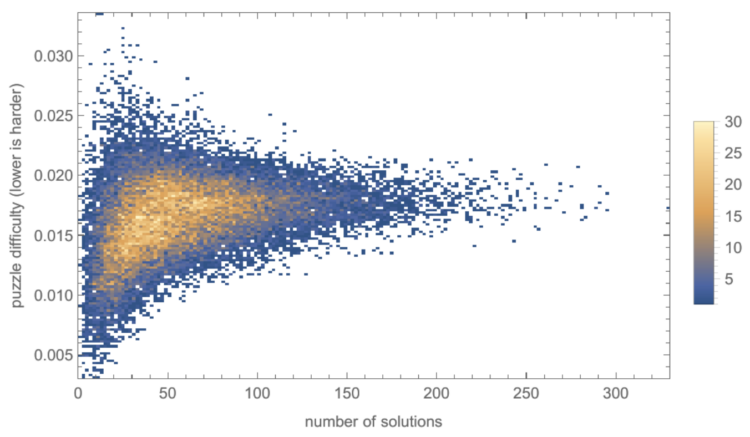
Christopher Wolfram explains his “unnecessarily detailed analysis” of the spelling game from the New York Times:
By this analysis, I argue that puzzle difficulty should be judged by the difficulty of the hardest word which the player must guess in order to reach Genius. The score required to reach Genius equals 70% of the total number of points available, so we can calculate puzzle difficulty by the 30% quantile of the difficulties of solution words weighted by their scores. (It’s the 30% quantile instead of the 70% quantile because lower word difficulty corresponds to harder words.) This measure has the advantage that it is a bit like taking the “average” of the solution word difficulties, but it also takes into account the score threshold for Genius. Let’s call this measure the puzzle difficulty.
There’s more than one way to spell yogurt, and the common spelling changes depending on where you live. However, the English version of Wikipedia serves people around the world. Which spelling do you use?
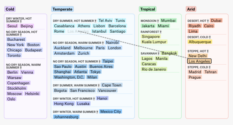
A global map of climate change can make a few degrees of rising temperature seem trivial. It just doesn’t look like that much. So, for the Pudding, Derek Taylor used forecasts from a study by Hylke Beck and team that used climate zones. Cities are placed in one of four zones to start and you can see where the end up.
According to Beck’s estimates, Moscow might be the only city left (from the included cities) in the cold zone in 2070. That seems concerning.
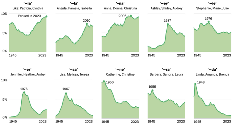
For WP’s Department of Data, Daniel Wolfe analyzed baby name data with Laura Wattenberg. But instead of zeroing in on trends for full names, they looked at the letters that names end with.
Then a funny thing happened: Names started giving way to sounds. Jason begot Mason, Jackson, Grayson, Carson and a whole family of other “-son” names that together make up a major 21st-century trend for baby boys.
Always up for baby name data.
State Farm won’t be renewing about 30,000 policies because of high wildfire and earthquake risk. For San Francisco Chronicle, Megan Fan Munce reports:
The decision affects homeowners policies, rental insurance and other property insurance. The company will not send official notices until July, but some customers have been notified by their State Farm agents that they will be among the 30,000. Recent filings with the California Department of Insurance show where these nonrenewals will be concentrated. State Farm accounts for 8.7% of all home insurance policies in California, according to the latest data, which is from 2022.
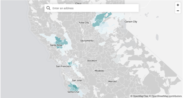
I was perusing home prices, as one does during idle times late at night, and saw an area with surprisingly low prices. It makes sense now.
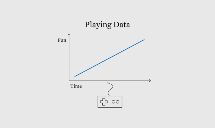
Visualization and analysis is usually about minimizing uncertainty to more clearly see patterns. On the other hand, games force you to play through uncertainty.
For Wired, Dhruv Mehrotra and Tim Marchman provide evidence that Perplexity, an AI-based company currently valued at a billion dollars, appears to be slurping up whatever they can get their hands on:
It also appears probable that in some cases—and despite a graphical representation in its user interface that shows the chatbot “reading” specific source material before giving a reply to a prompt—Perplexity is summarizing not actual news articles but reconstructions of what they say based on URLs and traces of them left in search engines like extracts and metadata, offering summaries purporting to be based on direct access to the relevant text.
The magic trick that’s made Perplexity worth 10 figures, in other words, appears to be that it’s both doing what it says it isn’t and not doing what it says it is.
Neven Mrgan describes what it was like to get an AI-generated email from a friend:
I knew that I didn’t want an algorithm to design layouts and draw illustrations “so I don’t have to,” but prior to this email, I never even pondered whether I wanted AI to call me up on behalf of people in my life. It had simply not occurred to me—and now that it has occurred to me, I definitely do not want small talk and relationships outsourced to server farms. This stuff shouldn’t feel hard or taxing; it’s what our presence here on Earth is mostly made up of. The effort, the clumsiness, and the time invested are where humanity is stored.
I got an alert for a link to FlowingData, and it was for a sloppy AI-generated site. The site covered a hodgepodge of topics with generated titles, text, and cover images. It looked like a news site on the surface but stripped of all meaning once you tried to read.
One of the “articles” was a “summary” of something I wrote. It felt lazy and offensive, which sounds familiar to what Mrgan felt about his friend’s “email.”
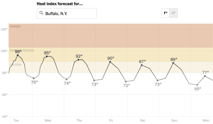
It’s abnormally hot in a large portion of the United States, and it’s going to stay that way for a few days. The New York Times has a heat tracker to show the areas with dangerous high temperatures and how long it will last.
A searchable line chart shows background bands for heat index levels, and a subtle gray to black gradient on the line reinforces the peaks.
Stay indoors and stay hydrated.
As you get older, it might start to feel like everyone is getting younger around you. At what point are you older than the majority?
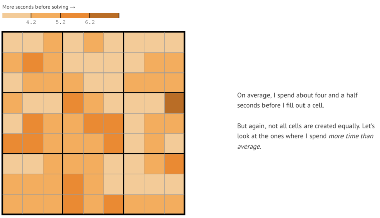
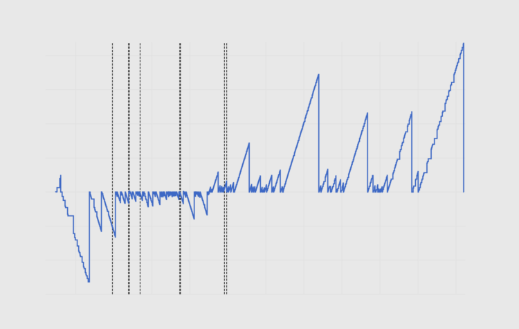
Vivek Rao likes to play Sudoku, enough that he collected data on his gameplay and analyzed his strategies:
In January 2023, I made a breakthrough. I started tracking what grids I fill out and how I fill them out1. And in the weeks after, I started to analyze my performance to look for patterns and ways I could speed up. As a throwback to my high school self, I decided to analyze 100 easy sudokus to see what I could learn about my performance.
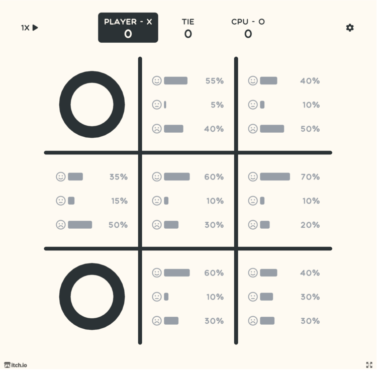
Thinking about life and randomness, Cameron Sun modified the classic game of Tic-Tac-Toe. You choose where you want to go but don’t control the outcome:
[I]n any given game of Probabilistic Tic-Tac-Toe you can do everything right and still lose (or do everything wrong and win.) However, the better player always rises to the top over time. These are characteristics that I find interesting about a lot of other games, and I thought they’d be fun to apply to an otherwise boring, solved game like tic-tac-toe. They’re also highly relevant to my life philosophy – that every outcome is effectively random, but our actions can often skew the odds in our favor. Bad breaks are inevitable, but good judgment is always rewarded (eventually, and given enough chances.)
The code is available on GitHub.
Visualization tends towards familiarity and convenience, which is useful for getting things done and reading data quickly. But the familiar is also less fun and can be stifling.
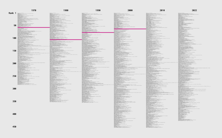
Job types changed over the years, because there were these things called computers that created occupations and shifted others. How did income change for different jobs, relative to everyone else? Use this chart to see how occupations ranked over the decades.
![]() I talked to Cole Nussbaumer Knaflic about my early motivations, FD origins, the new book, how I work, and data things. Listen to the episode here.
I talked to Cole Nussbaumer Knaflic about my early motivations, FD origins, the new book, how I work, and data things. Listen to the episode here.
Cole, who runs storytelling with data, came around not long after FD. Although she has a team now, I count Cole as one of the few long-term, independent visualization folks. It was fun to finally get to chat.
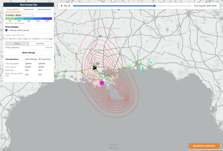
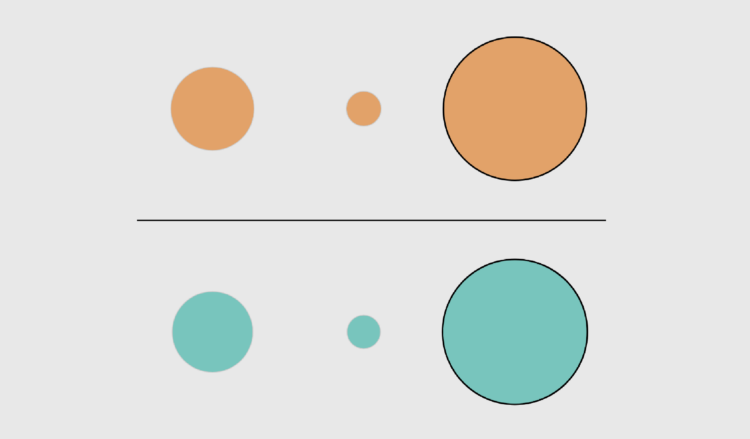
Stamen, whose design breakdowns I always appreciate, discusses why they took a different route to to show the uncertainty of wind speeds:
Wind speed probability data shows you the likelihood of sustained wind speeds that denote a category 1 hurricane (74+ mph). The way the data appears on a map is through concentric polygons that denote progressively less likely areas to experience a category 1 hurricane. We had bands showing the breakdown by 10%, but felt that given how much other data we needed to show, paring back the number of circles would be best. We ultimately decided on showing 90%, 50%, and 10% chance areas of category 1 hurricane. The team, and our stakeholders, agreed that this way of showing hurricane forecasting was far more precise than the cone of uncertainty. Wind speed probability data shows specific degrees of hurricane likelihood compared to only emphasizing one area like with the cone. Put simply, the cone of uncertainty tries to do too much at the cost of specificity.
See also: the challenges in reading the more common cone of uncertainty.

Ren Yuan visualized the GitHub commit history for the PyTorch library. The virtual rendering shows commits flying towards a repository with events sonified over time.
I wish this was a physical installation or could be experienced in VR. That would be fun.
Find Yuan’s other experiments with visualization and sonification on his site or his more frequently updated X feed. They will get the ol’ imagination going.
During the Dallas Stars away games during this year’s NHL playoffs, fans could attend watch parties at the home arena. The team used projectors and player tracking to show movements on the ice in real-time.
They should’ve used a colorblind-safe palette to differentiate the two teams instead of red and green. But this is a fun use of tracking technology that uses the hockey rink as a plotting space. I guess it brings the away fans closer to the game, too. Now do holograms.
 Visualize This: The FlowingData Guide to Design, Visualization, and Statistics (2nd Edition)
New tools, refined process.


